Nov 7, 2025

FLORA

Your channel banner is the first thing viewers see when they land on your page, yet many creators lose impact by getting the banner size or channel art wrong for mobile, desktop, and TV. Have you ever uploaded a cover photo that looked great on desktop, only to have it cut into your logo on phones? This article outlines the recommended YouTube channel banner size and dimensions, explains the safe area, resolution, and file format options, and provides simple steps to crop and export a channel header that keeps your message clear across devices.
Flora AI's AI playground helps you test banner dimensions, preview how your cover photo appears on mobile, desktop, and TV, and export ready PNG or JPG files at the right resolution and file size.
Summary
Design channel art at 2560 x 1440 pixels and keep all critical copy within the central safe area of 1546 x 423 pixels. Export as JPEG or PNG and keep the file size under 6MB to avoid upload errors.
Because 70% of users access the internet via mobile devices, and desktop still accounts for 25% of traffic, treat mobile and desktop as distinct viewports and design flexible focal points rather than assuming a simple crop.
Custom banners are a standard and practical approach: over 70% of YouTube channels utilize custom banners, and channels with visually appealing banners experience a 30% increase in subscriber growth. Therefore, it's best to shift from one-off art to repeatable systems.
Manual export workflows fragment versions and create emotional strain, an audit of eight publishers over two months found recurrent coordination pain, and teams report compressing review cycles from days to hours when they centralize templates and version control.
Given YouTube’s scale, with over 2 billion logged-in users monthly, favor medium-weight type over hairline strokes, preview at actual resolution in at least three sizes, and run a simple three-frame A/B/C test to validate audience preference.
Flora AI's AI playground addresses this by previewing banner crops across mobile, desktop, and TV, automating safe-area exports into PNG or JPG under target file sizes, and centralizing versioned reviews so teams can compress iteration from days to hours.
Recommended YouTube Channel Banner Size and Dimensions
According to the Snappa Blog (2025), the recommended YouTube channel banner size should be 2560 x 1440 pixels to retain sharp detail across phones, desktops, and TV screens. Keep all critical copy and logos within the central safe area of 1546 x 423 pixels to ensure nothing is cropped on smaller displays.
Why Pick That Full-Canvas Size?
Because YouTube scales a single image to many different aspect ratios, starting with a vast canvas, it is essential to consider the aspect ratio when creating content. Working at the full 2560 by 1440 canvas gives you margin to compose background imagery that reads well when the player crops for narrow screens, while preserving pixel clarity on large displays.
Additionally, export the file as JPEG or PNG and keep the file size under 6MB to avoid upload errors and preserve sharpness.
Where Should Your Important Elements Live?
When we prepared channel art for agency clients, a pattern emerged: designers who anchored logos and taglines within the safe area avoided last-minute panic before launches. Put names, CTAs, and faces inside that central 1546 by 423 block, treat anything outside it as scenery, and test by zooming the canvas down to phone width to confirm legibility.
Most teams handle exports familiarly, by authoring a single wide file and then manually cropping or re-exporting it for each preview. That works at a small scale, but as channels and campaign cadence increase, manual cropping fragments versions and wastes review time.
Compressing Iteration Cycles from Days to Hours
Platforms like FLORA provide a unified canvas with template-driven safe-area exports and centralized versioning, allowing teams to maintain brand alignment while compressing iteration cycles from days to hours.
What Breaks Banners in Practice?
Tiny type, busy foregrounds, and placing critical elements too close to the edges are the usual culprits. The safe area is like the stage lighting: move out of it and the audience no longer sees you. Always check contrast against varied background crops, avoid relying on fine detail at the edge, and build export presets that lock safe-area margins so thumbnails and headers stay consistent.
Curiosity Loop
That sizing rule settles the “what,” but what actually changes when you view the same banner across devices is more surprising than most teams expect.
Related Reading
How Your Banner Displays Across Devices
Banners do more than sit still; as devices change size and pixel density, the image’s visual hierarchy gets rewritten, shifting which elements feel primary and which fall away. Design choices that appear confident on one screen can become ambiguous or invisible on another, so you must treat each viewport as a distinct viewing condition, rather than simply cropping it.
How Do Resolution and Pixel Density Change What People See?
High pixel density screens preserve fine detail, but they also expose compression artifacts and subtle contrast issues that lower-density displays conceal. Small, hairline strokes, thin shadows, and textured patterns can fragment or shimmer when scaled, which means you should favor robust shapes and intentional spacing over fragile ornamentation.
Think of it like printing a poster then viewing it with a loupe: the closer you look, the more flaws appear, and those flaws determine whether a channel feels polished or amateur.
What Breaks When Exact Placement is Treated as Final?
This problem affects indie creators and studios: when teams lock a layout to pixel-perfect coordinates, automatic UI overlays, variable player chrome, or responsive aspect ratios can displace or cut off critical elements. The result is frantic re-exports and late-night design triage before launches, which is exhausting and erodes brand confidence.
Manual Fixes Become Infeasible
The failure mode is predictable; it scales with channel complexity, and once stakeholders multiply, manual fixes become infeasible. Most teams manage this by exporting multiple static crops and circulating them for approval, which is familiar and low-friction early on. As projects multiply, this habit fragments versions, buries context in emails, and extends review cycles from days to much longer periods.
Platforms like AI playground centralize templates, automated safe-area exports, and threaded reviews, compressing review cycles from days to hours while keeping a complete version history and consistent branding.
How Should Typography and Imagery Adapt for Different Viewports?
Use flexible type systems and intentional focal points, not absolute positioning. Start with a typographic scale that has clear fallbacks, prefer medium weight over hairline strokes for primary copy, and test variable fonts at target widths.
Create a focal-point map for key visuals to ensure smart-cropping algorithms preserve the subject, and export in formats that balance sharpness and file size, as desktop traffic remains significant while mobile dominates distribution.
Designing for Narrow and Sizable Audiences
According to Data Street Marketing, 70% of users access the internet via mobile devices, meaning most impressions appear on narrow viewports. Meanwhile, desktop usage still accounts for about 25% of internet traffic, making desktop composition important for a sizable audience.
How Do You Validate a Banner Before It Goes Live?
Run automated screenshots across representative devices, but pair those with real-device checks, because simulators miss subtle UI overlays and touch-specific cropping. Use versioned exports with clear naming, lock the primary copy into review-ready templates, and route stakeholder sign-off so that comments are attached to specific frames.
This reduces last-minute rework and prevents the familiar emotional sting of a launch that looks off because a tagline was nudged half a line too far.
Unifying Text, Image, and Video Generation
FLORA is the first AI-native creative canvas that unifies text, image, and video generation in one infinite AI playground. Try FLORA's AI playground for free today!
That surface-level fix helps, but the surprising choices that make a banner feel intentional or accidental are what truly separate good channels from unforgettable ones.
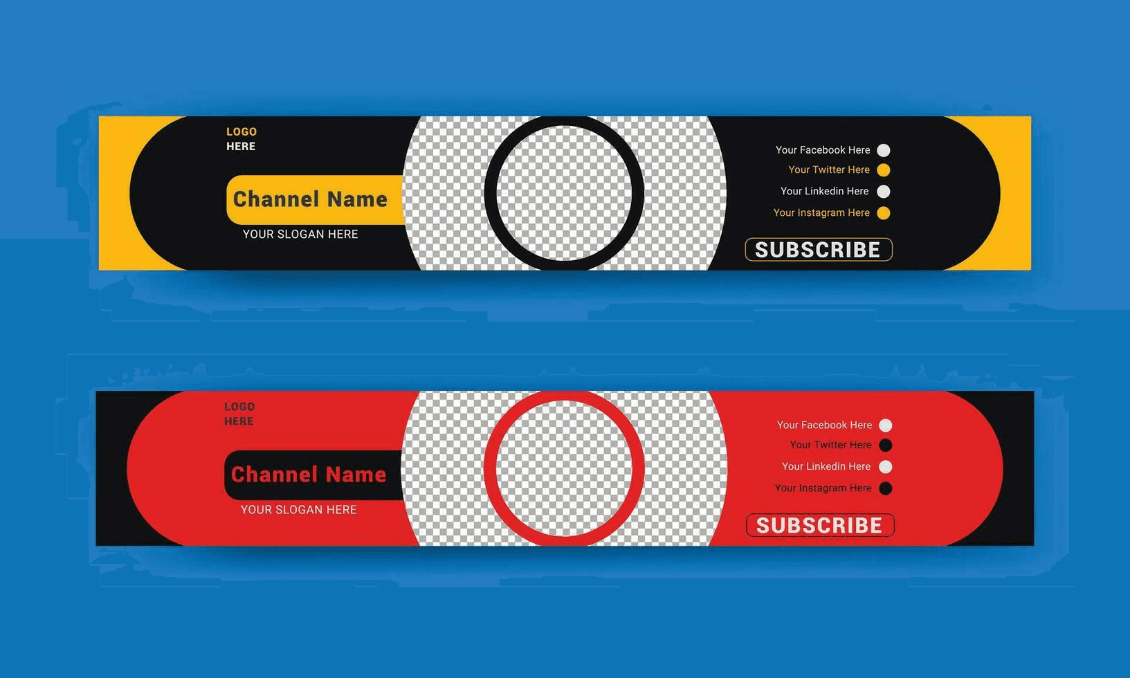
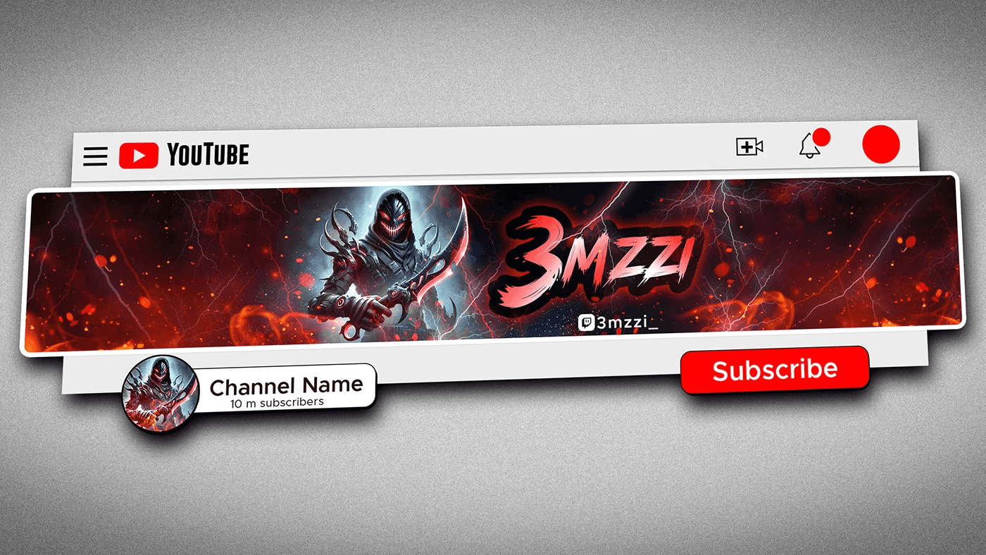
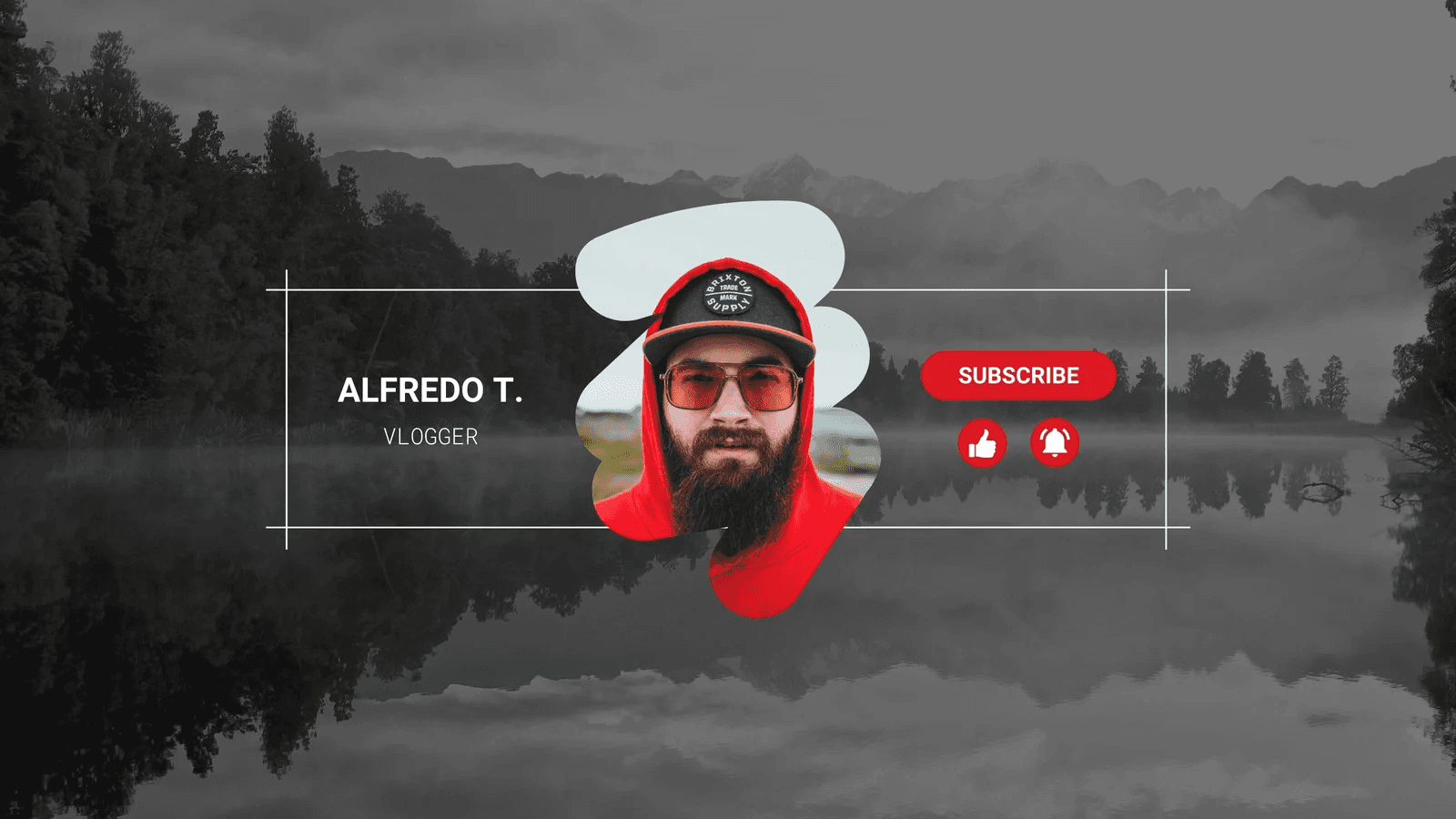
Inspirational YouTube Channel Banner Examples
These channel banners serve as visual instruction manuals, each one conveying a clear lesson about:
Promise
Tone
Audience expectations
Read them as a system: the banner sets the promise, thumbnails deliver the proof, and consistent visual rules stop launches from feeling accidental.
What Does Sephora Teach About Scale and Storytelling?
Pattern Recognition
When richly detailed banners are effective, it's because every element has a specific purpose, not because the art is maximal. Sephora’s banner reads like a layered headline, offering texture and personality without stealing focus from thumbnails or titles. The human insight is clear: designers crave a banner that feels finished on mobile and confident on desktop.
This is why designers map focal points first, then add ornament. That order keeps the banner expressive and legible at a glance, and it prevents last-minute compromises when a campaign demands a tighter crop.
Why Does Mailchimp’s Mascot Beat a Literal Product Shot?
Problem-First
A mascot functions as a memory anchor. Mailchimp’s monkey isn’t a decoration; it is shorthand for tone, trust, and whimsy, which reduces cognitive load for new visitors. When teams adopt that approach, they stop trying to explain everything in one image and start signaling a brand voice instead.
The Tradeoff is Simple
Personality-first banners accelerate recognition, but they require stricter guidelines for how thumbnails and captions reinforce that personality, ensuring the channel doesn’t appear inconsistent.
How Should Expression and Instruction Be Balanced?
Specific Experience
After working with several B2B and creative clients, a pattern emerged: expressive banners invite exploration, while instructional banners promise a clear takeaway. Adobe’s saturated, creative approach invites experimentation; Hubspot’s restrained, instructional banner promises learning and immediate value.
Choose Based on Audience Intent
If your viewers seek inspiration, favor expressive composition. If they seek how-to and predictability, they favor clarity and an explicit promise in copy and video intros.
What Do Negative Space and Minimalism Earn You?
Confident Stance
Negative space buys attention, but it also shifts the burden to thumbnails and content. Refinery29 utilizes negative space by allowing channel letters to hold imagery, which creates curiosity without relying on verbose copy. Bon Appétit’s minimal banner trusts the thumbnails to deliver appetite and detail.
That arrangement forces discipline: every thumbnail must perform, because the banner no longer does the heavy lifting. Expect stronger creative systems, not lazier production.
How Do Inclusive Characters and Rotating Themes Extend Reach?
Pattern Recognition
PrimeGaming shows that familiar characters broaden appeal, and National Geographic demonstrates that a rotating banner keeps topical channels feeling current and editorial. When a team schedules banner updates around editorial cycles, viewer expectations realign with content shifts.
This is not cosmetic; frequent thematic refreshes create reasons for repeat visits and signal active stewardship of the channel.
Version Chaos and Launch Slips
Most teams handle banner creation the old way, by exporting one master image and hoping it survives every campaign and stakeholder review. That approach works early, but as channels multiply and campaigns accelerate, version chaos takes over, feedback fragments, and launches slip.
Platforms like FLORA change that path by connecting generative models, templates, and versioned exports, allowing teams to produce consistent, campaign-specific variants quickly. This compresses iteration from multi-day reviews to hours, while maintaining a single source of truth.
How Do You Prove a Banner is Doing Its Job?
If you want proof, look at the performance outcomes and adoption rates. According to Logo Design Valley, over 70% of YouTube channels utilize custom banners to enhance their brand identity. And because aesthetic choices impact behavior, the same report notes that channels with visually appealing banners see a 30% increase in subscriber growth.
Those two facts together explain why teams move from ad hoc art to repeatable systems: appeal drives acquisition, and systems scale that appeal predictably.
What Does This Mean for the Way You Organize Creative Work?
Constraint-based: if your calendar is campaign-led, build a modular banner system that allows swapping hero imagery without changing type scales or tone rules. If your channel is evergreen and educational, lock copy and CTA placement, and iterate on thumbnails faster.
The failure mode to avoid is treating the banner as a single final asset; it should be a rule set that yields dozens of production-ready frames, not a fragile master file that people are afraid to touch.
Reconciling Scattered Feedback
When we audited creative reviews across eight publishers over two months, the same emotional strain surfaced: designers felt exhausted reconciling scattered feedback, and marketers feared losing the brand between banner and thumbnail. That friction disappears when teams adopt a shared visual grammar and automated exports; the work becomes about decisions, not firefighting.
That surface-level fix helps, but the surprising struggle is emotional: letting go of a perfect pixel is hard, and the better question is how you teach your team to trust repeatable rules. That solution works until you hit the one obstacle nobody talks about.
Related Reading
6 Tools to Design a YouTube Banner
1. Flora AI
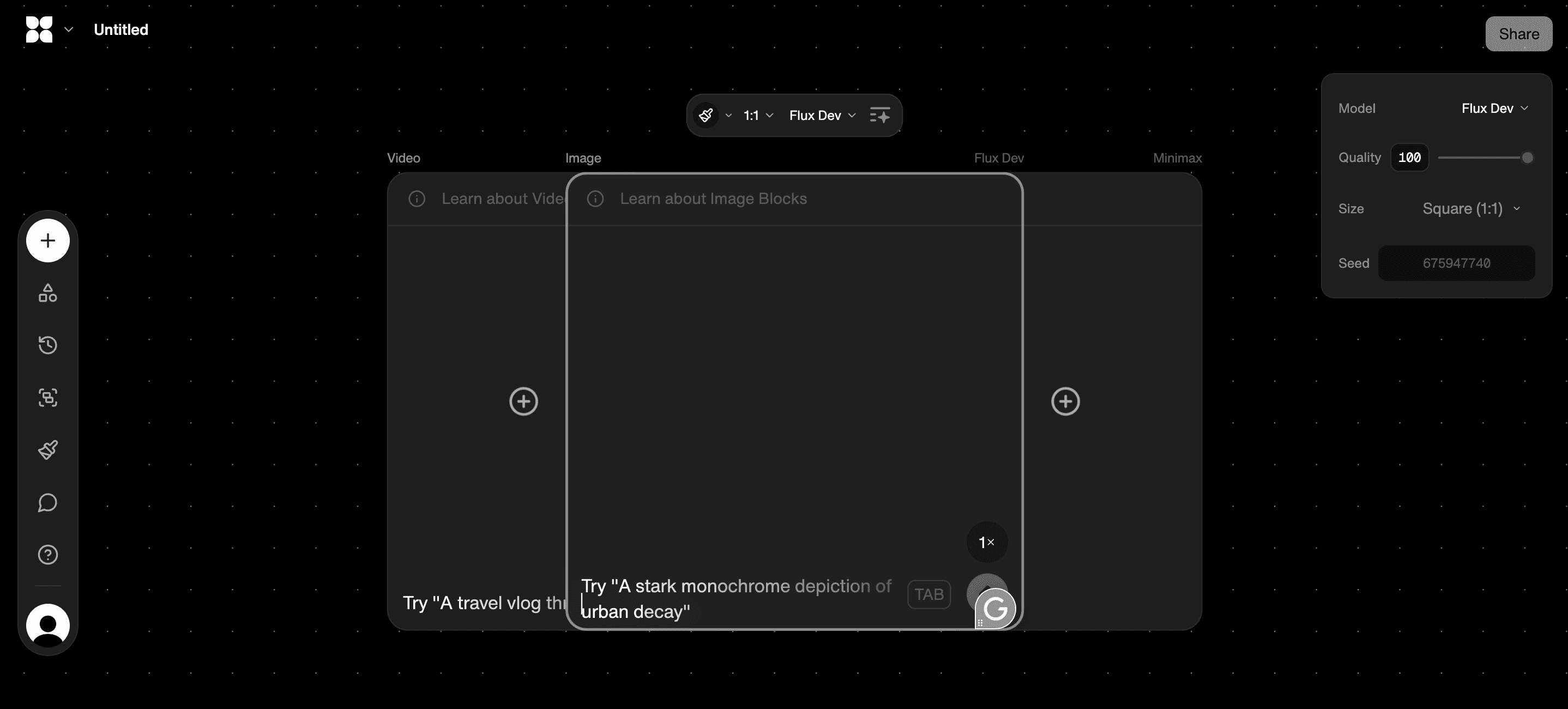
Flora AI is an AI-native creative platform built for teams that need a unified canvas for text, image, and video work. It replaces tab-switching with a node-based visual workspace where you can generate banner concepts from prompts, tweak compositions interactively, and version every iteration so reviews stay tied to the asset.
Best for studios that require production-grade outputs, Flora AI supports real-time collaboration, connects over 50 models for various creative tasks, and allows designers to lock brand rules, ensuring every export remains consistent across campaigns.
Practical Tradeoffs and Tips
Use it when you need hundreds of campaign-specific variants and want review notes attached to exact frames.
Expect a learning curve around node composition, but the time you invest pays back in fewer manual exports and fewer last-minute fixes.
Works well with asset libraries and team libraries, so you never lose approved logos or color palettes.
2. Adobe Spark for YouTube Banners
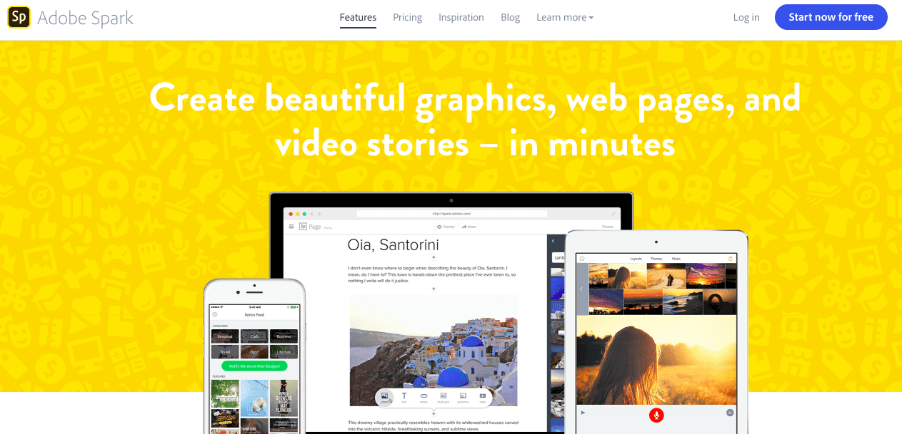
Adobe Spark is the fastest route from idea to a polished banner for non-designers, with curated templates, easy photo search, and straightforward text controls. You can assemble a clean channel header in minutes without needing to learn Photoshop.
Practical Tradeoffs and Tips
Choose Spark when you need speed and a familiar Adobe UI, but avoid it if your project demands complex compositing or fine-grained model-driven generation.
Spark’s template system accelerates prototyping, which helps teams that struggle with traditional design tools achieve a publish-ready outcome quickly.
Exporting variants is a manual process, so plan a simple naming convention and version folder if multiple stakeholders will be reviewing them.
3. Visme Drag-and-Drop YouTube Banner Maker
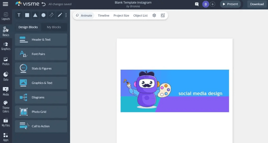
Visme offers a drag-and-drop editor with template-guided workflows and brand color controls, making it easy to produce consistent channel art across campaigns. It is a solid middle ground between pure templates and flexible design systems.
Practical Tradeoffs and Tips
Use Visme to create brand templates that non-designers can reuse without compromising visual consistency.
The drag interface reduces cognitive load for teams unfamiliar with vector tools, but it can become limiting if you need bespoke, layered effects.
Combine Visme templates with a centralized asset store so thumbnail and banner systems stay aligned.
4. Picmaker as the Easiest YouTube Banner Maker
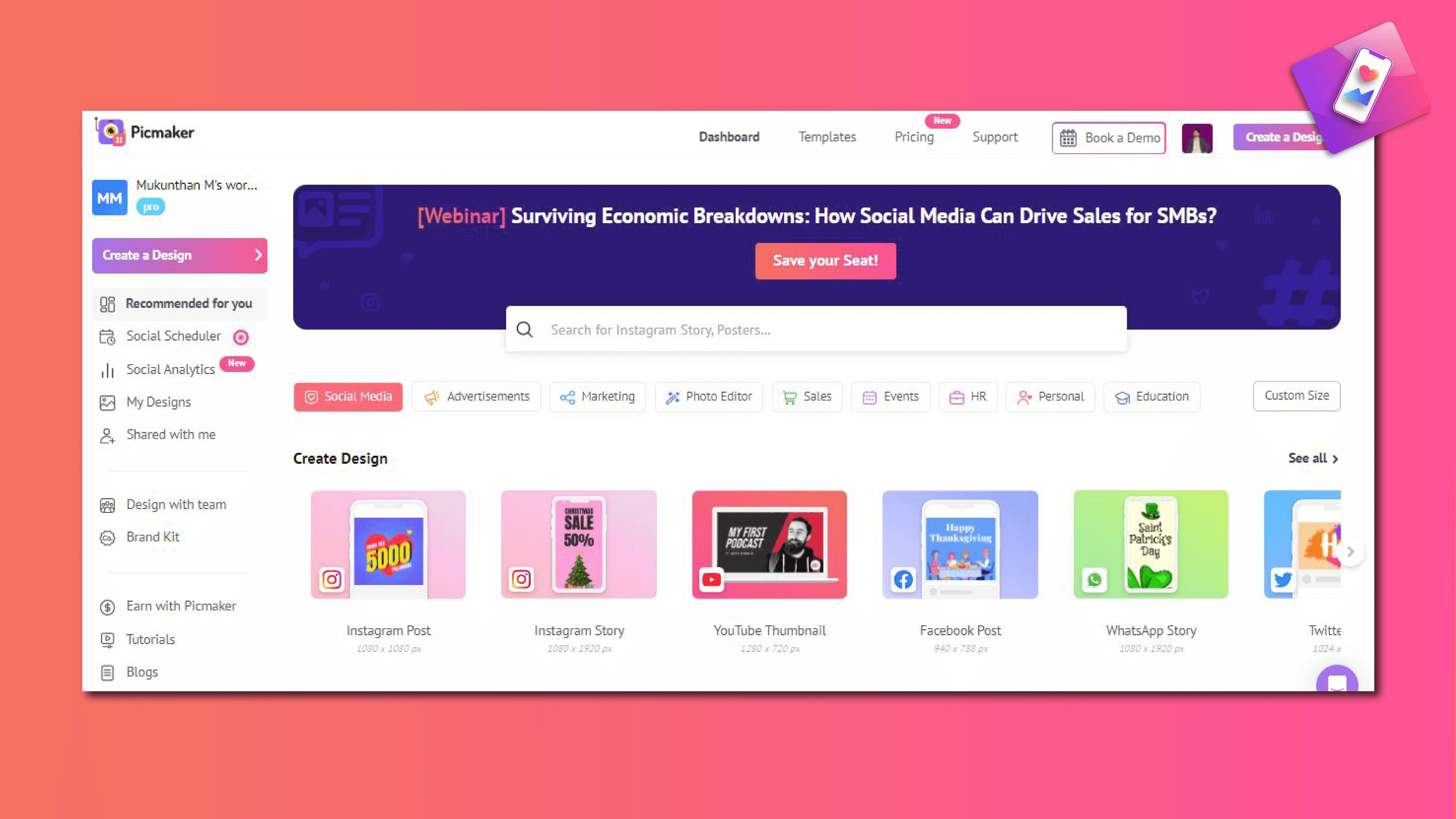
Picmaker markets itself as the simplest, most comprehensive channel art tool, with genre-specific templates, vivid backgrounds, and easy customization. It is made for creators who want quick, attractive results without deep design knowledge.
Practical Tradeoffs and Tips
If your team is intimidated by Photoshop, Picmaker will feel liberating; when we onboarded a small creator group during a two-week sprint, the fastest gains came from template-driven tools that removed decision paralysis.
Picmaker speeds solo creators through iterations, but teams that need strict brand governance should layer an approval step into the workflow.
Treat Picmaker as an ideation and quick-export tool, not the final stop for complex campaigns.
5. VistaCreate Editor Channel Art Maker by Crello
VistaCreate offers over 25,000 templates, featuring simple drag-and-drop customization and clear export options for a variety of formats. It is designed to scale for teams that require multiple variations without requiring the rebuilding of layouts every time.
Practical Tradeoffs and Tips
Use VistaCreate when you need a high template count and predictable outputs across channel themes.
The editor is forgiving for non-designers, but large studios may find its controls shallow for complex compositing.
Create a handful of locked master templates that enforce type and color rules, then let contributors swap imagery freely.
6. BrandCrowd YouTube Banner Creator
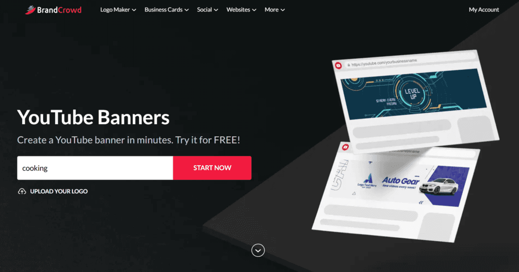
BrandCrowd focuses on template libraries organized by category, offering full customization and easy logo uploads. It gives teams freedom to iterate visually while keeping a consistent starting point.
Practical Tradeoffs and Tips
BrandCrowd works well for identity-first channels that depend on logo prominence and clear category templates.
It is best used as part of a system where designers export polished masters after initial concepting in the tool.
Maintain a single source folder for approved logo files and color codes to prevent accidental brand drift.
The Hidden Cost of Conflicting Notes
Most teams handle design by stitching together templates, manual edits, and email approvals. That familiar approach works well early on, but as channels scale and stakeholders multiply, feedback becomes scattered, version counts increase, and designers spend hours reconciling conflicting notes.
Platforms like Flora AI centralize generation, version control, and threaded comments, compressing review cycles from days to hours while keeping every decision traceable.
Why Pick One Tool Over Another?
If speed and low friction matter, template-first editors win because they reduce choices and accelerate output. When brand consistency and high volume are priorities, a unified canvas that enforces rules and supports batch exports is essential. If your team lacks Photoshop skills, prioritize editors who provide curated templates and clear guardrails so visual quality does not depend on individual expertise.
How Should You Evaluate a Tool Practically?
Look for three capabilities before committing: template governance so brand rules can be locked, version history that ties feedback to specific exports, and integrations that let you move approved assets into your CMS or publishing queue without manual re-naming. Also, observe how a tool handles collaborative edits, as switching between multiple text and image apps is the failure point that teams mention most; it interrupts the flow and multiplies review time.
Signal, Not Painting
A banner is a storefront awning, not a painting; it must signal who you are in a glance and survive messy handoffs. The right tool reduces cognitive friction, allowing decisions to occur where they should, not in a tangled thread of messages.
You think that settles it, but the design decisions that actually shift viewer behavior are quieter and more complicated to spot.
6 Design Tips for an Effective YouTube Channel Banner
1. Align It With Your Branding
Treat the banner as a single distilled signal of tone and promise. Choose one dominant visual token, one typeface family, and a strict color role system, for example: primary (logo), accent (call to action), and background (negative space). This rule set lets every thumbnail and intro reiterate the same promise without repeating the artwork.
Immediate Viewer Friction
This pattern appears across tutorial and lifestyle channels, where a mismatch between the banner's mood and the video tone creates immediate friction for new viewers—so map your voice to visuals before choosing imagery. Remember, YouTube is a high-reach platform, with over 2 billion logged-in users visiting each month, which means your banner must function like a clear sign on a bustling street.
2. Keep It Simple and Clean
Limit the banner to a single, readable proposition. Reduce the number of competing elements to three or fewer:
A logo or face
A short line of promise
A schedule or CTA if you must
Use large type and generous spacing so the eye can easily find the message at a glance. Think of the banner like a handshake through glass, brief but decisive; if that handshake is messy, viewers walk away unsure.
When choices multiply, default to one bold decision and remove everything that does not support it.
3. Use High-Quality Graphics
Select assets that scale effectively without relying on fine detail. Prefer bold shapes, solid fills, and photos shot at wide angles so the subject reads after aggressive cropping. If you use illustrations, export them as vectors or high-resolution PNGs with clean edges and flattened shadows. A practical rule, based on iterative design tests, is to preview the banner in at least three sizes at a proper resolution.
If any detail blurs or disappears, simplify that element rather than increasing resolution. Small studios often assume a bigger file fixes everything, but complexity is the real culprit.
4. Use Contrast Wisely
Set up a clear visual hierarchy with two contrast levers —color and weight —and use them in conjunction. Reserve high color contrast or bold weight for the primary phrase, then use lower contrast and medium weight for secondary copy. For accessibility, aim for a perceptible separation between the headline and background so that the headline remains readable without relying on context.
When typography competes with texture, the texture should be muted or shifted out of the focal plane.
5. Add Your Schedule
Display cadence in the simplest language possible, for example, "New videos: Mon 9PM (ET)" or "Weekly, Tuesdays." Treat the schedule like a structural promise, not marketing copy, and place it where cropping will rarely remove it. If your upload cadence changes, consider using a set phrase rather than trying to mention too many dates at once.
Viewers respond to predictability, and a clear schedule reduces the cognitive load of deciding when to return. Keep the text concise and lock it into your template so it remains visually consistent with later edits.
6. Get Your Audience Involved
Invite viewers into the process with actionable micro-engagements:
A two-option Community poll with visual mockups
A Short Question asking for the favorite color palette
A pinned comment thread where you promise to display the winning design for a month.
Audience Ownership and Plain-Language Feedback
This accomplishes two things: It fosters ownership and it provides plain-language feedback on tone and clarity. This technique also directly connects to brand discovery, as 90% of people report finding new brands or products on YouTube, according to Google. Involving your audience in creative decisions reduces guesswork and helps teams reach consensus more efficiently.
Fragmented Feedback Multiplies Rework
Most teams handle banner reviews through emails and scattered screenshots because it is familiar and low setup, but that approach fragments feedback, buries context, and multiplies rework as stakeholders grow. As reviews stretch from hours to days, designers spend time reconciling contradictory notes rather than improving the work.
Compressing Review Cycles from Days to Hours
Platforms like FLORA provide a unified canvas with templated safe areas, version history, and threaded comments, allowing teams to iterate dozens of production-ready variants while keeping feedback attached to specific frames. This compresses review cycles from days to hours and preserves brand fidelity.
A short test usable in any workflow is a three-frame experiment:
The branded promise
The expressive variant
The schedule-led variant
Release them to a small sample of your community, measure the qualitative votes, and then lock the winning rules into a template that you reuse across campaigns. That single habit reduces iteration waste and makes banner updates intentionally reversible.
Signaling One Clear Promise
The surprising part is not that banners matter; it is how much simpler decisions become when you stop trying to explain everything and start signaling one clear promise. That familiar friction melts away in ways you will not expect when you try the next step.
Try FLORA's AI-native Creative Canvas for Free Today
If you want a single, production-grade canvas that keeps brand kits intact and eliminates the tab-switching that drains creative time, consider FLORA’s AI playground. This node-based workflow combines text, image, and video generation in a single location.
With over 10,000 users and more than 50,000 projects created using FLORA’s Creative Canvas, you can sign up for free and see how centralized versioning and real-time collaboration eliminate the late-night re-exports that slow your channel or studio.


"/><stop offset="1" stop-color="rgba(15, 15, 15, 0)"/></linearGradient></defs><path d="M 899.729 124.429 L 931.177 124.429 L 931.177 108.467 L 946.905 108.467 L 946.905 44.616 L 884.001 44.616 L 884.001 92.504 L 868.274 92.504 L 868.274 124.429 L 852.554 124.429 L 852.554 140.392 L 836.826 140.392 L 836.826 156.355 L 852.554 156.355 L 852.554 172.317 L 836.826 172.317 L 836.826 204.242 L 821.098 204.242 L 821.098 236.168 L 852.554 236.168 L 852.554 252.129 L 758.2 252.129 L 758.2 236.167 L 789.65 236.167 L 789.65 204.241 L 805.378 204.241 L 805.378 172.316 L 821.098 172.316 L 821.098 124.428 L 836.826 124.428 L 836.826 92.504 L 852.554 92.504 L 852.554 44.616 L 836.826 44.616 L 836.826 28.654 L 962.625 28.654 L 962.625 44.616 L 978.353 44.616 L 978.353 60.579 L 994.081 60.579 L 994.081 76.541 L 978.353 76.541 L 978.353 124.429 L 946.905 124.429 L 946.905 140.392 L 931.177 140.392 L 931.177 156.355 L 946.905 156.355 L 946.905 236.168 L 978.417 236.168 L 978.417 220.205 L 994.145 220.205 L 994.145 204.242 L 1009.865 204.242 L 1009.865 188.28 L 1025.593 188.28 L 1025.593 204.242 L 1009.865 204.242 L 1009.865 220.205 L 994.145 220.205 L 994.145 236.168 L 1025.593 236.168 L 1025.593 252.13 L 915.449 252.13 L 915.449 156.355 L 899.729 156.355 Z M 1135.672 172.317 L 1119.944 172.317 L 1119.944 76.541 L 1104.216 76.541 L 1104.216 92.504 L 1088.496 92.504 L 1088.496 108.467 L 1072.768 108.467 L 1072.768 92.504 L 1088.496 92.504 L 1088.496 76.541 L 1104.216 76.541 L 1104.216 60.579 L 1119.944 60.579 L 1119.944 28.654 L 1135.672 28.654 L 1135.672 60.579 L 1151.392 60.579 L 1151.392 236.168 L 1167.12 236.168 L 1167.12 252.13 L 1104.216 252.13 L 1104.216 236.168 L 1119.944 236.168 L 1119.944 188.28 L 1135.672 188.28 Z M 1072.768 124.429 L 1072.768 140.392 L 1057.041 140.392 L 1057.041 156.355 L 1041.321 156.355 L 1041.321 172.317 L 1025.593 172.317 L 1025.593 156.355 L 1041.321 156.355 L 1041.321 140.392 L 1057.041 140.392 L 1057.041 124.429 Z M 176.61 25.988 C 124.406 25.988 78.864 38.954 68.867 80.108 C 64.424 102.095 70.533 130.282 105.522 145.504 C 107.678 146.379 109.332 146.83 110.516 147.152 C 112.382 147.661 113.082 147.852 112.742 148.886 C 112.186 150.577 106.633 150.014 102.19 148.323 C 69.424 136.484 51.65 107.168 54.983 77.289 C 60.536 35.572 109.966 -1.636 179.387 0.056 C 202.713 0.056 238.812 5.692 273.246 15.276 C 293.795 20.914 321.009 28.243 346.555 34.444 C 369.881 24.86 392.096 18.659 411.534 18.659 C 425.628 18.659 438.846 21.919 444.414 28.654 L 537.86 28.654 L 537.86 44.616 L 506.41 44.616 L 506.41 60.579 L 490.685 60.579 L 490.685 92.504 L 474.959 92.504 L 474.959 124.429 L 459.233 124.429 L 459.233 172.317 L 443.508 172.317 L 443.508 220.205 L 427.783 220.205 L 427.783 236.168 L 522.135 236.168 L 522.135 220.205 L 537.86 220.205 L 537.86 204.242 L 553.586 204.242 L 553.586 172.317 L 569.311 172.317 L 569.311 204.242 L 553.586 204.242 L 553.586 236.168 L 537.86 236.168 L 537.86 252.13 L 364.881 252.13 L 364.881 236.168 L 396.332 236.168 L 396.332 220.205 L 412.058 220.205 L 412.058 172.317 L 427.783 172.317 L 427.783 140.392 L 443.508 140.392 L 443.508 92.504 L 459.234 92.504 L 459.234 44.616 L 444.157 44.616 C 437.338 52.415 419.206 55.303 394.318 55.303 C 379.323 55.303 357.108 53.048 349.333 51.92 C 337.67 63.196 325.452 77.853 314.9 90.82 C 305.307 102.032 297.996 111.856 290.818 121.501 C 284.281 130.284 277.855 138.919 269.914 148.323 C 283.798 148.886 298.794 147.759 309.901 143.812 C 320.454 129.155 333.783 122.39 342.669 124.645 C 351.554 126.9 350.444 135.92 337.67 145.504 C 335.4 147.26 333.256 148.887 331.193 150.453 C 322.659 156.932 315.515 162.356 306.569 171.436 C 304.66 173.374 302.994 175.312 301.571 176.968 C 299.269 179.646 297.602 181.584 296.572 181.584 C 293.24 182.148 294.351 172 296.572 166.363 C 299.349 159.597 302.126 154.524 304.903 150.577 C 295.462 153.396 284.91 154.524 266.026 154.524 C 264.938 155.812 263.791 157.222 262.545 158.751 C 259.978 161.904 256.993 165.569 253.253 169.745 C 204.381 225.557 123.85 256 71.645 256 C 29.993 256 0 239.087 0 212.591 C 0 193.987 12.774 175.947 34.99 175.947 C 53.317 175.947 61.092 188.349 60.537 200.188 C 59.981 208.644 57.204 213.718 51.651 219.92 C 47.763 224.429 44.431 228.376 44.431 234.013 C 44.431 243.597 52.762 249.798 68.867 250.362 C 111.631 253.181 142.177 234.013 176.61 195.678 C 190.494 180.456 200.491 168.054 210.488 153.96 C 198.27 153.96 186.607 153.96 179.943 154.524 C 172.902 154.799 168.37 155.744 165.639 156.313 C 162.768 156.912 161.886 157.096 162.17 155.652 C 162.726 153.396 167.724 149.45 184.385 148.323 C 188.537 147.94 196.791 148.077 204.443 148.204 C 208.052 148.264 211.528 148.323 214.375 148.323 C 222.151 137.611 231.037 125.772 242.7 113.37 C 264.915 89.128 294.35 65.451 323.23 47.411 C 307.124 45.719 281.021 40.645 263.804 37.263 C 239.923 32.753 203.268 25.988 177.166 25.988 L 176.61 25.988 Z M 365.438 39.518 C 386.542 45.156 403.204 46.847 413.2 46.847 C 427.64 46.847 440.969 42.336 441.524 36.136 C 442.08 29.37 428.751 24.296 410.979 24.296 L 410.423 24.296 C 394.317 24.296 375.435 32.753 365.438 39.518 Z M 711.023 252.129 L 616.672 252.129 L 616.672 236.167 L 600.946 236.167 L 600.946 220.204 L 585.221 220.204 L 585.221 108.466 L 600.946 108.466 L 600.946 76.54 L 616.672 76.54 L 616.672 60.578 L 632.396 60.578 L 632.396 44.616 L 663.847 44.616 L 663.847 28.654 L 758.2 28.654 L 758.2 44.616 L 773.924 44.616 L 773.924 60.579 L 789.65 60.579 L 789.65 172.317 L 773.924 172.317 L 773.924 188.28 L 758.2 188.28 L 758.2 220.205 L 742.474 220.205 L 742.474 236.168 L 711.023 236.168 Z M 663.847 44.616 L 663.847 60.579 L 648.122 60.579 L 648.122 76.541 L 632.396 76.541 L 632.396 108.467 L 616.672 108.467 L 616.672 220.205 L 632.396 220.205 L 632.396 236.168 L 695.298 236.168 L 695.298 220.205 L 711.023 220.205 L 711.023 204.242 L 726.749 204.242 L 726.749 188.28 L 742.474 188.28 L 742.474 156.355 L 758.2 156.355 L 758.2 60.579 L 742.474 60.579 L 742.474 44.616 Z" fill="url(%23k7ftP17bN-2050371890-linear-gradient)" height="255.9995555606772px" id="k7ftP17bN" width="1167.1199228535695px"/></svg>)