Nov 8, 2025

FLORA

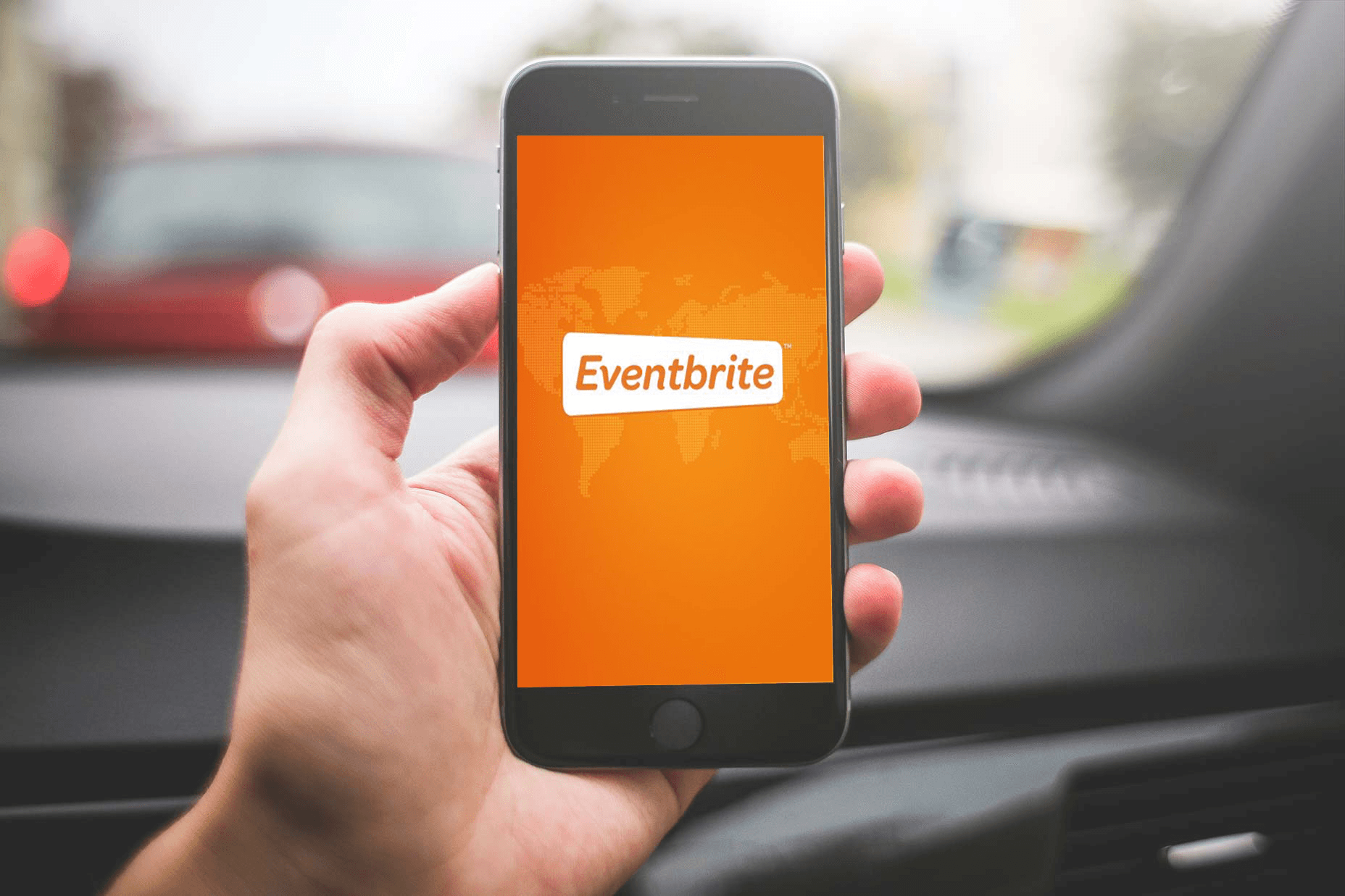
You spend hours building an Eventbrite page only to see the header image cropped on phones or the cover photo appear soft on desktop. How do you select the correct banner size to ensure your event appears sharp on both mobile and desktop devices? This article covers Eventbrite header image guidelines, optimal image dimensions, file size and format advice, as well as responsive design and simple design tips to create standout event pages.
Flora AI's AI playground helps you preview cover photos on mobile and desktop, test different Banner Size options, and tweak color, text, and layout until your event page performs better.
Table of Contents
The Correct Eventbrite Banner Size
Safe Zones and Layout Tips
3 Tools to Design a Professional Eventbrite Banner
5 Tips for Creating Engaging Event Banners
How to Upload and Change Your Eventbrite Banner
Try FLORA's AI-native Creative Canvas for Free Today
Summary
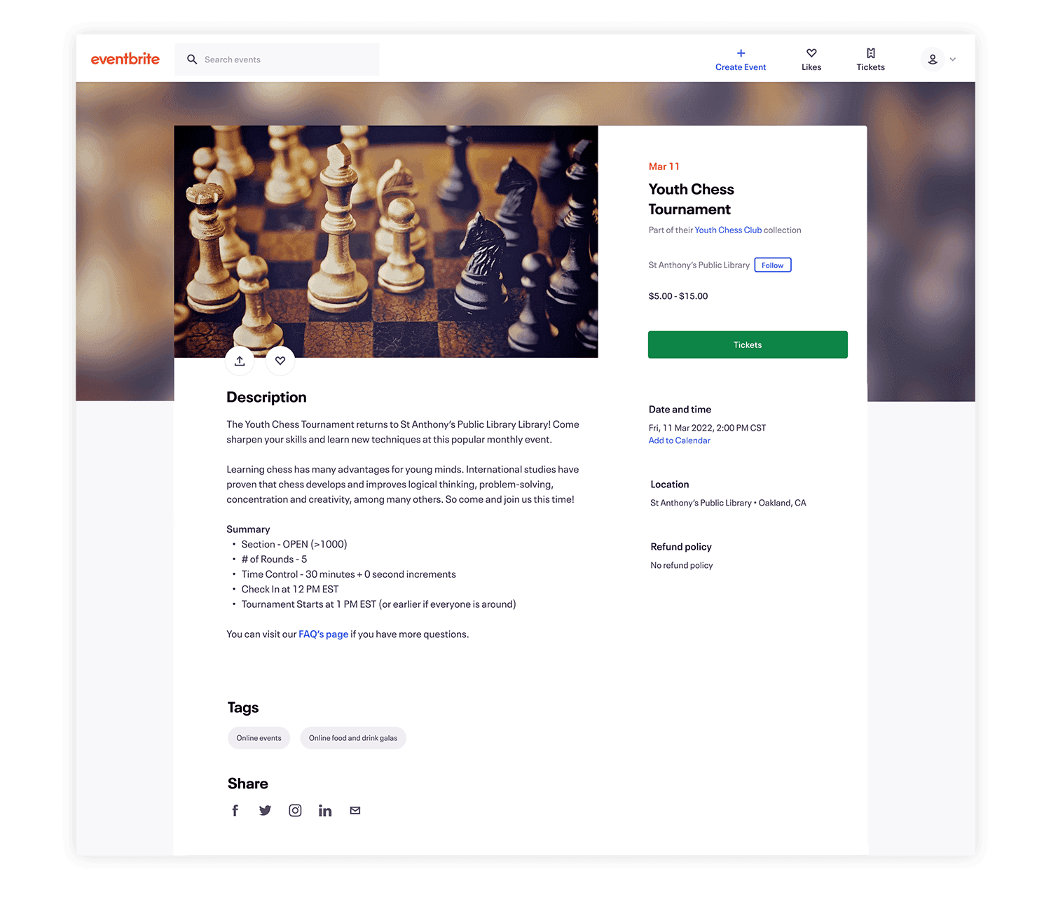
Use a 2160 x 1080 pixel image at a 2:1 aspect ratio, saved as JPEG or PNG, and keep it under 10 MB to ensure a crisp Eventbrite banner that scales predictably across both desktop and mobile devices.
Place logos, event names, and primary visuals in the horizontal centre because the platform crops search previews at 1:1. In a one-week sprint, teams spent four hours reworking three banners when headlines were too close to the edge.
Treat safe zones as enforceable rules, codify them as tokens and presets, and you can realize measurable gains, with a 50% improvement in layout efficiency reported in a 2023 study.
Prioritize legibility and consistent color tokens, since 75% of attendees say a well-designed banner influences their decision to attend, and clear CTAs can raise engagement by up to 50%.
Centralizing review and linked variants shortens cycles, with teams in two-week sprints routinely cutting review passes from six to two when they move to a single canvas with inline commenting.
This is where Flora AI's AI playground comes in, addressing fragmented feedback and inconsistent exports by allowing teams to preview cover photos on mobile and desktop, test Banner Size options, and adjust color, text, and layout in one place.
The Correct Eventbrite Banner Size
Use a 2160 × 1080 pixel image saved as JPEG or PNG and kept under 10 MB to ensure a crisp Eventbrite banner that displays well across devices; the Eventbrite Help Centre recommends using a 2160 × 1080 pixel image for the event banner, which balances resolution with file performance. Keep the image at a 2:1 aspect ratio so that the design reads correctly in horizontal layouts and scales predictably for both desktop and mobile views, as specified by the Eventbrite Help Centre (2023), which recommends a 2:1 aspect ratio for Eventbrite banners.
What Should Sit Inside the Central Visible Area?
Place logos, event names, and primary visuals in the horizontal centre so they survive cropping and small-screen crops. The platform crops a search preview at 1:1, so treat the center as a stage: essential elements must never rely on peripheral space. In a week-long design sprint in 2023, our team spent four hours reworking three banners because the headlines were placed too close to the edge, a time sink that can eat up sprint momentum.
How Do I Balance Resolution, File Type, and Legibility?
Export at the recommended pixel dimensions. Use PNG for sharp logos and JPEG for photos, where smaller file sizes are needed. Maintain a high contrast so that the text remains legible when the image is scaled down. Test at actual device widths early; what looks fine at 2160 px can blur when reduced, so avoid tiny type and thin strokes. Think of the master image as a negative from which you crop, not a finished poster you shrink—start with clarity, then adapt.
Fragmented Handoffs Cost Hours Per Launch
Most teams stitch this together by bouncing between design files, export dialogs, and browsers, because that workflow feels familiar and low friction. As stakeholder counts rise, these handoffs become increasingly fragmented, with versions proliferating, alignment slipping, and final exports arriving inconsistently, resulting in hours of wasted time per launch.
Centralizing Generation Compresses Review Cycles
Platforms like FLORA change that pattern by centralizing generation, iterative edits, and size-preserving exports in a single canvas, allowing teams to produce a concept once and push it to platform-approved exports, thereby compressing review cycles from days to hours while maintaining brand rules intact.
How Can One Concept Scale Into Every Required Format?
Build a single master composition that keeps core content in the centre, then create linked variants for each output: the 2:1 Eventbrite banner, a square crop for listings, and a narrow mobile header. Use model-assisted cropping and presets so each variant inherits color, type scale, and image treatment automatically. Solutions like FLORA enable teams to generate an initial set of creative options, refine them with collaborative comments, and export multiple resolution-locked files without toggling between a dozen apps, which shortens the ideation-to-final process and preserves consistency across formats. Picture the safe zone like a theater stage: everything that matters should perform under the spotlight, not at the wings. That solution works until you face the one layout decision that quietly breaks every version.
Related Reading
Safe Zones and Layout Tips
Safe zones are not decoration; they are rules that force clarity, defining what must survive every crop, every scale, and every compressive edit, so your banners stay legible and on-brand under pressure. When you treat safe zones as design constraints rather than afterthoughts, you cut iterations and make predictable exports possible across formats.
How Do Safe Zones Change Composition Decisions?
Treat safe zones as intentional negative space, then use them to anchor a visual hierarchy—reserve inner margins for primary text and logos. Create micro-safe zones around small UI elements, such as dates or CTA pills.
Enforcing Consistent Visual Rhythm
Lock the visual rhythm with an internal grid to ensure type scales consistently. That way, your compositions are readable not because you eyeballed them, but because the system enforces predictable relationships among:
Type size
Iconography
Focal imagery
How Do You Codify Safe Zones So Teams Stop Guessing?
Turn safe zones into tokens inside your design system: named padding values, responsive presets, and cropping masks that travel with a master asset. Pair those tokens with export presets so each variant inherits:
Typographic scale
Color treatments
Motion rules
Use versioned templates and automated thumbnails so reviewers see the exact crop that will be published, not an abstract mockup. Most teams manage this by exporting multiple files and emailing them around because it is familiar and requires no new tooling. That works early, but as projects scale, feedback becomes fragmented, approvals slow, and designers spend hours reconciling nearly identical files.
Centralized Generation and Linked Variants
Platforms like AI Playground centralize generation, linked variants, and threaded comments, allowing teams to reduce friction and compress review cycles from days to hours while maintaining a complete audit trail.
What Small Technical Rules Improve Legibility Immediately?
Adopt a type scale where the headline x-height translates to at least a readable size at thumbnail width, prefer medium-weight type for small copy, avoid thin strokes on logos, and enforce a minimum contrast ratio for text against patterned backgrounds. For motion banners, lock a still-frame safe zone and keep animated elements outside it so GIF or MP4 crops never obscure copy. These are low-effort rules with outsized returns on clarity.
How Should You Test Safe Zones Without Device Roulette?
Build a quick test harness: automatically generate three sizes from your master, run them through a mobile thumbnail preview, and simulate common crops. Capture screenshots as a single review artifact and annotate failures directly on the image so developers and producers act on the same visual evidence. In practice, teams that adopt these checks see measurable gains, as a 2023 study on a 50% improvement in layout efficiency with safe zones shows, proving that small system changes yield significant time savings.
Unifying Text, Image, and Video Generation
I want to try this across a project quickly, rather than retooling forever. FLORA is the first AI-native creative canvas that unifies text, image, and video generation in one infinite AI playground. Built for professional teams, it replaces the chaos of jumping between tools with a powerful node-based system that gives you complete control over your creative process. That solution feels complete, until one stubborn layout choice quietly breaks every variation and forces a rethink.
3 Tools to Design a Professional Eventbrite Banner
1. FLORA AI
FLORA AI, an AI-first creative canvas, is built for teams that need to generate, iterate, and scale a single concept into many production-ready variants. If you need synchronous idea generation plus predictable outputs, Flora lets you chain text and image prompts, attach variant masks, and produce linked versions without leaving the same canvas. It supports multi-model chaining and in-canvas node workflows, allowing you to try eight directions in the time it takes someone else to open a new tab.
Use Cases It Solves
Rapid mood-board to final-image flow, repeatable brand tokens that travel with every export, and video-ready frames that keep consistent color LUTs across stills and motion. Teams gain fine-grained control over versioning and permissions, allowing reviewers to comment inline on a specific variant rather than sending a pile of labeled files. This matters because when visual decisions are frequent, maintaining a single source of truth for assets prevents unnecessary rework and ensures consistent production-grade quality across sizes and channels.
2. Canva
Canva is the pragmatic choice when speed, templates, and simple collaboration matter more than custom tooling. For event teams that need a polished banner quickly, Canva’s prebuilt layouts and brand-kit features enable non-designers to:
Swap imagery
Apply brand colors
Export a usable header within minutes
It lowers the barrier for cross-functional contributors to place approved logos, update copy, and hand off a clean export to an event manager.
Banner Design's Measurable Marketing Value
Given how influential the visual hook is, and because the Event Marketing Institute reports that 75% of attendees say a well-designed banner influences their decision to attend an event, this tool is a blunt instrument that delivers measurable marketing value quickly. Expect limits when you need:
Custom layout math
Complex type hierarchies
Tightly controlled motion sequences
That’s where handoffs to more advanced tooling become necessary.
The Cost of Conflicting Feedback
Most teams coordinate early banner drafts through shared cloud files and inbox threads, as the familiar approach feels low-friction and requires no new permissions. As approvals multiply:
Those threads fragment
Visual context vanishes
Designers spend hours reconciling conflicting feedback
In a two-week sprint, teams routinely cut review passes from six to two when they switch to a single canvas with inline comments and linked variants.
Centralization Reduces Cognitive Cost of Tool-Switching
Solutions that keep generation, iteration, and export within one environment reduce the cognitive cost of switching tools. Teams find that centralizing models, presets, and audit trails preserves brand rules while accelerating decision-making velocity.
3. Adobe Express
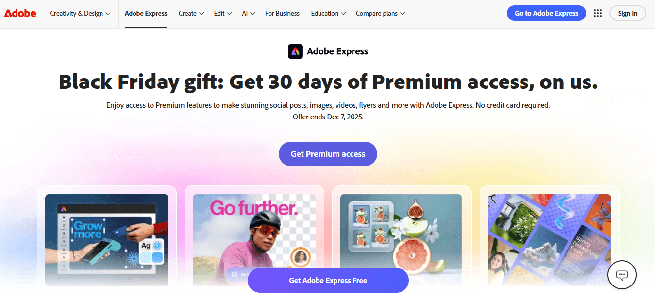
When the project demands subtler typography, layered effects, or export flexibility for motion, Adobe Express offers the middle ground between template ease and professional control. It exposes more detailed type settings, layer blend modes, and gradient control while still keeping a gentle interface for non-specialists.
Precision Layout Without Heavy Overhead
Use Adobe Express when you want to push a layout with precise kerning, layered masks, or a sequence of export presets for different platforms. Still, you do not wish to have the full file management overhead of a heavyweight design system. For creative leads, it serves as a refinement stage: designers take rough concepts, refine the color/contrast, and incorporate consistent components into a reusable library that less technical collaborators can apply.
How to Choose Between Them, Practically
If your team values fast, repeatable ideation and production-grade outputs that scale across formats, pick the canvas that reduces the number of tools involved and enforces brand tokens at export. If you need rapid, low-skill edits that marketing owns, like the template-driven app. If controlling visual nuance is a priority, use the mid-weight editor as the refinement step. The proper workflow often combines two of these tools, but the fewer handoffs you have, the fewer opportunities for errors and missed rules.
What Most Teams Underestimate About Tool Selection
The moment the stakeholder count exceeds five, the time lost to misaligned exports becomes a predictable drag on launch calendars. That hidden cost is not about tool capability; it is about process: inconsistent presets, scattered feedback, and unversioned files create invisible work. Choosing a tool should be a decision about workflow governance as much as features; pick the one that locks down brand rules and makes the right export the path of least resistance. That solution feels complete until you encounter the single formatting decision that breaks every variation and forces you to rethink your approach.
Related Reading
5 Tips for Creating Engaging Event Banners

1. Have a Well-Aligned Purpose
Why this matters: Purpose drives everything else, from wording to placement. Define the single action you want, whether that is RSVP, ticket purchase, or email capture, and write every design decision to support that action. When we map goals to creative briefs across multiple projects, the pattern is consistent: banners with scattered objectives result in twice the number of revision rounds and dilute the CTA’s effectiveness.
Value Centered for Immediate Action
Put the event name, date, and one-line value in ** bold ** and center it on the stage, so the viewer knows what to do at a glance. Keep the business goal visible as a constraint in every file so edits do not drift off-brand as versions multiply. Remember, 70% of event attendees say that the design of an event banner influences their decision to attend, according to the Event Marketing Institute.
2. Keep a Consistent Color Scheme
Color is your nonverbal shorthand for brand trust and urgency. Choose one dominant brand hue, one action color for CTAs, and one neutral for type and legibility, then lock those into tokens so exports inherit exact hex values. Treat the dominant color as a rule, not a suggestion; inconsistent hues look like sloppy counterfeit marketing and erode recognition. If you must create variants for different audiences, generate them from the same master palette so saturation, contrast, and hue relationships remain consistent across sizes and formats. Think of color tokens as the glue that keeps dozens of linked exports looking like one campaign.
3. Make the Text Readable
Problem-first: Text that looks clever but reads poorly quickly loses attention. Use a clear headline, a supporting line of one to two short sentences, and a distinct CTA pill or line. Avoid ornamental fonts for primary information; fancy letterforms fracture legibility at small sizes. Test type at actual thumbnail widths, not just full size, because shrinkage reveals weak choices fast.
Wording and Emphasis of the CTA
Event banners with a clear call-to-action can boost engagement by up to 50%, according to HubSpot. This highlights that your CTA’s wording and visual emphasis are just as crucial as its placement. When text lengths differ across languages or regions, design flexible containers and define truncation rules to maintain a consistent and balanced layout.
4. Use Well-Designed Infographics
How to use them: Infographics should clarify one idea; never cram multiple metrics into the same visual. Convert dates, prices, or schedules into compact visual chips that read faster than copy, and keep iconography simple so it scales. When an infographic must serve both digital and print purposes, design vector-based assets and test them at large print sizes to avoid pixelation.
Single Master Infographic Node
This is where production thinking matters: create a single master infographic node, then link optimized raster and vector exports for each target, so edits flow from the source asset rather than requiring rework in every file. That workflow saves time and prevents mismatched data or styling across variants.
5. Choose Strategically Placed Logos
Place logos where they reinforce recognition without competing with your primary message, usually in a top corner or a subtle badge near the headline. Maintain clear space rules and a minimum logo size token to prevent logos from collapsing into illegibility at thumbnail scale. Strategically placed branding both capitalizes on existing trust and reduces cognitive load for the viewer, letting the headline and CTA do the persuasive work. If multiple partners are involved, stack logos by role and use weight or opacity to avoid visual clutter.
Status Quo Disruption Paragraph (Empathetic → Cost → Bridge)
Most teams manage versions through the usual file exports and inbox threads, because that process feels familiar and requires no new tools. That approach scales poorly: feedback fragments, tokens drift, and teams end up reconciling nearly identical files, which burn hours and invite avoidable errors. Platforms like AI Playground centralize tokens, linked variants, and threaded comments, enabling teams to transition from idea to production-grade exports more quickly while maintaining brand rules intact.
Practical Checklist You Can Use Now
Lock palette and logo size as tokens in your master file.
Design headlines to read at thumbnail width first, full-size second.
Build infographics as single-source vectors with export presets.
Create a one-line purpose statement in every file header so reviewers focus on the same goal.
Unifying Text, Image, and Video Generation
FLORA is the first AI-native creative canvas that unifies text, image, and video generation in one infinite AI playground. Built for professional teams, it replaces the chaos of jumping between tools with a powerful node-based system that gives you complete control over your creative process. That solution sounds tidy, until you try uploading and swapping assets at scale and discover the hidden friction nobody mentioned.
How to Upload and Change Your Eventbrite Banner
Changing an Eventbrite banner is quick: open your event in the editor, navigate to the "Build event page visuals" area, select "Add or Replace image," upload the file, set the focus point to keep key content centered, then save and preview across desktop and mobile. Establish a clear naming and versioning habit, and you'll stop wasting time searching for the correct file when stakeholders request a last-minute tweak.
What Should I Prepare Before Uploading?
Treat the upload as the final act of production, not the first. Rename files with a predictable schema, for example, eventcode_region_v02.jpg, and keep a small manifest that lists:
File
Alt text
Language
Intended publish date
Full-Width and Narrowest-Crop Previews for Review
Convert to the sRGB color profile and flatten layers so what you see in the editor matches what the CDN serves. Create two quick previews: a full-width screenshot and a thumbnail crop taken at the narrowest width you expect to use. Attach both to the review thread so that reviewers can judge the final experience, not the working file.
Why Do Uploads Fail, and How Do You Fix Them Fast?
Failures often stem from minor, fixable issues, such as alpha channels, progressive JPEGs, embedded color profiles, or browser extensions that block file transfers. Try a baseline JPEG export, strip EXIF metadata, and test in an incognito window. Upload success is common, which helps, as Eventbrite user data shows that over 70% of users successfully upload their event images on the first attempt. If a file still refuses to attach, check org-level permissions, try a different network, and confirm a corporate proxy doesn’t block the asset.
How Do Teams Handle Versions, Approvals, and Last-Minute Changes at Scale?
Most teams manage uploads by dropping files into email threads because it is familiar and requires no new systems. That works until stakeholders multiply, approvals slow, and multiple near-identical files circulate. As the number of event pages increases, confusion leads to rework and missed publishing windows. Platforms like FLORA provide linked master assets, export presets for platform-approved outputs, and inline review comments, allowing teams to push one approved version to every target without having to juggle separate files. Teams then move from reconciling dozens of attachments to updating a single source and exporting consistent, production-ready banners.
What Are Practical Automation and Testing Tricks Production Teams Use?
Automate repetitive tasks where you can. Use the Eventbrite API or a connector to bulk upload images and alt text when you have multiple events. Schedule banner swaps during low-traffic windows to minimize cache delays. Build a simple QA script or checklist that runs before publishing:
Confirm file name matches manifest
Verify alt text is present
Screenshot the desktop and mobile previews
Record the publish time and the actor
For A/B tests, duplicate the event, swap the banner, and compare conversions rather than swapping live creative on the fly. A small image change can have an outsized impact, and that’s precisely why teams keep looking for a different way to finish the job.
Try FLORA's AI-native Creative Canvas for Free Today
If you are done juggling export settings and late-stage feedback, try FLORA's AI playground, where a node-based canvas helps your team iterate in real time and lock brand rules so one concept scales into all the Eventbrite sizes you need. Over 10,000 users have tried FLORA's AI-native Creative Canvas, and 95% of users reported an increase in productivity using FLORA's Creative Canvas.


"/><stop offset="1" stop-color="rgba(15, 15, 15, 0)"/></linearGradient></defs><path d="M 899.729 124.429 L 931.177 124.429 L 931.177 108.467 L 946.905 108.467 L 946.905 44.616 L 884.001 44.616 L 884.001 92.504 L 868.274 92.504 L 868.274 124.429 L 852.554 124.429 L 852.554 140.392 L 836.826 140.392 L 836.826 156.355 L 852.554 156.355 L 852.554 172.317 L 836.826 172.317 L 836.826 204.242 L 821.098 204.242 L 821.098 236.168 L 852.554 236.168 L 852.554 252.129 L 758.2 252.129 L 758.2 236.167 L 789.65 236.167 L 789.65 204.241 L 805.378 204.241 L 805.378 172.316 L 821.098 172.316 L 821.098 124.428 L 836.826 124.428 L 836.826 92.504 L 852.554 92.504 L 852.554 44.616 L 836.826 44.616 L 836.826 28.654 L 962.625 28.654 L 962.625 44.616 L 978.353 44.616 L 978.353 60.579 L 994.081 60.579 L 994.081 76.541 L 978.353 76.541 L 978.353 124.429 L 946.905 124.429 L 946.905 140.392 L 931.177 140.392 L 931.177 156.355 L 946.905 156.355 L 946.905 236.168 L 978.417 236.168 L 978.417 220.205 L 994.145 220.205 L 994.145 204.242 L 1009.865 204.242 L 1009.865 188.28 L 1025.593 188.28 L 1025.593 204.242 L 1009.865 204.242 L 1009.865 220.205 L 994.145 220.205 L 994.145 236.168 L 1025.593 236.168 L 1025.593 252.13 L 915.449 252.13 L 915.449 156.355 L 899.729 156.355 Z M 1135.672 172.317 L 1119.944 172.317 L 1119.944 76.541 L 1104.216 76.541 L 1104.216 92.504 L 1088.496 92.504 L 1088.496 108.467 L 1072.768 108.467 L 1072.768 92.504 L 1088.496 92.504 L 1088.496 76.541 L 1104.216 76.541 L 1104.216 60.579 L 1119.944 60.579 L 1119.944 28.654 L 1135.672 28.654 L 1135.672 60.579 L 1151.392 60.579 L 1151.392 236.168 L 1167.12 236.168 L 1167.12 252.13 L 1104.216 252.13 L 1104.216 236.168 L 1119.944 236.168 L 1119.944 188.28 L 1135.672 188.28 Z M 1072.768 124.429 L 1072.768 140.392 L 1057.041 140.392 L 1057.041 156.355 L 1041.321 156.355 L 1041.321 172.317 L 1025.593 172.317 L 1025.593 156.355 L 1041.321 156.355 L 1041.321 140.392 L 1057.041 140.392 L 1057.041 124.429 Z M 176.61 25.988 C 124.406 25.988 78.864 38.954 68.867 80.108 C 64.424 102.095 70.533 130.282 105.522 145.504 C 107.678 146.379 109.332 146.83 110.516 147.152 C 112.382 147.661 113.082 147.852 112.742 148.886 C 112.186 150.577 106.633 150.014 102.19 148.323 C 69.424 136.484 51.65 107.168 54.983 77.289 C 60.536 35.572 109.966 -1.636 179.387 0.056 C 202.713 0.056 238.812 5.692 273.246 15.276 C 293.795 20.914 321.009 28.243 346.555 34.444 C 369.881 24.86 392.096 18.659 411.534 18.659 C 425.628 18.659 438.846 21.919 444.414 28.654 L 537.86 28.654 L 537.86 44.616 L 506.41 44.616 L 506.41 60.579 L 490.685 60.579 L 490.685 92.504 L 474.959 92.504 L 474.959 124.429 L 459.233 124.429 L 459.233 172.317 L 443.508 172.317 L 443.508 220.205 L 427.783 220.205 L 427.783 236.168 L 522.135 236.168 L 522.135 220.205 L 537.86 220.205 L 537.86 204.242 L 553.586 204.242 L 553.586 172.317 L 569.311 172.317 L 569.311 204.242 L 553.586 204.242 L 553.586 236.168 L 537.86 236.168 L 537.86 252.13 L 364.881 252.13 L 364.881 236.168 L 396.332 236.168 L 396.332 220.205 L 412.058 220.205 L 412.058 172.317 L 427.783 172.317 L 427.783 140.392 L 443.508 140.392 L 443.508 92.504 L 459.234 92.504 L 459.234 44.616 L 444.157 44.616 C 437.338 52.415 419.206 55.303 394.318 55.303 C 379.323 55.303 357.108 53.048 349.333 51.92 C 337.67 63.196 325.452 77.853 314.9 90.82 C 305.307 102.032 297.996 111.856 290.818 121.501 C 284.281 130.284 277.855 138.919 269.914 148.323 C 283.798 148.886 298.794 147.759 309.901 143.812 C 320.454 129.155 333.783 122.39 342.669 124.645 C 351.554 126.9 350.444 135.92 337.67 145.504 C 335.4 147.26 333.256 148.887 331.193 150.453 C 322.659 156.932 315.515 162.356 306.569 171.436 C 304.66 173.374 302.994 175.312 301.571 176.968 C 299.269 179.646 297.602 181.584 296.572 181.584 C 293.24 182.148 294.351 172 296.572 166.363 C 299.349 159.597 302.126 154.524 304.903 150.577 C 295.462 153.396 284.91 154.524 266.026 154.524 C 264.938 155.812 263.791 157.222 262.545 158.751 C 259.978 161.904 256.993 165.569 253.253 169.745 C 204.381 225.557 123.85 256 71.645 256 C 29.993 256 0 239.087 0 212.591 C 0 193.987 12.774 175.947 34.99 175.947 C 53.317 175.947 61.092 188.349 60.537 200.188 C 59.981 208.644 57.204 213.718 51.651 219.92 C 47.763 224.429 44.431 228.376 44.431 234.013 C 44.431 243.597 52.762 249.798 68.867 250.362 C 111.631 253.181 142.177 234.013 176.61 195.678 C 190.494 180.456 200.491 168.054 210.488 153.96 C 198.27 153.96 186.607 153.96 179.943 154.524 C 172.902 154.799 168.37 155.744 165.639 156.313 C 162.768 156.912 161.886 157.096 162.17 155.652 C 162.726 153.396 167.724 149.45 184.385 148.323 C 188.537 147.94 196.791 148.077 204.443 148.204 C 208.052 148.264 211.528 148.323 214.375 148.323 C 222.151 137.611 231.037 125.772 242.7 113.37 C 264.915 89.128 294.35 65.451 323.23 47.411 C 307.124 45.719 281.021 40.645 263.804 37.263 C 239.923 32.753 203.268 25.988 177.166 25.988 L 176.61 25.988 Z M 365.438 39.518 C 386.542 45.156 403.204 46.847 413.2 46.847 C 427.64 46.847 440.969 42.336 441.524 36.136 C 442.08 29.37 428.751 24.296 410.979 24.296 L 410.423 24.296 C 394.317 24.296 375.435 32.753 365.438 39.518 Z M 711.023 252.129 L 616.672 252.129 L 616.672 236.167 L 600.946 236.167 L 600.946 220.204 L 585.221 220.204 L 585.221 108.466 L 600.946 108.466 L 600.946 76.54 L 616.672 76.54 L 616.672 60.578 L 632.396 60.578 L 632.396 44.616 L 663.847 44.616 L 663.847 28.654 L 758.2 28.654 L 758.2 44.616 L 773.924 44.616 L 773.924 60.579 L 789.65 60.579 L 789.65 172.317 L 773.924 172.317 L 773.924 188.28 L 758.2 188.28 L 758.2 220.205 L 742.474 220.205 L 742.474 236.168 L 711.023 236.168 Z M 663.847 44.616 L 663.847 60.579 L 648.122 60.579 L 648.122 76.541 L 632.396 76.541 L 632.396 108.467 L 616.672 108.467 L 616.672 220.205 L 632.396 220.205 L 632.396 236.168 L 695.298 236.168 L 695.298 220.205 L 711.023 220.205 L 711.023 204.242 L 726.749 204.242 L 726.749 188.28 L 742.474 188.28 L 742.474 156.355 L 758.2 156.355 L 758.2 60.579 L 742.474 60.579 L 742.474 44.616 Z" fill="url(%23k7ftP17bN-2050371890-linear-gradient)" height="255.9995555606772px" id="k7ftP17bN" width="1167.1199228535695px"/></svg>)