Nov 18, 2025

FLORA

Your Facebook group looks strong until the banner crops out your logo on phones or turns fuzzy on desktop. Choosing the right banner size and cover image dimensions for a Facebook group header controls what members see first, how your branding reads, and whether your call to action stays inside the safe area. This guide provides the exact Facebook group banner size, pixel dimensions, aspect ratio, and file format tips, along with safe zone rules and design best practices for creating crisp headers on both mobile and desktop devices. Want templates and clear steps to avoid cropping, low resolution, and layout problems?
Flora AI's AI playground helps you preview and resize header images, suggest the best pixels, and export ready-to-upload JPEG or PNG files so you spend less time guessing and more time growing your group.
Table of Contents
The Official Facebook Group Banner Size
How to Design a Perfect Facebook Group Banner
Facebook Group Banner Tools and Templates
How to Upload or Change Your Facebook Group Banner
Try FLORA's AI-native Creative Canvas for Free Today
Summary
The official Facebook Group cover should be created at 1,640 × 856 pixels, a 1.91:1 aspect ratio, to prevent platform stretching and reduce the risk of text or logos blurring or being cropped.
Desktops tend to trim the top and bottom, while mobile devices cut into the left and right edges. Therefore, keep primary elements within a central safe zone, which can make primary content 100% visible on mobile when applied correctly.
Export masters in the sRGB color profile. Use PNG for logos and text-heavy areas, and high-quality JPEG for photos with a quality setting of around 80-90%. Upload at the recommended size or slightly larger to preserve crispness on Retina displays.
Prioritize legibility by keeping typography large and high contrast, aiming for a contrast ratio of at least 4.5:1 for body text. Additionally, add tonal overlays behind captions to protect readability across photos.
Adopt template-driven workflows and one-click batch exports to compress review cycles from days to hours and reduce the manual resizes and scattered feedback that cause version confusion.
Start with locked templates and controlled variation, for example, two locked templates and six quick variants per template, run on-device previews, then batch-export files with metadata and license tags to avoid last-minute rework.
Flora AI's AI playground addresses this by letting teams preview and resize header images, generate and compare multiple on-brand variants, and batch-export correctly sized sRGB JPEG or PNG files.
The Official Facebook Group Banner Size
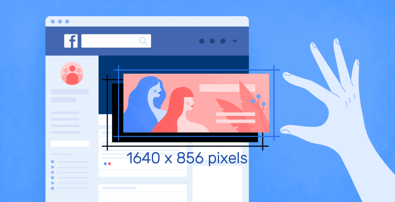
The official Facebook Group cover should be created at 1,640 × 856 pixels, which matches a 1.91:1 aspect ratio and ensures your design remains consistent across screens. Using that exact canvas size prevents the platform from stretching or compressing your image and reduces the chance that text or logos will blur or be cropped.
What Exactly Gets Cropped on Different Devices?
This pattern appears across groups and pages: desktop views tend to trim the top and bottom of the banner, while mobile views are more likely to cut into the left and right edges. That inconsistency is why text placed near any edge often disappears; it’s exhausting when a carefully crafted headline vanishes on a phone and you only notice after launch.
Where Should You Put Your Headline, Logo, and CTA?
Treat the center as sacred, like the center of a stage where the curtain rarely closes. Keep primary elements inside a central safe zone, roughly the middle width of the canvas, with a reduced vertical band so nothing sits too close to the top or bottom. This preserves legibility on narrow screens and keeps logos visible when Facebook crops horizontally.
How Should You Export Files to Avoid Blur and Colour Shifts?
Export in the sRGB colour profile as a high-quality JPG or PNG, and keep the original aspect ratio when resizing. On Retina or other high-density displays, uploading at the recommended size or slightly larger ensures crisp edges without relying on Facebook’s automatic resampling, which often produces soft text and muddy detail.
The Hidden Cost of Single-Master Artworks
Most teams handle banners familiarly, by producing one master artwork and forcing it to fit every device, because it’s quick and low-friction. That works initially, but as groups multiply and stakeholders weigh in, the hidden cost appears: dozens of manual resizes, scattered feedback, and repeated fixes for cropping-related errors, which waste time and erode brand consistency. Platforms like FLORA provide model-driven templates, centralized iteration, and batch export capabilities, allowing teams to generate multiple on-brand variants simultaneously and reduce review cycles from days to hours, while keeping every asset aligned.
A Few Practical Checks Before You Upload
Ensure important copy is well-positioned within the central band, avoid using tiny type, and preview the image on both an actual phone and a desktop browser before finalizing. A quick spot check will catch the kind of side cropping or vertical trimming that otherwise turns a carefully designed message into a broken one. That calm, correct size solves half the problem, but the part that trips teams up next is surprisingly human and process-driven.
Related Reading
How to Design a Perfect Facebook Group Banner
Design the perfect Facebook Group banner by treating it as a living asset: select a clear focal image, establish a small set of tested templates, and build a fast iteration loop to create, preview, and export variations without redoing the entire design. Do that, and you stop firefighting cropping and legibility problems, and start shipping consistent, on-brand banners every campaign.
How Should I Prioritize Contrast and Legibility?
Keep typography large, high-contrast, and modular. Aim for a contrast ratio of at least 4.5:1 for body text so captions remain readable across screens. Then, add a subtle overlay or tonal band behind the text to protect it when photos change. Keep primary visuals positioned to stay visible on phones, because platform crops and viewing behavior make preserving the central story non-negotiable. Practical checks show primary elements can be made 100% visible on mobile, which is why you must preview on several real devices before launch.
Which Export and File Settings Actually Preserve Quality?
Export masters in sRGB, keep a high-quality PNG for logos and text-heavy areas, and use a high-quality JPEG for photographic banners with quality set around 80 to 90 to balance sharpness and file size. Match the platform’s native framing by respecting the 1.91:1 aspect ratio, so Facebook is less likely to recrop your composition. Add metadata and a strict naming convention, such as campaign_date_variant_v1.png, so that automated systems and teammates can find the correct file instantly.
How Can Teams Iterate Fast Without Losing Brand Control?
Use a small matrix of templates, each with locked brand tokens: colors, type scale, and logo placement. For every campaign, create three tiers of variants: one optimized for photography, one for illustration, and one for motion. Then, run quick A/B checks against engagement metrics. This makes iteration deliberate, not chaotic; you move from guessing to testing.
The Drag of Fragmented, Email-Based Banner Updates
Most teams handle banner updates by editing a single master file and sending export requests via email, as this workflow is familiar and low-friction. As groups scale and stakeholders multiply, that habit fragments feedback across messages, creating dozens of near-duplicate files. This means design time balloons and brand inconsistencies slip in under deadline pressure.
Centralized AI Platforms for Rapid, Consistent Design
Platforms like AI playground centralize templates, unify multiple generative models for rapid variant production, provide real-time commenting on the same canvas, and enable one-click batch exports, compressing review cycles from days to hours while keeping every asset on-brand.
What About Animation, Video Banners, and Accessibility?
If you add motion, keep it subtle and loop-friendly, and provide a static fallback for slower connections. Export short MP4s with H.264 and a medium bitrate for compatibility, and include closed captions or text alternatives when the banner carries essential messaging. Run an accessibility check as part of your export checklist, and tag each asset with permission and licensing information so legal review is automated, not an afterthought.
A Practical Workflow You Can Adopt Today
Start with two locked templates for each brand voice: one image-led, one type-led.
Generate six quick variants per template using model-guided prompts so you have choices.
Run an on-device preview pass, mark winners, and batch-export final files with metadata and permission tags. That sequence turns repeated rework into a single predictable pipeline.
FLORA is the first AI-native creative canvas that unifies text, image, and video generation in one infinite AI playground. Try FLORA's AI playground for free today and see how centralized templates, version control, and batch exports remove the usual friction between idea and launch.
That solution sounds tidy, but the tricky part is how you choose templates and tools without trading creativity for conveyor-belt sameness.
Facebook Group Banner Tools and Templates
Choose the tool that matches the tradeoffs you care about: speed and repeatability, or fine-grained control and pixel-perfect exports. Templates and AI-assisted canvases accelerate testing and iteration; layered tools provide the control needed for complex compositions and brand systems.
Which Tool Fits My Workflow and Team?
If you need fast, repeatable banners with minimal handoffs, template-first editors are the fastest path. Canva and similar libraries provide non-designers with preset layouts and asset banks, allowing a social manager to produce a clean banner in minutes.
Browser Editing vs. System Control
For teams that want browser-based design with Photoshop-like controls but no install, Photopea provides layered editing and PSD compatibility. Designers who prioritize precise spacing, component libraries, and responsive constraints should use Figma or Photoshop, as these tools handle complex systems and handoffs cleanly.
How Should Templates and Presets Be Treated So They Stay Useful Rather Than Brittle?
Treat templates like a shared wardrobe with rules, not a pile of clothes. Lock brand tokens: color swatches, headline styles, minimum type sizes, and logo placements. Enforce a naming convention and metadata fields at export so that every file clearly indicates campaign, date, variant, and usage rights. This prevents ten nearly identical files from becoming a mess during review. The pattern appears across in-house teams and agencies: without enforced structure, edits multiply, approval threads scatter, and minor fixes become complete redesigns. That friction costs time and clarity as campaigns scale.
When Should You Pick Speed Over Precision, or Vice Versa?
If your goal is rapid testing across dozens of variants, choose a template-driven, AI-enabled canvas that can generate multiple options and batch-export them for A/B testing. If the banner is part of a tightly controlled brand system or will be used across high-resolution displays, prioritize layered tools that let you control:
Kerning
Export profiles
File formats
Design for Preview and High Density
For compatibility, note that many social presets still include a smaller preview size, such as 820 x 428 pixels, which is listed as a standard social preview dimension. Build previews to this scale when you expect thumbnails or link previews to appear. For masters intended for high-density displays, maintain an appropriately high resolution, such as 1640 x 856 pixels, so that downsampling preserves sharpness.
How Do You Keep AI-Generated Variations from Feeling Cookie-Cutter?
Avoid treating AI as a single “generate and go” step. Use style tokens and prompt templates, then apply controlled randomness—swap a single visual variable across a batch rather than changing everything at once. Run an automated QA check for contrast, logo visibility, and text truncation before human review to identify potential issues.
Reducing Generative Sameness and Anxiety
This pattern reduces the risk of generative sameness and the anxiety teams feel when their work looks generic or gets flagged as formulaic, while still delivering the speed that motivates AI use. Most teams handle approvals across email and chat because it is familiar and low-friction, but this approach fragments decisions as the number of stakeholders increases. That leads to lost context and longer review loops.
Centralized Workflows for Compressed Review Cycles
Platforms like FLORA provide a centralized canvas with version control, threaded comments, and batch export, offering teams a reproducible workflow that compresses review cycles and preserves asset history intact. This is especially useful when producing many near-identical variants and maintaining licensing metadata.
A Practical Checklist Designers Will Actually Follow
Create three locked templates:
Image-led
Typographic
Motion-fallback
Add metadata fields for campaign, region, and rights at the template level so exports are discoverable.
Use a small controlled set of prompt templates for generative imagery, and apply one variable per variant batch to test impact cleanly. Those steps turn dozens of ad-hoc edits into a single predictable process that scales without creative drift.
That tidy process sounds like an endpoint, but there is one operational snag most teams still trip over when they go to publish.
Related Reading
How to Upload or Change Your Facebook Group Banner
Open your Facebook group, click the Edit control on the cover photo, select Upload Photo, position the image so that the focal point looks right, and then save the Changes. That simple sequence works on both desktop and mobile, but the real work is in preparing the right files, previewing variants, and keeping permissions tidy so you do not have to redo the exact change multiple times.
Where Do I Find the Banner Controls on Desktop and Mobile?
On desktop, the Edit button sits at the bottom right of the cover image and opens the uploader and repositioner. On mobile:
Tap the three-dot menu near the top of the group
Select Edit Group Settings or Edit Cover Photo
Upload Photo or Choose Photo
If the Edit option is missing, check the account role and device: a moderator with the correct permissions can change the cover in many groups, and an older mobile app may hide the control until you update.
How Should I Prepare Files and Quick Previews?
Keep two practical files in your source folder for quick previews: a high-resolution master and a thumbnail-style preview. Save a crisp master at 1640 x 856 pixels as your archive copy so downsampling preserves sharp edges and detail. Also export a lightweight preview at 820 x 428 pixels for quick thumbnail checks and social previews that render smaller versions. Name files clearly, for example, campaign_date_master.png and campaign_date_preview.jpg, so reviewers never grab the wrong asset.
What If the Image Still Crops or the Text Vanishes After Upload?
First use the reposition drag tool and save a test, then view the group on at least one phone and one desktop browser. If text still gets cut, make two compositional variants: one shifted left for mobile-favored framing and one centered for desktop. Export both with explicit names, upload the version that matches the visual use case, and delete the unused file from the group to avoid confusion. Think of the banner like a theater marquee: put the headline on the stage, not in the wings.
The Hidden Cost of Fragmented Versioning
Most teams handle this with email threads and single-file edits, which feels familiar and low friction. That works until stakeholders multiply, last-minute copy changes arrive, and you end up reconciling three competing image files at 11 p.m. The hidden cost is wasted passbacks, version confusion, and repeated uploads that steal creative time and damage consistency.
What Fixes the Coordination Problem Without Adding More Meetings?
Platforms like FLORA centralize templates, version control, and batch exports, letting teams generate multiple on-brand variants, attach usage and rights metadata, and resolve comments inline so approvals do not scatter across messages. Teams find that centralizing generation and review reduces round time and ensures every export is matched to the campaign naming convention, making last-minute swaps manageable instead of chaotic.
Who Can Change Banners and How Do You Avoid Permission Mistakes?
Confirm the account role before you start, then keep a single source-of-truth asset library with role-based access. If moderators will update covers regularly, provide them with a locked template file to use, so they cannot accidentally shift logos or change color tokens. Add a short checklist to every upload: file name, resolution, preview check, and license tag. That checklist becomes a habit, and habits remove the friction that causes repeated rework.
A Short Checklist to Follow Before You Click Save Changes
Choose the intended variant and name it clearly.
Confirm the uploader account has the proper role.
Preview on phone and desktop.
Attach a note with usage, campaign, and license information so future editors do not have to guess.
It is satisfying to fix a cropped headline or missing logo, but the frustrating part is that this is not even the most complex piece to figure out.
Related Reading
Try FLORA's AI-native Creative Canvas for Free Today
We know it’s exhausting when a banner tweak turns into days of fragmented feedback and last-minute re-exports. For fewer handoffs and faster launches, consider a more innovative approach. Over 1 million users have tried FLORA’s AI-native Creative Canvas, and a 2025 Efficiency Study found that 70% of users reduced design time by 40%. Try FLORA’s AI playground for free and see if it shortens your banner cycles the way it did for these teams.


"/><stop offset="1" stop-color="rgba(15, 15, 15, 0)"/></linearGradient></defs><path d="M 899.729 124.429 L 931.177 124.429 L 931.177 108.467 L 946.905 108.467 L 946.905 44.616 L 884.001 44.616 L 884.001 92.504 L 868.274 92.504 L 868.274 124.429 L 852.554 124.429 L 852.554 140.392 L 836.826 140.392 L 836.826 156.355 L 852.554 156.355 L 852.554 172.317 L 836.826 172.317 L 836.826 204.242 L 821.098 204.242 L 821.098 236.168 L 852.554 236.168 L 852.554 252.129 L 758.2 252.129 L 758.2 236.167 L 789.65 236.167 L 789.65 204.241 L 805.378 204.241 L 805.378 172.316 L 821.098 172.316 L 821.098 124.428 L 836.826 124.428 L 836.826 92.504 L 852.554 92.504 L 852.554 44.616 L 836.826 44.616 L 836.826 28.654 L 962.625 28.654 L 962.625 44.616 L 978.353 44.616 L 978.353 60.579 L 994.081 60.579 L 994.081 76.541 L 978.353 76.541 L 978.353 124.429 L 946.905 124.429 L 946.905 140.392 L 931.177 140.392 L 931.177 156.355 L 946.905 156.355 L 946.905 236.168 L 978.417 236.168 L 978.417 220.205 L 994.145 220.205 L 994.145 204.242 L 1009.865 204.242 L 1009.865 188.28 L 1025.593 188.28 L 1025.593 204.242 L 1009.865 204.242 L 1009.865 220.205 L 994.145 220.205 L 994.145 236.168 L 1025.593 236.168 L 1025.593 252.13 L 915.449 252.13 L 915.449 156.355 L 899.729 156.355 Z M 1135.672 172.317 L 1119.944 172.317 L 1119.944 76.541 L 1104.216 76.541 L 1104.216 92.504 L 1088.496 92.504 L 1088.496 108.467 L 1072.768 108.467 L 1072.768 92.504 L 1088.496 92.504 L 1088.496 76.541 L 1104.216 76.541 L 1104.216 60.579 L 1119.944 60.579 L 1119.944 28.654 L 1135.672 28.654 L 1135.672 60.579 L 1151.392 60.579 L 1151.392 236.168 L 1167.12 236.168 L 1167.12 252.13 L 1104.216 252.13 L 1104.216 236.168 L 1119.944 236.168 L 1119.944 188.28 L 1135.672 188.28 Z M 1072.768 124.429 L 1072.768 140.392 L 1057.041 140.392 L 1057.041 156.355 L 1041.321 156.355 L 1041.321 172.317 L 1025.593 172.317 L 1025.593 156.355 L 1041.321 156.355 L 1041.321 140.392 L 1057.041 140.392 L 1057.041 124.429 Z M 176.61 25.988 C 124.406 25.988 78.864 38.954 68.867 80.108 C 64.424 102.095 70.533 130.282 105.522 145.504 C 107.678 146.379 109.332 146.83 110.516 147.152 C 112.382 147.661 113.082 147.852 112.742 148.886 C 112.186 150.577 106.633 150.014 102.19 148.323 C 69.424 136.484 51.65 107.168 54.983 77.289 C 60.536 35.572 109.966 -1.636 179.387 0.056 C 202.713 0.056 238.812 5.692 273.246 15.276 C 293.795 20.914 321.009 28.243 346.555 34.444 C 369.881 24.86 392.096 18.659 411.534 18.659 C 425.628 18.659 438.846 21.919 444.414 28.654 L 537.86 28.654 L 537.86 44.616 L 506.41 44.616 L 506.41 60.579 L 490.685 60.579 L 490.685 92.504 L 474.959 92.504 L 474.959 124.429 L 459.233 124.429 L 459.233 172.317 L 443.508 172.317 L 443.508 220.205 L 427.783 220.205 L 427.783 236.168 L 522.135 236.168 L 522.135 220.205 L 537.86 220.205 L 537.86 204.242 L 553.586 204.242 L 553.586 172.317 L 569.311 172.317 L 569.311 204.242 L 553.586 204.242 L 553.586 236.168 L 537.86 236.168 L 537.86 252.13 L 364.881 252.13 L 364.881 236.168 L 396.332 236.168 L 396.332 220.205 L 412.058 220.205 L 412.058 172.317 L 427.783 172.317 L 427.783 140.392 L 443.508 140.392 L 443.508 92.504 L 459.234 92.504 L 459.234 44.616 L 444.157 44.616 C 437.338 52.415 419.206 55.303 394.318 55.303 C 379.323 55.303 357.108 53.048 349.333 51.92 C 337.67 63.196 325.452 77.853 314.9 90.82 C 305.307 102.032 297.996 111.856 290.818 121.501 C 284.281 130.284 277.855 138.919 269.914 148.323 C 283.798 148.886 298.794 147.759 309.901 143.812 C 320.454 129.155 333.783 122.39 342.669 124.645 C 351.554 126.9 350.444 135.92 337.67 145.504 C 335.4 147.26 333.256 148.887 331.193 150.453 C 322.659 156.932 315.515 162.356 306.569 171.436 C 304.66 173.374 302.994 175.312 301.571 176.968 C 299.269 179.646 297.602 181.584 296.572 181.584 C 293.24 182.148 294.351 172 296.572 166.363 C 299.349 159.597 302.126 154.524 304.903 150.577 C 295.462 153.396 284.91 154.524 266.026 154.524 C 264.938 155.812 263.791 157.222 262.545 158.751 C 259.978 161.904 256.993 165.569 253.253 169.745 C 204.381 225.557 123.85 256 71.645 256 C 29.993 256 0 239.087 0 212.591 C 0 193.987 12.774 175.947 34.99 175.947 C 53.317 175.947 61.092 188.349 60.537 200.188 C 59.981 208.644 57.204 213.718 51.651 219.92 C 47.763 224.429 44.431 228.376 44.431 234.013 C 44.431 243.597 52.762 249.798 68.867 250.362 C 111.631 253.181 142.177 234.013 176.61 195.678 C 190.494 180.456 200.491 168.054 210.488 153.96 C 198.27 153.96 186.607 153.96 179.943 154.524 C 172.902 154.799 168.37 155.744 165.639 156.313 C 162.768 156.912 161.886 157.096 162.17 155.652 C 162.726 153.396 167.724 149.45 184.385 148.323 C 188.537 147.94 196.791 148.077 204.443 148.204 C 208.052 148.264 211.528 148.323 214.375 148.323 C 222.151 137.611 231.037 125.772 242.7 113.37 C 264.915 89.128 294.35 65.451 323.23 47.411 C 307.124 45.719 281.021 40.645 263.804 37.263 C 239.923 32.753 203.268 25.988 177.166 25.988 L 176.61 25.988 Z M 365.438 39.518 C 386.542 45.156 403.204 46.847 413.2 46.847 C 427.64 46.847 440.969 42.336 441.524 36.136 C 442.08 29.37 428.751 24.296 410.979 24.296 L 410.423 24.296 C 394.317 24.296 375.435 32.753 365.438 39.518 Z M 711.023 252.129 L 616.672 252.129 L 616.672 236.167 L 600.946 236.167 L 600.946 220.204 L 585.221 220.204 L 585.221 108.466 L 600.946 108.466 L 600.946 76.54 L 616.672 76.54 L 616.672 60.578 L 632.396 60.578 L 632.396 44.616 L 663.847 44.616 L 663.847 28.654 L 758.2 28.654 L 758.2 44.616 L 773.924 44.616 L 773.924 60.579 L 789.65 60.579 L 789.65 172.317 L 773.924 172.317 L 773.924 188.28 L 758.2 188.28 L 758.2 220.205 L 742.474 220.205 L 742.474 236.168 L 711.023 236.168 Z M 663.847 44.616 L 663.847 60.579 L 648.122 60.579 L 648.122 76.541 L 632.396 76.541 L 632.396 108.467 L 616.672 108.467 L 616.672 220.205 L 632.396 220.205 L 632.396 236.168 L 695.298 236.168 L 695.298 220.205 L 711.023 220.205 L 711.023 204.242 L 726.749 204.242 L 726.749 188.28 L 742.474 188.28 L 742.474 156.355 L 758.2 156.355 L 758.2 60.579 L 742.474 60.579 L 742.474 44.616 Z" fill="url(%23k7ftP17bN-2050371890-linear-gradient)" height="255.9995555606772px" id="k7ftP17bN" width="1167.1199228535695px"/></svg>)