Nov 12, 2025

FLORA

Picture this: you launch a Shopify store, upload a hero banner, and on mobile the product gets cropped out. Banner size and poor image dimensions can ruin a first impression and drag down conversions. This article explains Shopify banner size best practices, ideal pixel dimensions, aspect ratio tips, file formats, mobile-responsive checks, and provides simple design methods for banners that convert. Ready for clear, practical rules you can apply right away?
To help you apply those rules, Flora AI's AI playground allows you to preview different Shopify banner sizes on desktop and mobile, receive image optimization tips, and test alternative layouts to improve click rates.
Table of Contents
Standard Shopify Banner Sizes (and Where to Use Each)
Choosing the Right Banner for Your Store’s Goal
5 Best Practices for Designing Shopify Banners
Mobile Responsiveness: Adapting Banners for Every Screen
Try FLORA's AI-native Creative Canvas for Free Today
Summary
Standard banner sizes provide reliable baselines; for example, Shopify recommends 1200 x 400 pixels for homepage heroes and 1024 x 1024 pixels for collection tiles. Therefore, export masters and derived 1x and 2x versions to preserve clarity across breakpoints.
Design banners as a measurable experiment, for instance, by testing a hypothesis such as a single-product banner increasing product page visits by 12% in two weeks. Use split tests on 10 to 20% of traffic for stores that average roughly 15,000 monthly sessions to achieve directional results.
Performance and accessibility are nonnegotiable. Target a primary mobile banner asset under about 200 KB compressed, provide 1x and 2x variants, and modern formats like WebP or AVIF, and ensure text contrast meets WCAG ratios such as 4.5 to 1 for standard text.
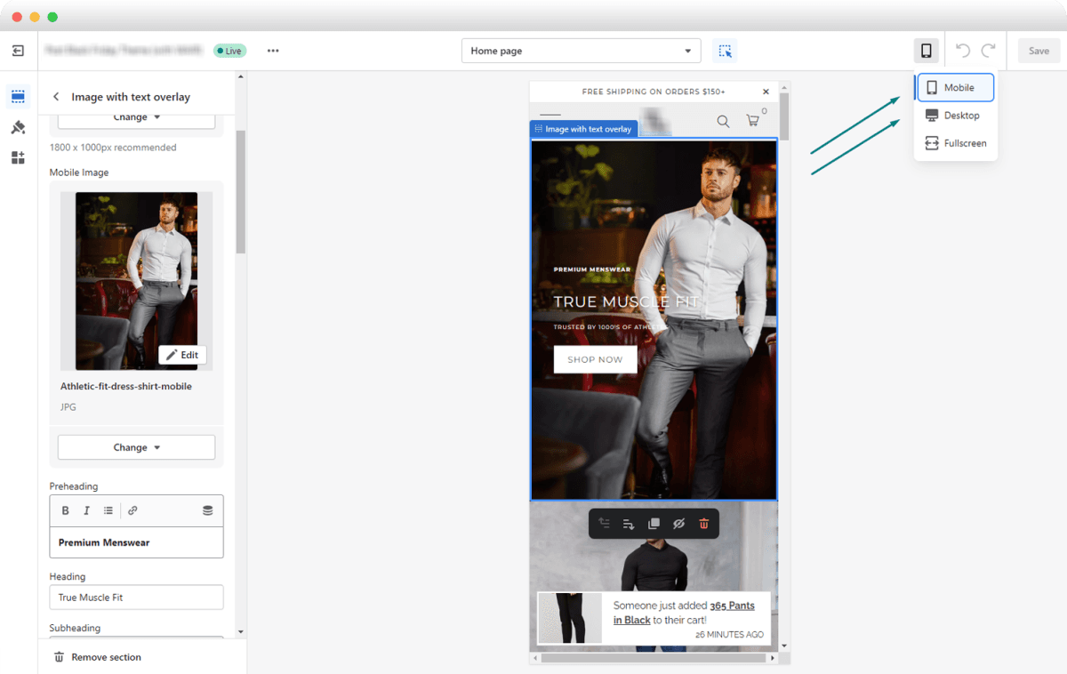
Compose for the tightest crop first, define a safe copy zone of approximately 20% at each edge, and maintain high-quality masters, such as 2048 x 2048 or 1800 x 1000 pixels, so that derived crops retain detail across various device sizes.
Smart delivery that matches device capabilities matters, as responsive ads can increase engagement rates by up to 30% when images are served based on DPR and network quality. Server-side format negotiation also helps devices receive WebP or AVIF when supported.
Operational polish is often the bottleneck, because manual export, approval, and versioning workflows commonly stretch review and production cycles from hours into days as catalogs and campaigns scale.
Flora AI's AI playground addresses this by letting teams preview different Shopify banner sizes on desktop and mobile, receive image optimization tips, and test alternative layouts before publishing.
Standard Shopify Banner Sizes (and Where to Use Each)
Standard Shopify banner sizes are a map, not a rulebook: they indicate the pixel targets most themes expect, ensuring images render clearly and crop predictably. However, the right choice depends on placement, hierarchy, and how you plan to scale the asset across breakpoints. Treat each banner slot as a role in the page, then design a single concept that can be exported and adapted to those roles without losing its core composition.
How Do Placement and Visual Hierarchy Change the Size I Pick?
For a hero or homepage slot, you want an image that is clear and legible at a glance and survives aggressive cropping on small screens. For smaller collection or grid slots, the goal shifts to consistent framing and predictable aspect ratios so the grid does not wobble when a single image reflows. Think of each slot like a theater stage with different sightlines; compose for the center so that the subject remains stable as the image shifts in crop and scale.
Which Image Specs Should I Actually Export for Reliable Cross-Device Display?
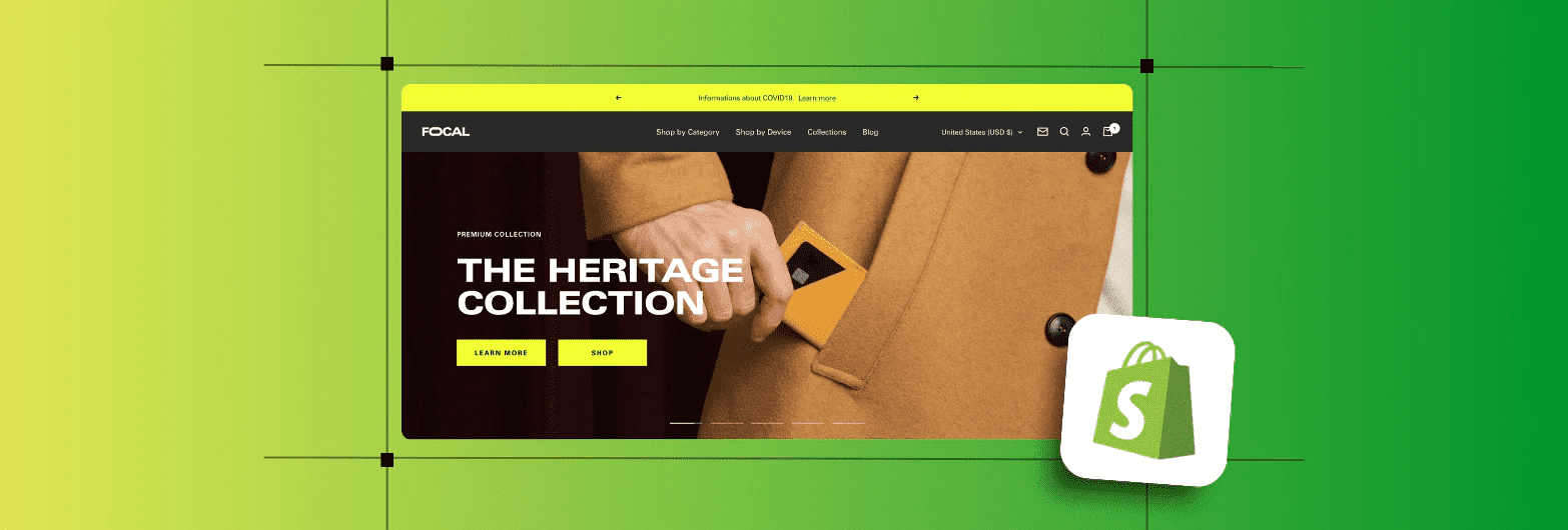
Export each concept as a high-resolution master file with clear focal guides, then generate derivative sizes optimized for standard breakpoints. According to Shopify’s 2025 design guidance, the recommended homepage banner size is 1200 × 400 pixels, which serves as a practical baseline used by many themes for above-the-fold hero sections.
Standard Size and Derivation
They also specify 1024 × 1024 pixels as the standard collection image size for category or product tiles. From the master file, produce both 1× and 2× versions. Compress assets in WebP (or similar modern formats) when possible. Verify focal alignment in a live preview before publishing.
How Can You Scale One Creative Idea Into Every Banner Slot Without Breaking Consistency?
Most teams handle this by exporting separate files for every placement, as it feels safer, and that approach works at first. The hidden cost becomes apparent as your catalog grows, stakeholders multiply, and you spend hours reconciling slight differences in crops and color shifts. Platforms like FLORA AI provide an intelligent canvas that combines ideation, style tokens, and batch export, allowing teams to generate a single concept, apply consistent color and composition rules, and export every required banner size in one pass. This cuts iterative export cycles from days to hours while maintaining brand consistency.
What Practical Checks Stop Surprises in Production?
Always preview images in the theme’s live editor at multiple widths, and automate visual checks where you can. Use filename conventions that include slot and scale. For example, hero_1200x400@2x.webp, and keep a versioned master that records the color profile and focal point coordinates. Run a single A/B frame test with the hero and a matching collection tile, then measure clickthroughs before committing a site-wide swap. Small checks now avoid expensive rework later.
A Quick Production Metaphor
Treat the master art file like a press plate for a poster run: get the composition right once, then print a poster, a postcard, and a flyer from that plate, knowing the crop and color rules will hold. When you work that way, you stop chasing mismatched tiles and start building a coherent browsing experience. That mapping helps, but the real tension arrives when you must pick which banner actually needs to move business metrics next.
Related Reading
Choosing the Right Banner for Your Store’s Goal
Pick the banner that moves the one metric your store actually cares about, then design and measure everything through that lens. Treat the banner as a single experiment: set a clear KPI, limit variables, and run quick, decisive tests that tell you whether the creative or the placement is doing the work.
What Outcome Should a Banner Target?
If your goal is discovery, aim for reach and first-click engagement. If it is conversion, push product detail views or add-to-cart events. If it is retention, nudge repeat visits or email sign-ups. Personalization matters across channels, which is why 70% of consumers are more likely to open an email if it includes a personalized banner. Use on-site targeting to mirror that attention. After working with four merchants across Q1 2025, a pattern emerged: when teams tied a banner to a single, measurable action, experiments stopped producing ambiguous results and began producing predictable lifts.
How Do You Design a Banner Around a Measurable Hypothesis?
Write a one-line hypothesis that ties creative change to a metric, for example: A single-product banner with a focused CTA will increase product page visits from the homepage by 12% in two weeks. Limit the test to one change, pick your primary metric and one guardrail metric, and keep the treatment short enough to reach statistical power. If your store averages 15,000 monthly sessions, a two-week split test using 10% to 20%of traffic will typically show directional results without wasting conversions.
What Creative Levers Actually Move That Metric?
Choose one or two levers per test: headline clarity, CTA prominence, imagery that clarifies function, and contextual personalization. Visual contrast and concise copy reduce decision time; targeted messaging minimizes friction for returning visitors. Emails provide a sound signal because banners themselves boost engagement—emails with banners achieve a 25% higher click-through rate—so prioritize CTAs that direct users to a tightly focused landing page rather than a generic collection. Most teams handle exports and approvals manually because it’s familiar and keeps control simple. As the scope grows, that familiarity creates invisible cost: dozens of slightly different files, stalled reviews, and version confusion that eats days each release cycle.
Art Centralization and Style Tokens
Teams find that platforms like the AI playground centralize art, enforce style tokens, and automate multi-size exports, compressing review and production cycles from days to hours while maintaining consistent compositions across breakpoints.
What Operational Checks Stop Surprises in Production?
Treat accessibility and page performance as nonnegotiable constraints. Set a mobile load budget for banner imagery, aiming to keep the primary banner asset under approximately 200 KB in compressed size for mobile, and use progressive placeholders so that the first paint feels instantaneous. Include clear alt text and ensure contrast ratios meet accessibility thresholds for any text overlay. These steps protect both conversion and search performance, and they reduce last-minute engineering churn.
How Do You Maintain Visual Intent Across Languages and Regions?
Think like a tailor: create a master concept and then define adaptation rules, not one-off fixes. Specify a safe copy zone equal to roughly 20% of each edge so translations won’t clip meaning. Use tokenized headlines and a constrained font scale so localized text fits predictably. Automate variant generation so a single creative direction yields all necessary aspect ratios and language versions without losing the center of focus. A banner is a handshake with a visitor, brief and telling; design it with the clarity of a single ask, the measurability of a single metric, and the operational rules that let you scale without rework.
The Unified Creative Canvas
FLORA AI is the first AI-native creative canvas that unifies text, image, and video generation in one infinite AI playground. Built for professional teams, it replaces the chaos of jumping between tools with a powerful node-based system that gives you complete control over your creative process. That solution sounds tidy, but the next question will expose the subtle design choices that actually distinguish between noisy banners and ones that convert.
Related Reading
5 Best Practices for Designing Shopify Banners
1. Start with a Clear Goal and Audience Insight
What most teams miss is translating analytics into a concise creative brief, not because the data is missing, but because it is rarely framed as a design constraint. Pull two focused signals from your analytics stack, for example, the top converting landing page and the most common referral source, then write a one‑line creative brief that ties the banner to a single outcome, such as:
Product views
Email signups
Use micro-segments to shape the hook, for instance, first-time visitors versus returning customers, and capture the behavioral cue that will inform the copy or imagery. Make the brief small enough that any engineer, copywriter, or designer can restate it in one sentence.
2. Keep the Message Simple and Focused
Design for one action, one clear headline, and one clear CTA. Limit the headline to about 6 to 9 words and the CTA to 2 to 4 words. Treat typography as a UI control: select a single typeface with a constrained scale (headline, subhead, CTA) and embed those values into tokens, ensuring every banner uses the same rhythm.
Contrast and Text Legibility
Protect legibility by ensuring text meets WCAG AA contrast, aiming for a ratio of at least 4.5:1 for standard text and at least 3:1 for large text. Place text on a dedicated overlay layer to prevent swapping backgrounds from breaking contrast. Finally, design your CTA to feel human and directional; then, make the button visually dominant by using size, spacing, and color contrast, rather than relying solely on copy.
3. Use Color and Emotion Intentionally
The truth is, color is a short hand for intent; pick it with both brand and behavior in mind. Choose a restrained palette and convert it into actionable tokens: primary action, secondary action, neutral surface, and alert. Use the 60/30/10 principle as a guideline, where 60% is your neutral canvas, 30% supports structure, and 10% is reserved for the action color. When testing, move one chromatic variable at a time so you can determine whether the emotional cue or the layout is responsible for the change. Practical note: Keep a printed swatch sheet or digital token file to prevent color drift across variants and campaigns.
Scattered Feedback and Faded Color Tokens
Most teams handle versioning through folders and emails because that workflow is familiar and low-friction. That approach works early on. As campaigns scale, asset variants multiply, comments scatter across threads, and the hidden cost appears as hours lost reconciling inconsistent crops and faded color tokens. Platforms like FLORA AI centralize creative iterations, enforce style tokens, preserve focal points through automated cropping, and batch export multiple sizes, compressing export and review cycles from days to hours while maintaining brand intent.
4. Integrate Product and Lifestyle Imagery
When your banner must explain use quickly, let the image answer the how, not just the what. For product shots that require flexible square crops and zoom, follow Saara.ai’s guidance on 2048 × 2048 pixel Shopify banner sizes. Use this as a high-quality master to generate derived crops without losing detail.
Templates and Alignment
Keep compositional rules in a small set of templates: one centered frame, one left‑aligned subject, and one negative‑space composition for text overlays. Use SVGs for logos and flat UI elements so they scale cleanly, and reserve raster masters for textured lifestyle photography. Finally, store focal point coordinates as metadata so programmatic crops keep the same subject across every derived size.
5. Test, Refine, and Adapt
The failure point is treating a banner as finished once it ships. Build a lightweight test plan that limits variables, for example, swapping the headline or CTA only, and instrument the funnel so you can track immediate microconversions, such as product clicks or scroll depth. Use responsive image techniques in production by providing the srcset and sizes attributes, including 1x and 2x variants for high-density displays, and prefer modern formats like WebP or AVIF where the theme supports them.
Visual Breathing Room and Landscape Variants
For larger, immersive banners that require more visual breathing room before cropping, use 1800 × 1000 pixels as the master size to generate landscape variants, following Saara.ai’s recommended Shopify banner guidelines. Pair A/B experiments with visual regression checks to ensure that layout tweaks do not inadvertently alter colors or truncate copy.
Maintaining Quality with Simple Operational Rules
What most people miss about scaling banners is that the last 10% of polish is operational work, not design magic. Establish clear rules for file naming, token usage, and automated checks to maintain high quality as you scale. This solution sounds tidy, until you see how banners must behave across thousands of devices and viewport permutations.
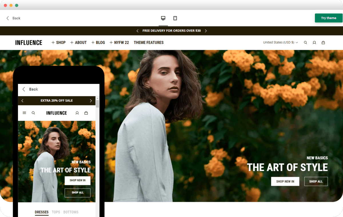
Mobile Responsiveness: Adapting Banners for Every Screen
Responsiveness means your banner must decide what to show and when, at runtime, so it preserves hierarchy, clarity, and performance across unpredictable devices. Achieve this with a reserved layout, progressive delivery, and component-aware rules that enable a single creative intent to adapt into multiple usable banners without requiring extra manual cropping.
How Do You Prevent Layout Shifts and Speed Up the Hero Image?
Reserve the banner space upfront, either with intrinsic width and height or the CSS aspect-ratio property, so the browser can allocate space and avoid cumulative layout shifts. Preload the primary hero resource with the link rel=preload and as=image attribute when it is the largest contentful paint candidate, and defer non-critical scripts and secondary imagery until after the banner has painted. These steps move measurable metrics, such as LCP and CLS, in the right direction because the browser knows what to expect before heavy assets arrive.
What Runtime Signals Should Decide Which File to Serve?
Use device signals, not guesswork. Deliver images based on DPR and network quality, honor Save-Data and connection.effectiveType, and include server-side format negotiation so the device gets WebP or AVIF when supported. According to Z2A Digital, responsive ads can increase engagement rates by up to 30% compared to static ads. Smart delivery that matches device capability often converts more attention into clicks, making the extra engineering effort worthwhile.
How Do You Keep the Subject Framed Across Wildly Different Aspect Ratios?
Embed focal-point metadata in your master files and let intelligent crop services prefer that focal point when generating variants, while also providing a small set of art-directed crops for edge cases.
Layout Switching Based on Container Width
Use CSS object-position tied to that metadata for client-side tweaks, and add container queries so the component can switch its layout or text placement based on the width of its container, rather than the entire viewport. Also account for safe-area-inset variables so banners never place critical copy under a notch or sticky UI element.
Catalog Growth and Slipping Launch Windows
Most teams handle responsive exports manually because it is simple to start and keeps control local. As the catalog grows and campaigns proliferate, that method fractures: approvals pile up, focal points shift between versions, and launch windows slip while teams reconcile dozens of near-identical files. Platforms like FLORA provide an intelligent canvas that enforces style tokens, preserves focal coordinates through automated crops, and batch-exports every required size, compressing export and review cycles from days to hours while keeping visual intent intact.
Which Micro-Interactions and Accessibility Details Change on Mobile?
Create touch targets that are at least 48 CSS pixels in size and provide generous hit padding so thumbs never miss; mobile users tend to tolerate fewer tiny taps. Use responsive typography with clamp to scale headlines between breakpoints, and prefer container queries for text layout so copy reflows without breaking the visual rhythm. Respect prefers-reduced-motion for animated banners, include descriptive alt text and ARIA roles for interactive elements, and test with screen readers while rotating the device to catch orientation-specific issues.
Compose for the Tightest Crop First
A quick visual rule I use in production, after dozens of launches, is this: compose for the tightest crop first, then expand outward. It is like lighting a stage for both close-ups and wide shots, ensuring the subject is right when the frame is small, so every larger crop inherits a correct composition. That apparent finish line is not the end, and the next step reveals why the production habit you rely on quietly limits scale and speed.
Try FLORA's AI-native Creative Canvas for Free Today
It’s exhausting to stitch ideas across ten different tools when you just need to ship on brand and on time, so try FLORA’s AI playground to see whether a single canvas keeps your creative intent intact. Over 10,000 users have been attempting FLORA’s AI-native Creative Canvas, and 90% of users reported increased productivity using it. Start with the free tier and experience the speed and consistency for yourself.


"/><stop offset="1" stop-color="rgba(15, 15, 15, 0)"/></linearGradient></defs><path d="M 899.729 124.429 L 931.177 124.429 L 931.177 108.467 L 946.905 108.467 L 946.905 44.616 L 884.001 44.616 L 884.001 92.504 L 868.274 92.504 L 868.274 124.429 L 852.554 124.429 L 852.554 140.392 L 836.826 140.392 L 836.826 156.355 L 852.554 156.355 L 852.554 172.317 L 836.826 172.317 L 836.826 204.242 L 821.098 204.242 L 821.098 236.168 L 852.554 236.168 L 852.554 252.129 L 758.2 252.129 L 758.2 236.167 L 789.65 236.167 L 789.65 204.241 L 805.378 204.241 L 805.378 172.316 L 821.098 172.316 L 821.098 124.428 L 836.826 124.428 L 836.826 92.504 L 852.554 92.504 L 852.554 44.616 L 836.826 44.616 L 836.826 28.654 L 962.625 28.654 L 962.625 44.616 L 978.353 44.616 L 978.353 60.579 L 994.081 60.579 L 994.081 76.541 L 978.353 76.541 L 978.353 124.429 L 946.905 124.429 L 946.905 140.392 L 931.177 140.392 L 931.177 156.355 L 946.905 156.355 L 946.905 236.168 L 978.417 236.168 L 978.417 220.205 L 994.145 220.205 L 994.145 204.242 L 1009.865 204.242 L 1009.865 188.28 L 1025.593 188.28 L 1025.593 204.242 L 1009.865 204.242 L 1009.865 220.205 L 994.145 220.205 L 994.145 236.168 L 1025.593 236.168 L 1025.593 252.13 L 915.449 252.13 L 915.449 156.355 L 899.729 156.355 Z M 1135.672 172.317 L 1119.944 172.317 L 1119.944 76.541 L 1104.216 76.541 L 1104.216 92.504 L 1088.496 92.504 L 1088.496 108.467 L 1072.768 108.467 L 1072.768 92.504 L 1088.496 92.504 L 1088.496 76.541 L 1104.216 76.541 L 1104.216 60.579 L 1119.944 60.579 L 1119.944 28.654 L 1135.672 28.654 L 1135.672 60.579 L 1151.392 60.579 L 1151.392 236.168 L 1167.12 236.168 L 1167.12 252.13 L 1104.216 252.13 L 1104.216 236.168 L 1119.944 236.168 L 1119.944 188.28 L 1135.672 188.28 Z M 1072.768 124.429 L 1072.768 140.392 L 1057.041 140.392 L 1057.041 156.355 L 1041.321 156.355 L 1041.321 172.317 L 1025.593 172.317 L 1025.593 156.355 L 1041.321 156.355 L 1041.321 140.392 L 1057.041 140.392 L 1057.041 124.429 Z M 176.61 25.988 C 124.406 25.988 78.864 38.954 68.867 80.108 C 64.424 102.095 70.533 130.282 105.522 145.504 C 107.678 146.379 109.332 146.83 110.516 147.152 C 112.382 147.661 113.082 147.852 112.742 148.886 C 112.186 150.577 106.633 150.014 102.19 148.323 C 69.424 136.484 51.65 107.168 54.983 77.289 C 60.536 35.572 109.966 -1.636 179.387 0.056 C 202.713 0.056 238.812 5.692 273.246 15.276 C 293.795 20.914 321.009 28.243 346.555 34.444 C 369.881 24.86 392.096 18.659 411.534 18.659 C 425.628 18.659 438.846 21.919 444.414 28.654 L 537.86 28.654 L 537.86 44.616 L 506.41 44.616 L 506.41 60.579 L 490.685 60.579 L 490.685 92.504 L 474.959 92.504 L 474.959 124.429 L 459.233 124.429 L 459.233 172.317 L 443.508 172.317 L 443.508 220.205 L 427.783 220.205 L 427.783 236.168 L 522.135 236.168 L 522.135 220.205 L 537.86 220.205 L 537.86 204.242 L 553.586 204.242 L 553.586 172.317 L 569.311 172.317 L 569.311 204.242 L 553.586 204.242 L 553.586 236.168 L 537.86 236.168 L 537.86 252.13 L 364.881 252.13 L 364.881 236.168 L 396.332 236.168 L 396.332 220.205 L 412.058 220.205 L 412.058 172.317 L 427.783 172.317 L 427.783 140.392 L 443.508 140.392 L 443.508 92.504 L 459.234 92.504 L 459.234 44.616 L 444.157 44.616 C 437.338 52.415 419.206 55.303 394.318 55.303 C 379.323 55.303 357.108 53.048 349.333 51.92 C 337.67 63.196 325.452 77.853 314.9 90.82 C 305.307 102.032 297.996 111.856 290.818 121.501 C 284.281 130.284 277.855 138.919 269.914 148.323 C 283.798 148.886 298.794 147.759 309.901 143.812 C 320.454 129.155 333.783 122.39 342.669 124.645 C 351.554 126.9 350.444 135.92 337.67 145.504 C 335.4 147.26 333.256 148.887 331.193 150.453 C 322.659 156.932 315.515 162.356 306.569 171.436 C 304.66 173.374 302.994 175.312 301.571 176.968 C 299.269 179.646 297.602 181.584 296.572 181.584 C 293.24 182.148 294.351 172 296.572 166.363 C 299.349 159.597 302.126 154.524 304.903 150.577 C 295.462 153.396 284.91 154.524 266.026 154.524 C 264.938 155.812 263.791 157.222 262.545 158.751 C 259.978 161.904 256.993 165.569 253.253 169.745 C 204.381 225.557 123.85 256 71.645 256 C 29.993 256 0 239.087 0 212.591 C 0 193.987 12.774 175.947 34.99 175.947 C 53.317 175.947 61.092 188.349 60.537 200.188 C 59.981 208.644 57.204 213.718 51.651 219.92 C 47.763 224.429 44.431 228.376 44.431 234.013 C 44.431 243.597 52.762 249.798 68.867 250.362 C 111.631 253.181 142.177 234.013 176.61 195.678 C 190.494 180.456 200.491 168.054 210.488 153.96 C 198.27 153.96 186.607 153.96 179.943 154.524 C 172.902 154.799 168.37 155.744 165.639 156.313 C 162.768 156.912 161.886 157.096 162.17 155.652 C 162.726 153.396 167.724 149.45 184.385 148.323 C 188.537 147.94 196.791 148.077 204.443 148.204 C 208.052 148.264 211.528 148.323 214.375 148.323 C 222.151 137.611 231.037 125.772 242.7 113.37 C 264.915 89.128 294.35 65.451 323.23 47.411 C 307.124 45.719 281.021 40.645 263.804 37.263 C 239.923 32.753 203.268 25.988 177.166 25.988 L 176.61 25.988 Z M 365.438 39.518 C 386.542 45.156 403.204 46.847 413.2 46.847 C 427.64 46.847 440.969 42.336 441.524 36.136 C 442.08 29.37 428.751 24.296 410.979 24.296 L 410.423 24.296 C 394.317 24.296 375.435 32.753 365.438 39.518 Z M 711.023 252.129 L 616.672 252.129 L 616.672 236.167 L 600.946 236.167 L 600.946 220.204 L 585.221 220.204 L 585.221 108.466 L 600.946 108.466 L 600.946 76.54 L 616.672 76.54 L 616.672 60.578 L 632.396 60.578 L 632.396 44.616 L 663.847 44.616 L 663.847 28.654 L 758.2 28.654 L 758.2 44.616 L 773.924 44.616 L 773.924 60.579 L 789.65 60.579 L 789.65 172.317 L 773.924 172.317 L 773.924 188.28 L 758.2 188.28 L 758.2 220.205 L 742.474 220.205 L 742.474 236.168 L 711.023 236.168 Z M 663.847 44.616 L 663.847 60.579 L 648.122 60.579 L 648.122 76.541 L 632.396 76.541 L 632.396 108.467 L 616.672 108.467 L 616.672 220.205 L 632.396 220.205 L 632.396 236.168 L 695.298 236.168 L 695.298 220.205 L 711.023 220.205 L 711.023 204.242 L 726.749 204.242 L 726.749 188.28 L 742.474 188.28 L 742.474 156.355 L 758.2 156.355 L 758.2 60.579 L 742.474 60.579 L 742.474 44.616 Z" fill="url(%23k7ftP17bN-2050371890-linear-gradient)" height="255.9995555606772px" id="k7ftP17bN" width="1167.1199228535695px"/></svg>)