Nov 11, 2025

FLORA

Have you ever opened your site on your phone and found the header banner cropped, loading slowly, and the call-to-action hidden? Banner size decides that first impression; pixel width, aspect ratio, responsive banners, and file size all shape how your hero image or leaderboard appears on mobile and desktop. This article guides you through selecting the ideal website banner size for every screen and campaign.
Flora AI's AI playground enables you to preview banner dimensions across various viewports, test mobile and desktop versions, and optimize file size to ensure your headers and ads load faster, thereby increasing clicks.
Table of Contents
What Is a Website Banner?
Standard Website Banner Sizes (and When to Use Each)
How to Choose the Right Banner Size for Your Website
5 Design Best Practices for Website Banners
9 Tools and Resources for Creating Web Banners
Try FLORA's AI-native Creative Canvas for Free Today
Summary
Banner size dictates composition and messaging more than any other decision, with leaderboards remaining dominant since 728x90 pixels is the most common banner size.
Technical constraints, such as file weight, aspect ratio, and pixel density, directly affect load time and cropping. Therefore, export masters at a 2x device pixel ratio and design headlines to be readable at a minimum width of 320 pixels.
Manual resizing scales poorly, for example, producing roughly 180 variants for one retail launch added about three full days of rework for designers.
Simple, mobile-first design matters because 70% of users prefer visually appealing banners, and optimized banners see a 30% increase in user engagement.
Prioritize a small set of slots that buyers serve, rather than chasing every format. For example, consider a mid-rectangle, such as 336x280, plus a leaderboard and a tall rail, with three prioritized sizes that typically cover most inventory.
Measure outcomes against placement goals, as banner ads can increase brand awareness by up to 80%, and over 70% of marketers still include banner ads in their digital strategies.
Flora AI's AI playground addresses this by allowing teams to preview banner dimensions across viewports, test mobile and desktop versions, and reduce file size so that headers and ads load faster.
What Is a Website Banner?
A website banner is a purposeful visual strip on a page, designed to capture attention and drive specific actions, such as clicking a promotion or guiding a user to a product. You should treat it as an intentional creative canvas, not a decorative afterthought; its size, aspect ratio, and safe area determine what you can show and how reliably users will see the message.
How Does Banner Size Change Creative Decisions?
When we build banners, size dictates composition more than any other single choice. A narrow leaderboard forces tight headlines and single-image focus, while a square or medium rectangle gives room for product shots and a clear call to action. That changes how you:
Brief creative direction
Set type scale
Prioritize visible elements inside the safe zone
Think of size like a stage lighting rig: the same actor, different cues, different mood.
Why Do Technical Limits Matter as Much as Design?
The practical constraints are real, not theoretical: file weight affects load time, aspect ratio influences cropping behavior across breakpoints, and pixel density impacts crispness on high-resolution displays. Responsive banners must include fallback crops and text that remains readable at small sizes. Delivering many variations quickly becomes a production problem unless you automate exports, compression, and naming. That production friction is why teams that standardize export pipelines and template systems cut revision cycles dramatically.
What Trade-Offs Should Teams Weigh When Choosing Dimensions?
The familiar approach is to reuse a handful of popular sizes because inventory tends to favor them, making buying simpler.
Leaderboard & Medium Rectangle
As MonetizeMore reports, the most common banner ad size is 728x90 pixels, so leaderboards still dominate top-of-page placements, making horizontal layouts a safe default for hero messaging. When space is embedded in content streams, 300x250 pixels is noted as the second most popular size, making medium rectangles ideal for in-article clarity and higher viewability. The hidden cost is that chasing every available size without a scalable process multiplies asset count, multiplies manual checks, and erodes brand consistency.
Cost of Hand-Resizing
Most teams handle production by exporting multiple PSDs, resizing them by hand, and sending zipped assets through approval email chains. This approach works well initially because it is familiar and requires no new tools. As campaigns scale across devices and partners, those handoffs become fragmented:
Designers repeat retouching for ten sizes
Reviewers request contradictory text treatments
Finalization shifts from hours to days
Platforms like Flora AI centralize the creative canvas, stitching model-driven layouts, templated safe zones, and batch exports together so teams iterate within a single system, preserving style while compressing review cycles from days to hours.
How Should You Prepare Your Assets to Scale Across Multiple Placements?
If your workflow requires producing many dimensions, standardize a base composition and derive variants programmatically, maintaining a consistent visual hierarchy. Use layered templates with clearly labeled safe areas, export both vector and pixel masters, and prefer modern formats like WebP for photographic banners. Keep one high-quality source file per creative direction.
Automation Checklist for Build Scripts
Automate naming conventions and version tags so that build scripts can select the appropriate density and compression settings for each breakpoint. A simple checklist here saves hours later: a safe area, a readable headline at 320 pixels wide, a CTA that is legible at thumbnail scale, and a file size budget that falls under the ad network limit. A window display is a good analogy: size decides how much of your product people will actually see, and your job is to stage what matters most inside that frame. That choice seems settled, until the placement and audience flip the decision in ways most teams do not expect.
Related Reading
Standard Website Banner Sizes (and When to Use Each)
Choose sizes that match where the banner needs to perform and what you need it to do, not because a spec feels familiar. Match placement, viewer behavior, and creative throughput, then translate that into a handful of prioritized dimensions you can design, test, and automate from a single source master.
When Should I Favor a Wide, Shallow Format for First Impressions?
A horizontal banner often carries the first visual line of interest, so treat it like a headline: bold, legible, and designed to survive the top-of-page crop. For inventory planning, remember that 728x90 pixels is the most popular banner size. The Brief AI, 2025-01-01, indicates that publishers and ad tech still allocate a significant amount of viewable real estate to that footprint, making it the home of predictable reach.
How Do I Think About Medium Rectangles Inside Content?
Medium rectangles excel when you need a compact mix of visual and message that sits within editorial flow, but they demand a tighter information architecture:
Single focal image
Short headline
Uncluttered CTA
That practical balance explains why the 300x250 pixel size is the second most popular banner size—the Brief AI, and why this size often wins for mid-funnel engagement and programmatic inventory.
When Are Tall, Narrow Formats the Smarter Choice?
Choose vertical formats when you want sustained presence as users scroll, or when you can stage a visual narrative down a column. Tall banners support progressive reveals and sequential messaging, which increases attention time without forcing more text. Be deliberate about motion and timing: a short slide or staggered reveal performs better than a long looping animation that users quickly tune out.
What Constraints Should Guide Mobile Banner Choices?
On small screens, prioritize tap targets, headline legibility at a small scale, and file weight for slow networks. Mobile banners should reduce copy to one explicit action and swap imagery for emblematic shapes or product thumbnails so the message survives glances and variable cropping.
The Hidden Cost of Asset Ballooning
The familiar workflow most teams use works initially, but it creates friction as the number of campaigns increases. Most teams still hand-resize creative, export dozens of variants, and route approvals through fragmented threads, which is comfortable and low-cost in the short run. The hidden cost becomes apparent as asset counts balloon and QA time becomes a recurring drain, forcing trade-offs between speed and fidelity.
Single Concept to Hundreds of Variants
Platforms like Flora AI offer a different path: teams find that an intelligent canvas, unified models, and batch derivation let a single concept produce hundreds of pixel-perfect variants while preserving style and safe zones. That approach reduces repetitive resizing, enforces a consistent hierarchy across formats, and maintains high iteration velocity as complexity increases.
What Small Rules Change the Most Between Sizes?
This pattern appears consistently across publisher and product landing pages: wrong banner size makes a design look unprofessional, and leaderboards without a bold CTA squander the brief moment of attention the header commands. Set a strict micro-checklist for each prioritized size, including:
Focal point mapping for crop behavior
CTA scale and contrast
Animation length cap
A two-tier fallback image for extreme crops
Size Choices as Production Levers
These simple rules save dozens of back-and-forths when you scale. Think of your size choices as production levers, not design absolutes; the wiser you are about prioritizing a few sizes and automating their derivation, the more creative control you keep as volume rises. That apparent decision feels settled until you discover the surprising tradeoffs that force you to choose one size over another.
How to Choose the Right Banner Size for Your Website
Choose one high-resolution master canvas that preserves your composition, and then derive everything else programmatically from it. This single decision collapses a long list of manual resizing steps into predictable rules. Prioritize the master by the most demanding placement and device pixel density, and treat every downstream size as a constrained crop of that intelligent canvas.
How Should I Pick a Master Canvas?
Pick the master by the place that demands the most visual information, not by habit. If your hero needs room for a product scene, headline, and negative space, start with a high-resolution source like 1024 x 536 pixels, because it preserves composition when you downscale and keeps type sharp across density changes. Export the master at a 2x device pixel ratio, keep layered vectors for logos, and store a flattened WebP for quick testing. This allows you to run both speed and fidelity checks from the same file.
What Metadata and Structure Should I Bake Into Files?
Embed composition metadata up front: mark a primary focal point, two fallback crops, and a strict safe area as separate, named layers. Include an XML or JSON sidecar that lists headline length limits, CTA coordinates, and preferred crop behavior per aspect ratio. That will:
Automate crop engines to preserve the subject without guessing
Reduce QA loops
Keep typography consistent
This is because the rendering rules travel with the asset, not trapped in a designer’s head or a spreadsheet.
Which Downstream Sizes Should I Prioritize for Programmatic Derivation?
Prioritize slots that buyers and publishers actually serve, then add a small set of conversion-driven variants. Reserve a flexible mid-rectangle for editorial and in-article inventory, such as 336 x 280 pixels, as recommended by Avada, because it often preserves a full product shot or portrait crop without requiring heavy cropping. Pair that with one narrow leaderboard and one tall rail; three prioritized sizes cover most inventory while keeping export counts manageable.
Why Do Teams Stall Between Speed and Fidelity?
Most teams handle this process manually, exporting multiple sizes and routing approvals via email, as it is a familiar approach. It works well initially, but as campaigns scale, asset counts increase exponentially, feedback becomes fragmented, and designers spend hours reconciling contradictory requests instead of refining their concepts. Solutions, such as platforms that provide an intelligent canvas and a unified model library, replace manual resizing with rule-driven derivation, compressing review cycles from days to hours while preserving style across every exported pixel.
How Should You Choose When to Simplify Versus When to Invest in High Fidelity?
Treat fidelity as a staged decision: use low-weight, emblematic versions for early testing and reserve pixel-perfect masters for final creative. If a campaign’s success metric is brand recall, invest in a few high-fidelity masters and propagate them; if you need many rapid creative permutations for performance testing, prioritize templates with strong focal metadata and automated variations. The constraint-based rule is simple: If you need lots of variants fast, optimize for automation and strict templates; when visual nuance matters more than speed, optimize for large masters and manual polish.
How Should You Measure Whether a Chosen Size Strategy Works?
Map metrics to the decision that produced the asset. For view-driven placements track viewability and time-on-frame; for conversion placements, track CTR adjusted for viewability. Run small factorial tests that compare the same creative at two aspect ratios and one simplified treatment, so you can see whether cropping or copy change drove the lift. If your pipeline couples derivation metadata with telemetry, you can attribute wins back to specific crop rules and refine the master composition rules rather than chasing cosmetic changes.
Manual Resizing Fails at Scale
This pattern appears across product teams and creative agencies: manual resizing is fine until it is not, and the moment scale becomes an issue, production friction becomes the most significant drag on creativity. That friction is what unified generative canvases address by keeping design intent and derivation rules together, allowing a single concept to produce hundreds of on-brand assets without losing control. That simple choice appears to be finished, until you realize the next step forces tradeoffs you did not expect.
Related Reading
5 Design Best Practices for Website Banners
1. Keep the Design Simple
Simplicity forces decisions that improve performance. Use a single visual focal point, a short headline, a clear CTA, and intentional negative space so the eye stops where you want it to. Use 2 to 3 colors at most and type that reads at thumbnail scale; long copy and competing animations dilute the impact. Research from Design Studio shows 70% of users prefer websites with visually appealing banners, which explains why investing in visual clarity pays off for brand perception and recall rather than piling on extras.
2. Use the Space Optimally
Think of the banner as a small stage: every pixel has a role, and the arrangement should answer the user’s immediate question, not provide the full explanation. Map hierarchy before you design: headline, hero image, CTA, and legal or secondary text only if necessary. Optimize safe areas so critical copy never crops on standard breakpoints, and set strict file size budgets to prevent slow loads.
Layout Choices Drive Measurable Behavior
When you prioritize function over decoration, you also create headroom for A/B testing layouts and copy, which yields measurable wins. For instance, websites with optimized banners experience a 30% increase in user engagement, indicating that layout choices drive measurable behavior, not just aesthetics.
3. Be Consistent
Inconsistent tone destroys trust faster than a mediocre design. Align the color palette, photography treatment, voice, and motion timing with the brand playbook so that the banner reads as part of a cohesive campaign across various placements and sizes. If your brand voice is calm and restrained, a jittery animation will feel like it comes from a different company.
Shifting Focus from Aesthetics
Create micro-guidelines per campaign: logo scale, corner radius, image crop rules, and a motion cadence cap. When teams centralize these rules in a template system, reviewers stop arguing about aesthetics and start focusing on message testing. That shift reduces contradictory feedback and preserves stylistic integrity as assets multiply.
4. Optimize for Mobile
On most creative teams, mobile becomes the gating constraint for legibility and speed, not desktop. Prioritize:
Tap-friendly CTAs
Headline sizes that remain readable at narrow widths
Imagery that reduces to a clear emblem or product thumbnail
Account for common mobile behaviors, like quick scrolling and variable network speeds, by delivering a lightweight fallback image and by limiting animation loops to short, purposeful gestures.
Manual Export Slowdowns at Scale
Most teams handle variant exports manually because it is familiar; however, as stakeholders multiply, this practice creates slowdowns and inconsistent mobile fallbacks, which is precisely where automated derivation and density-aware exports save design hours while maintaining on-brand results.
5. Stay Up to Date With Design Trends
Trends are tools, not commandments. Test new formats against a conservative control to learn what actually moves your metrics, rather than chasing novelty. Use A/B tests that compare one familiar creative against one experimental treatment, measure viewability-adjusted CTR and micro-conversions, then iterate. Keep a rolling experiment log that ties creative treatments to outcomes so trend adoption becomes an evidence-based decision, not a guess. Also, curate a short list of trend-safe moves that preserve your brand DNA, so you can experiment without fragmenting recognition across channels.
Familiar Coordination Fails at Scale
Most teams coordinate multiple sizes and approvals with spreadsheets, ad hoc exports, and message threads because that process is familiar and requires no new tools. As campaigns scale, that familiarity costs time, creates scattered feedback, and produces inconsistent fallbacks across device breakpoints.
Compressing Cycles with Derivation Rules
Platforms like Flora AI centralize a single intelligent canvas, apply derivation rules across aspect ratios, and batch-export density-specific assets, compressing review cycles from days to hours while keeping composition intent and brand rules intact. Think of a banner as a passing billboard at 60 miles per hour, not a gallery piece; you have one glance to make the decision you want.
9 Tools and Resources for Creating Web Banners
Banner formats still matter because banners remain a core channel for many programs, as evidenced by the fact that over 70% of marketers use banner ads in their digital marketing strategies. Therefore, choose tools that scale with your asset volume and review cadence.
1. Flora AI
Who It’s For
Multi‑person creative teams and studios that need one concept to become dozens or hundreds of pixel-perfect assets.
What It Does Best
Unified generative canvas that blends text, image, and video generation with node-based layout controls, live collaboration, and batch derivation. Use it when you need model-driven variations, predictable safe-area rules, and export pipelines that respect device pixel ratio and compression budgets.
Practical Tip
Treat Flora as your master-source system, not a one-off editor; store focal-point metadata and export presets with each concept so downstream automation can generate crops reliably.
Limitations
Higher learning curve for non-designers compared with drag-and-drop tools, and you should plan governance for model outputs to control brand voice.
2. Canva
Who It’s For
Small businesses, marketers, and content teams that need fast prototypes and social-sized banners.
What It Does Best
A massive template library, brand kit basics, and approachable UI that enables non-designers to create a presentable draft in minutes.
Practical Tip
Use Canva’s team templates and bulk-creation features for simple campaign variants, but reserve them for projects under roughly 30–50 derived assets; beyond that, manual exports become a time sink.
Limitations
Limited automation for programmatic derivation and fewer options for high-fidelity typography or batch A/B testing workflows.
3. Adobe Express
Who It’s For
Designers who prioritize typographic control and polished layouts inside an Adobe-centered workflow.
What It Does Best
Refined type tools, advanced layout control, Creative Cloud asset integration, and higher‑quality templates for hero placements.
Practical Tip
Use Express for final polish when fidelity matters; export vector elements (SVG) for logos and layered masters for pixel-accurate downstream crops.
Limitations
Steeper onboarding and a cost structure that makes it a tougher fit for high-velocity, low‑budget campaigns.
4. Kittl
Who It’s For
Creators who want stylistic control over text treatment and illustration-heavy banners.
What It Does Best
Expressive text warping, trending font collections, and an illustration-focused asset library that helps banners feel unique without heavy retouching.
Practical Tip
Use Kittl when you want a distinctive headline treatment that scales across sizes; export as vectors so text warps remain crisp in tall or narrow crops.
Limitations
Less suited for motion-rich or programmatic feed banners.
5. Envato Placeit
Who It’s For
Teams that need ready-made hero visuals, mockups, and streamer/game‑oriented banners fast.
What It Does Best
Extensive template catalog across social, web, and streaming dimensions, plus quick mockups and simple video editing.
Practical Tip
Pick Placeit for one-off campaign visuals or product mockups you can ship without a design sprint; grab subscription bundles when you need regular weekly assets.
Limitations
A templated look can feel generic at scale unless you add custom brand treatments.
6. Crello
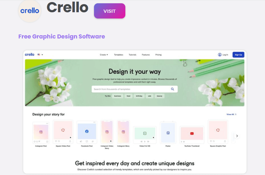
Who It’s For
Non‑technical creators who want theme-organized templates and an easy editor for campaign rotations.
What It Does Best
Themed templates, drag-and-drop simplicity, and a usable brand kit for consistent color and font application.
Practical Tip
Use Crello for campaign proof-of-concepts and local-market variants where speed takes precedence over bespoke design.
Limitations
Fewer enterprise-grade export tools and automation compared with production platforms.
7. Visme
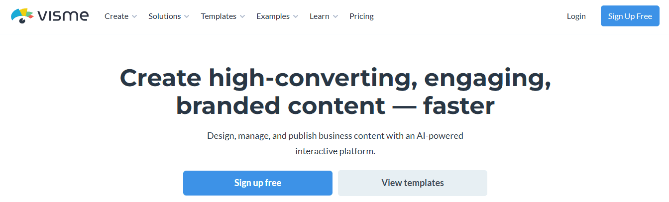
Who It’s For
Teams that require banners with data visualization, interactive elements, or in-banner charts.
What It Does Best
Charts, animated data widgets, and interactive exports that make informational banners readable and actionable. Visme also offers an AI banner generator for rapid concepts.
Practical Tip
If your creative requires embedded metrics or a story arc inside the banner, prototype in Visme and export lightweight assets for production refinement.
Limitations
Interactive features add complexity and may not be supported across all ad inventories.
8. Bannersnack
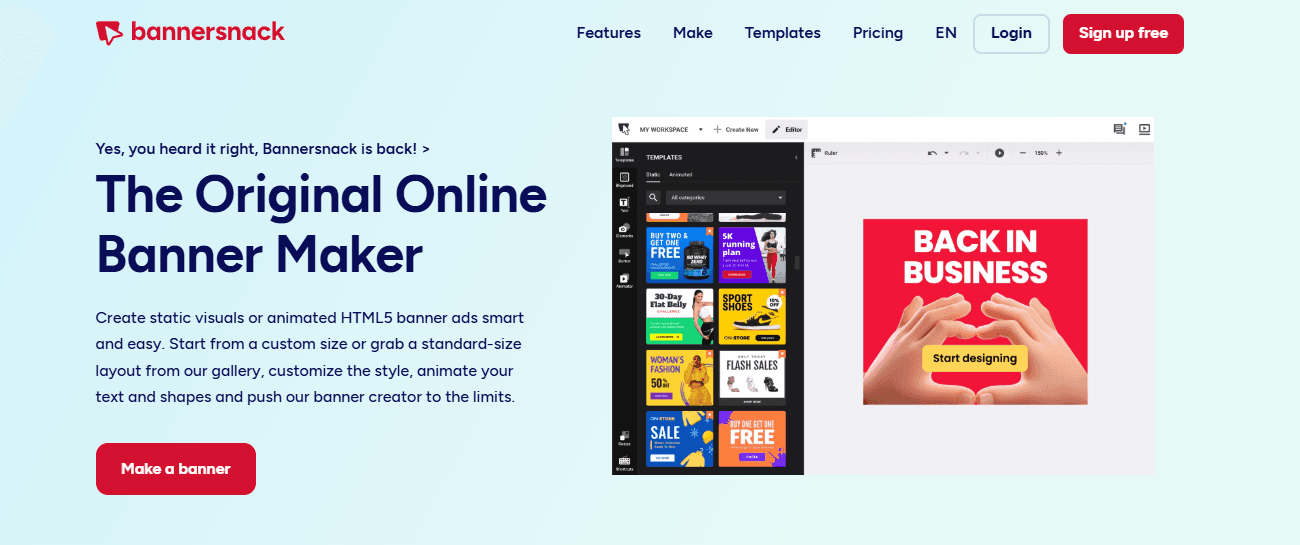
Who It’s For
Marketers who want simple, animated, and dynamic HTML5 banners without writing code.
What It Does Best
Easy timeline-based animations, template-driven motion, and straightforward HTML5 export for publishers that accept it.
Practical Tip
Keep animations short and purposeful; export a static fallback image alongside HTML5 to preserve reach on restricted inventory.
Limitations
Animation features are broad but not as granular as complete motion design tools; testing on target placements remains essential.
9. Bannerflow
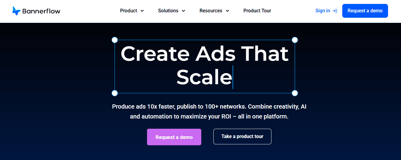
Who It’s For
Large marketers and agencies running multi-slot, programmatic campaigns that need feed-driven creative, testing, and analytics.
What It Does Best
Enterprise features like dynamic content feeds, A/B testing, campaign-level analytics, and governance controls for brand consistency across thousands of impressions.
Practical Tip
Use Bannerflow when inventory and creative volume require automated feed mapping and integrated measurement; plan for onboarding and associated costs as part of the decision-making process.
Limitations
Powerful but can be overkill for small campaigns, and setup requires clearer data feeds and asset taxonomy. After working with a retail team during an eight-week product launch, a pattern emerged: Canva accelerated first drafts and stakeholder buy-in. However, when the campaign required producing roughly 180 variants for local markets, the lack of bulk automation forced designers into manual exports, adding approximately three full days of rework.
This gap between prototype speed and production throughput is where tool choice really shows its cost in time and morale. Most teams handle review and variant exports through ad-hoc threads and zip files, as this method is familiar and requires no new platform approvals. That works at low volume, but as stakeholders multiply, feedback fragments, and the time to finalization stretches from days into weeks.
Centralized Derivation and Intent
Platforms like Flora AI centralize the creative canvas, apply derivation rules across various aspect ratios, and batch-export density-aware assets, substantially reducing review cycles while maintaining composition intent and brand rules. Remember that banners still matter for awareness, not just clicks. One helpful statistic to keep in mind is that Banner ads can increase brand awareness by up to 80%, which should guide whether you prioritize reach-optimized templates or conversion-focused micro-variants.
Related Reading
Try FLORA's AI-native Creative Canvas for Free Today
We know it’s exhausting when tools fail to apply your brand kit, forcing you to manually adjust colors, fonts, and crops while deadlines pile up. For a smoother workflow, consider FLORA’s AI-native Creative Canvas, which has already been tried by over 10,000 users and has increased productivity by 30%.


"/><stop offset="1" stop-color="rgba(15, 15, 15, 0)"/></linearGradient></defs><path d="M 899.729 124.429 L 931.177 124.429 L 931.177 108.467 L 946.905 108.467 L 946.905 44.616 L 884.001 44.616 L 884.001 92.504 L 868.274 92.504 L 868.274 124.429 L 852.554 124.429 L 852.554 140.392 L 836.826 140.392 L 836.826 156.355 L 852.554 156.355 L 852.554 172.317 L 836.826 172.317 L 836.826 204.242 L 821.098 204.242 L 821.098 236.168 L 852.554 236.168 L 852.554 252.129 L 758.2 252.129 L 758.2 236.167 L 789.65 236.167 L 789.65 204.241 L 805.378 204.241 L 805.378 172.316 L 821.098 172.316 L 821.098 124.428 L 836.826 124.428 L 836.826 92.504 L 852.554 92.504 L 852.554 44.616 L 836.826 44.616 L 836.826 28.654 L 962.625 28.654 L 962.625 44.616 L 978.353 44.616 L 978.353 60.579 L 994.081 60.579 L 994.081 76.541 L 978.353 76.541 L 978.353 124.429 L 946.905 124.429 L 946.905 140.392 L 931.177 140.392 L 931.177 156.355 L 946.905 156.355 L 946.905 236.168 L 978.417 236.168 L 978.417 220.205 L 994.145 220.205 L 994.145 204.242 L 1009.865 204.242 L 1009.865 188.28 L 1025.593 188.28 L 1025.593 204.242 L 1009.865 204.242 L 1009.865 220.205 L 994.145 220.205 L 994.145 236.168 L 1025.593 236.168 L 1025.593 252.13 L 915.449 252.13 L 915.449 156.355 L 899.729 156.355 Z M 1135.672 172.317 L 1119.944 172.317 L 1119.944 76.541 L 1104.216 76.541 L 1104.216 92.504 L 1088.496 92.504 L 1088.496 108.467 L 1072.768 108.467 L 1072.768 92.504 L 1088.496 92.504 L 1088.496 76.541 L 1104.216 76.541 L 1104.216 60.579 L 1119.944 60.579 L 1119.944 28.654 L 1135.672 28.654 L 1135.672 60.579 L 1151.392 60.579 L 1151.392 236.168 L 1167.12 236.168 L 1167.12 252.13 L 1104.216 252.13 L 1104.216 236.168 L 1119.944 236.168 L 1119.944 188.28 L 1135.672 188.28 Z M 1072.768 124.429 L 1072.768 140.392 L 1057.041 140.392 L 1057.041 156.355 L 1041.321 156.355 L 1041.321 172.317 L 1025.593 172.317 L 1025.593 156.355 L 1041.321 156.355 L 1041.321 140.392 L 1057.041 140.392 L 1057.041 124.429 Z M 176.61 25.988 C 124.406 25.988 78.864 38.954 68.867 80.108 C 64.424 102.095 70.533 130.282 105.522 145.504 C 107.678 146.379 109.332 146.83 110.516 147.152 C 112.382 147.661 113.082 147.852 112.742 148.886 C 112.186 150.577 106.633 150.014 102.19 148.323 C 69.424 136.484 51.65 107.168 54.983 77.289 C 60.536 35.572 109.966 -1.636 179.387 0.056 C 202.713 0.056 238.812 5.692 273.246 15.276 C 293.795 20.914 321.009 28.243 346.555 34.444 C 369.881 24.86 392.096 18.659 411.534 18.659 C 425.628 18.659 438.846 21.919 444.414 28.654 L 537.86 28.654 L 537.86 44.616 L 506.41 44.616 L 506.41 60.579 L 490.685 60.579 L 490.685 92.504 L 474.959 92.504 L 474.959 124.429 L 459.233 124.429 L 459.233 172.317 L 443.508 172.317 L 443.508 220.205 L 427.783 220.205 L 427.783 236.168 L 522.135 236.168 L 522.135 220.205 L 537.86 220.205 L 537.86 204.242 L 553.586 204.242 L 553.586 172.317 L 569.311 172.317 L 569.311 204.242 L 553.586 204.242 L 553.586 236.168 L 537.86 236.168 L 537.86 252.13 L 364.881 252.13 L 364.881 236.168 L 396.332 236.168 L 396.332 220.205 L 412.058 220.205 L 412.058 172.317 L 427.783 172.317 L 427.783 140.392 L 443.508 140.392 L 443.508 92.504 L 459.234 92.504 L 459.234 44.616 L 444.157 44.616 C 437.338 52.415 419.206 55.303 394.318 55.303 C 379.323 55.303 357.108 53.048 349.333 51.92 C 337.67 63.196 325.452 77.853 314.9 90.82 C 305.307 102.032 297.996 111.856 290.818 121.501 C 284.281 130.284 277.855 138.919 269.914 148.323 C 283.798 148.886 298.794 147.759 309.901 143.812 C 320.454 129.155 333.783 122.39 342.669 124.645 C 351.554 126.9 350.444 135.92 337.67 145.504 C 335.4 147.26 333.256 148.887 331.193 150.453 C 322.659 156.932 315.515 162.356 306.569 171.436 C 304.66 173.374 302.994 175.312 301.571 176.968 C 299.269 179.646 297.602 181.584 296.572 181.584 C 293.24 182.148 294.351 172 296.572 166.363 C 299.349 159.597 302.126 154.524 304.903 150.577 C 295.462 153.396 284.91 154.524 266.026 154.524 C 264.938 155.812 263.791 157.222 262.545 158.751 C 259.978 161.904 256.993 165.569 253.253 169.745 C 204.381 225.557 123.85 256 71.645 256 C 29.993 256 0 239.087 0 212.591 C 0 193.987 12.774 175.947 34.99 175.947 C 53.317 175.947 61.092 188.349 60.537 200.188 C 59.981 208.644 57.204 213.718 51.651 219.92 C 47.763 224.429 44.431 228.376 44.431 234.013 C 44.431 243.597 52.762 249.798 68.867 250.362 C 111.631 253.181 142.177 234.013 176.61 195.678 C 190.494 180.456 200.491 168.054 210.488 153.96 C 198.27 153.96 186.607 153.96 179.943 154.524 C 172.902 154.799 168.37 155.744 165.639 156.313 C 162.768 156.912 161.886 157.096 162.17 155.652 C 162.726 153.396 167.724 149.45 184.385 148.323 C 188.537 147.94 196.791 148.077 204.443 148.204 C 208.052 148.264 211.528 148.323 214.375 148.323 C 222.151 137.611 231.037 125.772 242.7 113.37 C 264.915 89.128 294.35 65.451 323.23 47.411 C 307.124 45.719 281.021 40.645 263.804 37.263 C 239.923 32.753 203.268 25.988 177.166 25.988 L 176.61 25.988 Z M 365.438 39.518 C 386.542 45.156 403.204 46.847 413.2 46.847 C 427.64 46.847 440.969 42.336 441.524 36.136 C 442.08 29.37 428.751 24.296 410.979 24.296 L 410.423 24.296 C 394.317 24.296 375.435 32.753 365.438 39.518 Z M 711.023 252.129 L 616.672 252.129 L 616.672 236.167 L 600.946 236.167 L 600.946 220.204 L 585.221 220.204 L 585.221 108.466 L 600.946 108.466 L 600.946 76.54 L 616.672 76.54 L 616.672 60.578 L 632.396 60.578 L 632.396 44.616 L 663.847 44.616 L 663.847 28.654 L 758.2 28.654 L 758.2 44.616 L 773.924 44.616 L 773.924 60.579 L 789.65 60.579 L 789.65 172.317 L 773.924 172.317 L 773.924 188.28 L 758.2 188.28 L 758.2 220.205 L 742.474 220.205 L 742.474 236.168 L 711.023 236.168 Z M 663.847 44.616 L 663.847 60.579 L 648.122 60.579 L 648.122 76.541 L 632.396 76.541 L 632.396 108.467 L 616.672 108.467 L 616.672 220.205 L 632.396 220.205 L 632.396 236.168 L 695.298 236.168 L 695.298 220.205 L 711.023 220.205 L 711.023 204.242 L 726.749 204.242 L 726.749 188.28 L 742.474 188.28 L 742.474 156.355 L 758.2 156.355 L 758.2 60.579 L 742.474 60.579 L 742.474 44.616 Z" fill="url(%23k7ftP17bN-2050371890-linear-gradient)" height="255.9995555606772px" id="k7ftP17bN" width="1167.1199228535695px"/></svg>)