Nov 19, 2025

FLORA

Ever uploaded a new header photo that looks perfect on desktop but gets cropped on phones? Banner Size determines the result by setting pixel dimensions, aspect ratio, safe area, and file format, so your LinkedIn cover photo or company header either reads well or gets chopped across desktop and mobile. This article walks through the LinkedIn company page banner size and best design tips, covering recommended dimensions, ideal crops, image formats like PNG and JPG, and simple layout moves to keep your brand clear on every device.
To help, Flora AI's AI playground lets you preview your LinkedIn Company Page Banner Size and header designs on desktop and mobile. It suggests recommended pixel dimensions, highlights the safe area, and helps you export the correct PNG or JPG for a clean upload.
Table of Contents
Recommended LinkedIn Company Page Banner Size
LinkedIn Banners on Desktop vs. Mobile
9 Design Tips for LinkedIn Company Page Banner
7 Top Tools for Designing LinkedIn Banners
Try FLORA's AI-native Creative Canvas for Free Today
Summary
Use the exact pixel targets for predictable results: the main company banner at 1128 × 382 pixels, the Overview cover at 502 × 282 pixels, and the Life tab hero at 1128 × 376 pixels, keeping logos and text inside a central safe zone and exporting as PNG or JPG for crisp uploads.
Left-side overlays shift between desktop and mobile, and that matters: desktop users are 30% more likely to engage with LinkedIn banners. In comparison, mobile variants see a 15% lower conversion rate, so left-aligned CTAs and fine details often disappear on phones.
Design discipline pays off: a well-designed LinkedIn banner can increase engagement by up to 50%, and companies with optimized banners see about a 30% increase in brand visibility. Lock in intent and keep messaging single-minded.
Visuals and brevity drive attention; LinkedIn posts with images receive 2x higher engagement, which supports using high-quality imagery, a single short line of copy in the center third, high-contrast type, and avoiding tiny edge details.
Manual variant workflows scale poorly; designers commonly rebuild the same banner five times across pages, languages, and stakeholders, stretching review cycles and producing inconsistent crops.
Flora AI's AI playground addresses this by letting teams preview LinkedIn banners on desktop and mobile, highlight safe areas, suggest recommended pixel dimensions, and export the correct PNG or JPG for each context.
Recommended LinkedIn Company Page Banner Size
Use 1128 × 382 pixels for the main company banner, keep all important text and logos centered inside a safe zone, and export as PNG or JPG with a small file size so the image loads crisply. For the Overview and Life tabs, use the smaller, specific sizes so the visuals remain readable and avoid edge cropping.
What Exact Sizes and Formats Do I Need for Each Company Page Area?
Main Company Page banner (recommended): 1128 × 382 pixels. Keep primary messaging and logos toward the center so device cropping does not cut them off. Accepted formats are PNG or JPG, and the page historically enforces tight file limits, so optimize for the web.
Overview tab cover image, recommended: 502 × 282 pixels, use simple visuals and avoid small type.
Life tab hero image, recommended: 1128 × 376 pixels, favor people and culture imagery with a clear focal point near the center.
Why Do LinkedIn Specifications Sometimes Look Inconsistent?
Platform documentation can show different specs depending on the section or a recent update, which is why you will see multiple numbers floating around.
Size and Aspect Ratio
According to LinkedIn’s recommended company page banner size of 1128 × 191 pixels and its published 6:1 aspect-ratio guidance for responsive rendering, a standard reference size exists for specific layouts, helping ensure consistent rendering across devices. Treat these as guardrails: the exact pixel box you deliver matters less than keeping a reliable safe zone and testing across devices.
How Should Teams Organize the Banner Design Process to Avoid Last-Minute Edits?
Most teams start by designing one full-bleed composition and then manually crop or recreate variants for each tab and device, because that workflow is familiar and feels quick at first. The hidden cost is hours lost each release reconciling edge-cropped logos, inconsistent color treatment, and last-minute resizing that breaks copy hierarchy. Platforms like Flora AI provide an alternative path; teams find that an intelligent canvas, with connected models and on‑canvas iteration, quickly turns one concept into multiple production-grade variants, compressing revision cycles while keeping visual rules consistent.
What Practical Rules Stop Banners from Breaking When They Scale?
Keep copy to a single short line inside the center third of the canvas, use high-contrast type for accessibility, and avoid tiny icons or fine detail near the edges. Export using the sRGB profile, run a light JPEG compression pass, and preview the file on both high-density and standard screens before uploading. It is exhausting when designers rebuild the same banner five times for different sections; a disciplined, safe-zone-plus-batch-export workflow saves both creative energy and stakeholder goodwill.
How Do I Test and QC a Banner Before Publishing?
Preview on multiple resolutions and at real upload size. Check how the banner looks with the company logo and navigation visible, and inspect the thumbnail crop, as LinkedIn sometimes uses a reduced-height preview. Use a short checklist: centered focal point, legible typography at small scale, correct color profile, and a filename that includes the page and date so you can roll back quickly if needed.
Photograph, Not Poster
A small analogy to make the point: think of the banner as a framed photograph, not a poster, so expect the frame to trim the edges and compose your subject accordingly. The frustrating part—and the thing that will make your next release noticeably cleaner—is that these visual rules hold until you hand the job off to a growing team, at which point the work multiplies.
Related Reading
LinkedIn Banners on Desktop vs. Mobile
The desktop shows a modest overlap of the profile photo in the lower left. In contrast, mobile increases overlap enough to eat into the left side of most compositions, so you must design with the larger mobile occlusion in mind. The practical effect is predictable: left-aligned CTAs and fine details that read on desktop often disappear on phones, and that mismatch costs attention and clarity.
What Exactly Changes Between Desktop and Mobile?
On desktop, the profile image covers a tight patch near the bottom-left, leaving most of the banner intact. On mobile, the same overlay expands visually and, depending on device scaling and navigation chrome, can intrude farther toward the center-left, making formerly visible elements vanish or feel cramped. The result is not a subtle crop; it is a change in composition that can flip the visual weight of your whole header.
How Does That Difference Affect Attention and Outcomes?
Because the overlay shifts with the viewport and UI chrome, you get different user behavior by device, and that matters commercially. According to recent engagement data from SQ Magazine, brands that rely on left-side CTAs or imagery lose measurable engagement when that space is obscured.
What Breaks in Real Projects, and Why Does It Feel So Frustrating?
This pattern appears consistently across company pages and personal profiles: teams create one polished banner, upload it, then watch stakeholders point out clipped logos or missing CTAs after the fact. That frustration is real and draining because the fix is not aesthetic nuance; it is process. When you treat the banner as a single static file, you build brittle output that fails as soon as device chrome or profile art changes.
What Are the Common Visual Failure Modes to Check For?
Look for these failure modes, which often occur: small text that becomes illegible when the left side is masked, asymmetrical compositions that suddenly lean heavily to the left or right, and interaction hotspots that land under the profile photo. Accessibility slips in quietly, too; low-contrast type placed near the overlay loses contrast when the visible area changes. These problems are predictable, and predictable problems are fixable.
The Sprawl of Manual Cropping and Variants
Most teams handle this by designing one master image and manually cropping or re-exporting variants, because it is familiar and low overhead. That works early, but as pages, languages, and profile images multiply, the cost appears: review cycles stretch, inconsistent crops slip into production, and the brand starts to look sloppy across devices. Platforms like AI playground change the math, centralizing variant generation with model-driven crops and batch export, compressing review cycles from days to hours while keeping visual rules consistent.
How Should You Validate Before Publishing?
Run a quick device matrix: test the banner with several profile-photo sizes and both light and dark avatar edges, toggle browser zoom and device pixel ratio in dev tools, and check the list and module thumbnail crops where the banner might be reused. Use A/B testing for any CTA or phrasing that sits in the left third, and measure clicks by device so you know whether a desktop-first approach is harming mobile conversions. Finally, keep a versioned asset manifest, so you can roll back changes when stakeholder feedback requires a tweak.
Predictable Design Scales with Stakeholders
Designing with this reality in mind changes your workflow and your team’s mood. It stops the late-night panic of rebuilding banners for an uncooperative phone UI. It replaces it with a predictable, repeatable process that scales with more pages, more languages, and more stakeholders.
The Unified AI Playground
FLORA is the first AI-native creative canvas that unifies text, image, and video generation in one infinite AI playground. Try FLORA's AI playground for free today!
Related Reading
9 Design Tips for LinkedIn Company Page Banner
1. Design Your LinkedIn Banner with an Intent
Make the banner a tactic, not an ornament. Decide whether the header should raise brand awareness, promote a campaign, drive conversions, or signal culture, then align every visual choice to that outcome.
Focus on Measurable Goals
When teams treat the banner as an open canvas without a measurable goal, the result is scattered messaging and low utility; the fix is a one-sentence brief that every designer and reviewer can repeat. Because this is a business asset, that single brief saves revision cycles and keeps stakeholders focused on outcomes rather than opinions.
2. Know Your Potential Profile Visitors
Who lands on the page, and what do they need in five seconds? Recruiters want credibility, customers wish to clarity about offerings, and partners want proof of scale. This pattern appears across startups and agencies: designers create something aspirational, while visitors are trying to answer practical questions. The trade-off is between tone and information; choose the version that best aligns with your top conversion goal for the page, and consider swapping creative variants as your priority audience shifts.
3. Use Premium-quality Visuals
High-resolution, professionally lit imagery reads as authority. Use original photos of your team, studio, or product where possible; if you must use stock, pick images that could plausibly be yours. Low-quality visuals are the fastest way to erode trust because they signal carelessness. Keep texture and focal clarity in mind, and avoid over-processing, which can flatten authentic detail and make the brand feel manufactured.
4. Limit Your Text
A banner is a signal, not a brochure. Put only the name, a one-line value proposition, or a short CTA on the canvas. Crowding with paragraphs destroys legibility and makes scanning impossible. When we moved clients from multi-line taglines to a single short line, visual clarity improved and stakeholder disagreements dropped, because there was less copy to argue over. Also, remember that concise copy forces you to sharpen your message, making it more persuasive.
5. Choose Appropriate Fonts
Use no more than two type families: one for the headline, one for supporting lines. Prioritize legibility over novelty; ornate display faces look distinctive at a large scale but fail at smaller previews. When type needs to be both expressive and functional, choose a robust geometric or humanist typeface and reserve decorative faces for nonessential accents. The standard failure mode I see is an appetite for visual flair that sacrifices hierarchy; resolve that by locking font choices before design exploration starts.
6. Choose Your Color Scheme Wisely
Colors should support recognition and contrast, not overwhelm. Pick a palette that echoes your brand identity and ensures readable type against backgrounds, including thumbnails and reduced previews. If your brand uses intense hues, balance them with neutral fields or subtle gradients so the banner reads clearly at a glance. Also, accessibility factor: test foreground/background contrast for legibility and for people using color-limited displays.
7. Tell a Story Visually
Think of the banner as the first frame of a short documentary about your business. Use composition and subject to imply process, character, or promise—an in‑studio shot that shows creative activity, an editorial portrait that suggests leadership, or a product close-up that signals craft. Visual storytelling hooks attention emotionally, which is why many teams choose imagery that highlights people and workflow rather than abstract patterns.
8. Embrace Simplicity
Simplicity is a discipline, not a default. Remove every element that does not support your intent and the audience's needs. Designs that breathe scale better and cause fewer review fights across languages and markets. A helpful test: if an element still matters after you step away for 24 hours, keep it; if not, remove it. Simplicity also reduces the risk of inconsistency when different teams adapt the banner for other channels.
9. Keep in Mind Your LinkedIn Profile Picture Location
Avoid placing key messaging or small details where the profile image or UI elements might obscure them. This is a predictable visual failure that distracts from the page and makes it feel sloppy. Place critical content where it remains visible across common presentation contexts, and treat the profile image zone as reserved space rather than optional real estate.
Why This Set of Practices Pays Off
Clear intent plus disciplined craft converts attention into outcomes. In practice, that means a banner designed to support a measurable goal will outperform an aimless banner every time, and visual consistency across touchpoints reduces friction in approvals and localization.
Engagement and Visibility Lift
Insights show that a well-designed LinkedIn company page banner can increase engagement by up to 50%; the lift from better design is real and directly tied to how focused your banner is. And because visibility compounds brand recognition, data indicating that companies with optimized LinkedIn banners see a 30% increase in brand visibility shows that treating this asset as strategic moves it from cosmetic to commercial.
Status Quo, the Hidden Cost, and the Better Path
Most teams handle banner production with the familiar approach of iterating on a single file and exporting manual crops for other contexts, because that workflow is immediate and obvious. It works until the number of pages, languages, and stakeholders grows, then review times stretch and errors multiply, costing creative time and brand consistency. Platforms like FLORA provide an intelligent canvas with connected models and batch export that convert a single concept into multiple production-grade variants in real time, compressing variant production from days to hours while preserving visual rules.
Concrete Decisions to Make Now
Lock the brief first, then set font and color constraints to prevent scope creep during review.
Use original imagery when it strengthens the narrative; where you must use stock, select for provenance and plausibility.
Set a one-line headline limit for the banner and move supporting copy to the About section to avoid clutter.
Build a short QA checklist that includes readability, contrast, and whether the profile-picture zone is clear.
A storefront window reveals what’s for sale, or it confuses the passerby; a LinkedIn banner should do the former with precision and a single intent.
7 Top Tools for Designing LinkedIn Banners
1. FLORA AI
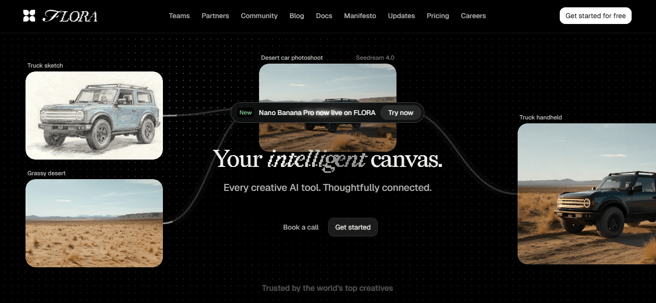
FLORA is an AI-native creative canvas that unifies text, image, and video generation on one infinite canvas. Its node-based system gives you programmatic control over variants, so you can generate a master composition and then produce device-specific crops, type-safe overlays, and campaign variants without hopping between tabs.
Model Chaining and Rework Reduction
Teams that need consistent output across banners, social, and display will value FLORA’s real-time collaboration and model chaining, which reduces manual rework when art direction or copy changes. The tradeoff is an initial mental model to learn, but once established, it eliminates repetitive export and versioning friction.
2. Canva
Canva is the fastest way to spin up professional-looking banners from templates and simple AI prompts. Use it when time and clarity matter: quick brand-aligned layouts, fast resizing, and export presets get you live without specialist skills. It pairs well with a centralized brand kit for smaller teams that cannot justify a full-time designer. Expect limits when you need deep, custom photo retouching or precise layout rules at scale; Canva favors speed over programmatic variant control.
3. Fotor
Fotor shines at photo-first banners, with robust background removal, object eraser, and artistic effects that make imagery sing. If your banner relies on a polished in-studio photo or product shot, Fotor will often produce the cleanest single-image result. The weakness is that its layout and brand-control features feel shallow for heavy-brand projects, so organizations that need strict typographic systems or many localized variants will find themselves rebuilding in another tool.
4. Visme
Visme offers flexible templates and a serious brand kit for teams that publish data-rich content and want on-brand visual systems. It supports saved color palettes, fonts, and shared assets so designers can keep multiple pages consistent. New users report a steeper learning curve, so plan more ramp time and a short playbook for everyday banner tasks before handing it to a broader team.
Polished Storytelling and Data Visuals
For companies that prioritize polished storytelling and data visuals in their header, Visme is a strong choice. Most teams handle banner production by creating a single polished file and manually exporting crops, because that workflow is familiar and immediate. That works until languages, campaign variants, and stakeholder input multiply, at which point review cycles lengthen and errors crop up. Platforms like FLORA provide an alternative path, letting teams generate consistent, production-grade variants in real time, which compresses variant production from days to hours while keeping visual rules intact.
5. VistaCreate
VistaCreate is a clean, beginner-friendly editor with many ready-made templates and straightforward drag-and-drop controls. It is a fast option for small teams who want usable banners without deep design skills. Watch out for the free plan limits and paywalled templates, which can cause pain if you rely on AI credits or need a high volume of templates. If your workflow depends on many AI-driven iterations per month, factor those credit constraints into capacity planning.
6. Venngage
Venngage blends simple design controls with strong charting and layout help, and its newer AI layout suggestions can speed ideation. It is a sensible pick when your banner needs to align with broader report materials or data-led content, and when you want easy, branded templates for recurring campaigns. The editor is straightforward, and the interactive visuals can be repurposed across company pages.
7. Piktochart
Piktochart has polished templates and useful image-refinement tools that help you craft distinctive banners. If you favor highly styled templates and need built-in AI image editing, Piktochart can deliver unique looks quickly. Its search and taxonomy for templates can feel mixed, so expect some time finding exact matches; that search pain is solvable with an internal pattern library or saved templates once you lock designs.
Why Choose One Tool Over Another?
Match tool strengths to constraints. If you need fast social media variants and non-designers to publish, choose Canva or VistaCreate. If you prioritize photo finishing, choose Fotor. If your banners must tie into data presentations and brand systems, choose Visme or Venngage. If you want programmatic variant generation and on‑canvas iteration across image, text, and video, select a unified canvas like FLORA.
Practical Workflow Patterns to Reduce Rework
Create a single brief and a locked brand kit before design work begins, so previews do not prompt endless copy edits.
Use a master asset with overlay guides so every export preserves a safe zone and type hierarchy.
Save a small set of approved templates for each audience segment to avoid ad hoc one-offs that break consistency.
2x Engagement, 30% Visibility
A quick proof point about visuals and engagement—the kind of outcome your banner should support: according to data showing that LinkedIn posts with images receive 2x higher engagement, imagery materially improves attention, and findings that companies with optimized LinkedIn banners see a 30% increase in brand visibility.
How Teams Actually Feel and Fail
This pattern appears across in-house and agency teams: designers deliver a great master, non-designers crop or edit it, and the result drifts from brand standards. It is exhausting when each release spawns a new round of micro-fixes. When teams adopt a single canvas or a locked template library, approvals shrink, and confidence grows because people can point to a single source of truth.
A Finishing Analogy
Think of your banner workflow like a kitchen where one chef makes a sauce that everyone tastes. In a chaotic kitchen, each cook re-seasoned the sauce, and it ended up salty. Centralize the recipe and the seasoning, and every plate tastes the same. That simple fix looks solved, until a campaign needs twenty localized variants in two days, and the old process shows its limits.
Try FLORA's AI-native Creative Canvas for Free Today
I know how draining it is to juggle tabs and rebuild banners for every format, so consider using a single intelligent canvas—more than 10,000 users have already tried FLORA’s AI-native Creative Canvas. Teams are reporting real gains too, with 90% of users noting increased productivity using FLORA’s Creative Canvas. Try FLORA’s AI playground for free and see whether it shortens your review cycles and keeps your brand consistent.


"/><stop offset="1" stop-color="rgba(15, 15, 15, 0)"/></linearGradient></defs><path d="M 899.729 124.429 L 931.177 124.429 L 931.177 108.467 L 946.905 108.467 L 946.905 44.616 L 884.001 44.616 L 884.001 92.504 L 868.274 92.504 L 868.274 124.429 L 852.554 124.429 L 852.554 140.392 L 836.826 140.392 L 836.826 156.355 L 852.554 156.355 L 852.554 172.317 L 836.826 172.317 L 836.826 204.242 L 821.098 204.242 L 821.098 236.168 L 852.554 236.168 L 852.554 252.129 L 758.2 252.129 L 758.2 236.167 L 789.65 236.167 L 789.65 204.241 L 805.378 204.241 L 805.378 172.316 L 821.098 172.316 L 821.098 124.428 L 836.826 124.428 L 836.826 92.504 L 852.554 92.504 L 852.554 44.616 L 836.826 44.616 L 836.826 28.654 L 962.625 28.654 L 962.625 44.616 L 978.353 44.616 L 978.353 60.579 L 994.081 60.579 L 994.081 76.541 L 978.353 76.541 L 978.353 124.429 L 946.905 124.429 L 946.905 140.392 L 931.177 140.392 L 931.177 156.355 L 946.905 156.355 L 946.905 236.168 L 978.417 236.168 L 978.417 220.205 L 994.145 220.205 L 994.145 204.242 L 1009.865 204.242 L 1009.865 188.28 L 1025.593 188.28 L 1025.593 204.242 L 1009.865 204.242 L 1009.865 220.205 L 994.145 220.205 L 994.145 236.168 L 1025.593 236.168 L 1025.593 252.13 L 915.449 252.13 L 915.449 156.355 L 899.729 156.355 Z M 1135.672 172.317 L 1119.944 172.317 L 1119.944 76.541 L 1104.216 76.541 L 1104.216 92.504 L 1088.496 92.504 L 1088.496 108.467 L 1072.768 108.467 L 1072.768 92.504 L 1088.496 92.504 L 1088.496 76.541 L 1104.216 76.541 L 1104.216 60.579 L 1119.944 60.579 L 1119.944 28.654 L 1135.672 28.654 L 1135.672 60.579 L 1151.392 60.579 L 1151.392 236.168 L 1167.12 236.168 L 1167.12 252.13 L 1104.216 252.13 L 1104.216 236.168 L 1119.944 236.168 L 1119.944 188.28 L 1135.672 188.28 Z M 1072.768 124.429 L 1072.768 140.392 L 1057.041 140.392 L 1057.041 156.355 L 1041.321 156.355 L 1041.321 172.317 L 1025.593 172.317 L 1025.593 156.355 L 1041.321 156.355 L 1041.321 140.392 L 1057.041 140.392 L 1057.041 124.429 Z M 176.61 25.988 C 124.406 25.988 78.864 38.954 68.867 80.108 C 64.424 102.095 70.533 130.282 105.522 145.504 C 107.678 146.379 109.332 146.83 110.516 147.152 C 112.382 147.661 113.082 147.852 112.742 148.886 C 112.186 150.577 106.633 150.014 102.19 148.323 C 69.424 136.484 51.65 107.168 54.983 77.289 C 60.536 35.572 109.966 -1.636 179.387 0.056 C 202.713 0.056 238.812 5.692 273.246 15.276 C 293.795 20.914 321.009 28.243 346.555 34.444 C 369.881 24.86 392.096 18.659 411.534 18.659 C 425.628 18.659 438.846 21.919 444.414 28.654 L 537.86 28.654 L 537.86 44.616 L 506.41 44.616 L 506.41 60.579 L 490.685 60.579 L 490.685 92.504 L 474.959 92.504 L 474.959 124.429 L 459.233 124.429 L 459.233 172.317 L 443.508 172.317 L 443.508 220.205 L 427.783 220.205 L 427.783 236.168 L 522.135 236.168 L 522.135 220.205 L 537.86 220.205 L 537.86 204.242 L 553.586 204.242 L 553.586 172.317 L 569.311 172.317 L 569.311 204.242 L 553.586 204.242 L 553.586 236.168 L 537.86 236.168 L 537.86 252.13 L 364.881 252.13 L 364.881 236.168 L 396.332 236.168 L 396.332 220.205 L 412.058 220.205 L 412.058 172.317 L 427.783 172.317 L 427.783 140.392 L 443.508 140.392 L 443.508 92.504 L 459.234 92.504 L 459.234 44.616 L 444.157 44.616 C 437.338 52.415 419.206 55.303 394.318 55.303 C 379.323 55.303 357.108 53.048 349.333 51.92 C 337.67 63.196 325.452 77.853 314.9 90.82 C 305.307 102.032 297.996 111.856 290.818 121.501 C 284.281 130.284 277.855 138.919 269.914 148.323 C 283.798 148.886 298.794 147.759 309.901 143.812 C 320.454 129.155 333.783 122.39 342.669 124.645 C 351.554 126.9 350.444 135.92 337.67 145.504 C 335.4 147.26 333.256 148.887 331.193 150.453 C 322.659 156.932 315.515 162.356 306.569 171.436 C 304.66 173.374 302.994 175.312 301.571 176.968 C 299.269 179.646 297.602 181.584 296.572 181.584 C 293.24 182.148 294.351 172 296.572 166.363 C 299.349 159.597 302.126 154.524 304.903 150.577 C 295.462 153.396 284.91 154.524 266.026 154.524 C 264.938 155.812 263.791 157.222 262.545 158.751 C 259.978 161.904 256.993 165.569 253.253 169.745 C 204.381 225.557 123.85 256 71.645 256 C 29.993 256 0 239.087 0 212.591 C 0 193.987 12.774 175.947 34.99 175.947 C 53.317 175.947 61.092 188.349 60.537 200.188 C 59.981 208.644 57.204 213.718 51.651 219.92 C 47.763 224.429 44.431 228.376 44.431 234.013 C 44.431 243.597 52.762 249.798 68.867 250.362 C 111.631 253.181 142.177 234.013 176.61 195.678 C 190.494 180.456 200.491 168.054 210.488 153.96 C 198.27 153.96 186.607 153.96 179.943 154.524 C 172.902 154.799 168.37 155.744 165.639 156.313 C 162.768 156.912 161.886 157.096 162.17 155.652 C 162.726 153.396 167.724 149.45 184.385 148.323 C 188.537 147.94 196.791 148.077 204.443 148.204 C 208.052 148.264 211.528 148.323 214.375 148.323 C 222.151 137.611 231.037 125.772 242.7 113.37 C 264.915 89.128 294.35 65.451 323.23 47.411 C 307.124 45.719 281.021 40.645 263.804 37.263 C 239.923 32.753 203.268 25.988 177.166 25.988 L 176.61 25.988 Z M 365.438 39.518 C 386.542 45.156 403.204 46.847 413.2 46.847 C 427.64 46.847 440.969 42.336 441.524 36.136 C 442.08 29.37 428.751 24.296 410.979 24.296 L 410.423 24.296 C 394.317 24.296 375.435 32.753 365.438 39.518 Z M 711.023 252.129 L 616.672 252.129 L 616.672 236.167 L 600.946 236.167 L 600.946 220.204 L 585.221 220.204 L 585.221 108.466 L 600.946 108.466 L 600.946 76.54 L 616.672 76.54 L 616.672 60.578 L 632.396 60.578 L 632.396 44.616 L 663.847 44.616 L 663.847 28.654 L 758.2 28.654 L 758.2 44.616 L 773.924 44.616 L 773.924 60.579 L 789.65 60.579 L 789.65 172.317 L 773.924 172.317 L 773.924 188.28 L 758.2 188.28 L 758.2 220.205 L 742.474 220.205 L 742.474 236.168 L 711.023 236.168 Z M 663.847 44.616 L 663.847 60.579 L 648.122 60.579 L 648.122 76.541 L 632.396 76.541 L 632.396 108.467 L 616.672 108.467 L 616.672 220.205 L 632.396 220.205 L 632.396 236.168 L 695.298 236.168 L 695.298 220.205 L 711.023 220.205 L 711.023 204.242 L 726.749 204.242 L 726.749 188.28 L 742.474 188.28 L 742.474 156.355 L 758.2 156.355 L 758.2 60.579 L 742.474 60.579 L 742.474 44.616 Z" fill="url(%23k7ftP17bN-2050371890-linear-gradient)" height="255.9995555606772px" id="k7ftP17bN" width="1167.1199228535695px"/></svg>)