Nov 13, 2025

FLORA

You send a weekly newsletter and the hero image looks perfect on your laptop, but gets cut off on a phone. Banner size matters because the wrong email header size or banner dimensions can hide your call to action, slow load time, and tank engagement. This article provides clear guidelines for email banner size, including pixel width and aspect ratio, file size, resolution, safe area, and responsive template tips, to help you design for maximum impact. Ready to stop guessing and start creating banners that work across desktop and mobile?
Flora AI’s AI playground helps you test and preview banner dimensions, compress images, and fine-tune header size and layout in real-time, so you can see how your design performs on different devices without writing code.
Table of Contents
Standard Email Banner Sizes (and When to Use Each)
Designing for Mobile and Responsive Emails
File Size and Format Best Practices
5 Tools to Create Perfectly Sized Email Banners
Try FLORA's AI-native Creative Canvas for Free Today
Summary
Desktop email headers should be conservative, with recommended widths of 650 to 700 pixels and heights between 90 and 200 pixels. Header files should be kept under 100 KB to avoid clipping and slow loading times.
Design mobile banners as a separate canvas, targeting a width of about 350px and a height of up to 100px, because 46% of all email opens occur on mobile devices, and pixel density can compromise legibility if not adequately tested.
Select heroes when one visual must dominate the fold, using desktop hero heights of 350 to 500px and a reduced mobile height of around 200px, exporting overlay text at 2x, and maintaining a safe margin to ensure critical copy never crops.
Manual resizing breaks at scale, with workflows that start as a two-hour edit turning into a day-long quality control cycle as campaigns multiply from a few sends to dozens per month.
Prioritize modern codecs and perceptual compression, such as WebP or AVIF, as WebP can reduce image size by up to 50% compared to JPEG, aiming for sub-150 KB on hero images. Notably, a 30% reduction in file size significantly improves load time.
Prevent inbox surprises with automated previews and seeded real-device tests, plus a preflight checklist that includes screenshot diffs, alt text checks, and byte-size limits. Mobile-friendly emails can increase unique clicks by about 15%.
This is where the AI playground fits in. AI playground addresses this by centralizing template rules, auto-resize and batch-export capabilities, and cross-device previews so teams can produce device-optimized banners and reduce manual QC time.
Standard Email Banner Sizes (and When to Use Each)

Email banners are not one-size-fits-all; pick the banner type first, then pick a size that matches both the reading context and the creative intent. For brand headers, select compact, guaranteed-to-render dimensions; for promotional heroes, choose taller canvases that carry visual weight while still fitting within common client widths.
What Size Should My Email Header Be?
For desktop headers, use a width and height that play safe across clients, so your logo and masthead never get cropped, and your layout grid stays steady. [For desktops, email headers are ideally 650-700px wide and 90-200px high.
Optimizing Email Headers
Mailmodo recommends that range because those dimensions avoid clipping in the most common desktop clients and give designers room for both identity and quick CTAs. Keep the header file under 100 KB, use SVG for logos when possible, and reserve the taller heights in that range only when you need a photographic or multi-element header.
How Should I Size Banners for Mobile?
Treat mobile as a separate canvas, not a scaled-down desktop. For mobile, it is recommended to use a width of 350px or more and a height of up to 100px. Mailmodo, 2024, frames the mobile guideline so that images fit most handsets without forcing horizontal scrolling or unpredictable client scaling. Use single-column composition, larger tap targets, and test on real devices because an image that looks fine at 1x can crush legibility at 2x if you do not account for pixel density.
When is a Hero Banner Better Than a Short Header?
Choose a hero when a single message or visual must capture the reader’s attention from the full fold, and opt for a short header when navigation, brand recognition, or rapid scanability are the key priorities. For desktop hero banners, aim for widths that align with standard email containers, and heights in the 350- to 500-pixel range to accommodate photography and a bold type lockup. For mobile, reduce the height to approximately 200 pixels and prioritize a single focal point to ensure images crop cleanly. Use a 2x export for hero CTA text that overlays photography, and include a safe margin so critical copy never sits on the edge of a client crop.
Why Do Teams Still Struggle at Scale, and How Does the Process Break Down?
Most teams handle resizing and variant production manually because the tools at hand are familiar and seem quicker for single sends. That works at first, then cracks appear: as campaigns multiply, assets proliferate, stakeholder notes fragment, and inconsistent crops leak into live sends. When you scale from a few weekly campaigns to dozens per month, the manual pathway turns a two-hour edit into a day-long quality control cycle, compromising brand consistency.
How Can Teams Strike a Balance Between Size and Creative Control?
Platforms like FLORA provide template-driven canvases with multi-model generation, auto-resize rules, and batch export, allowing teams to create once and produce channel-optimized variants quickly. These solutions maintain brand tokens, locked margins, and legally safe licensing in the same version history as creative iterations, which shortens review cycles and reduces rework because designers do not have to rebuild or retarget each asset for every client.
What Practical Constraints Matter That Designers Often Miss?
File weight beats pixel perfection when readers are on slow connections, so prioritize compressed 2x PNG or WebP for photographic banners and SVG for vector marks. Strip metadata and aim for a file size of under 150 KB for hero imagery when possible. Also, plan for alt text, fallback background colors, and test with common clients where image blocking or aggressive resizing happens. Think of email banners like tailored clothing, not billboards, where seams and hems matter as much as the print.
A Small Analogy to Keep You Honest
When you resize banners by hand, you are tailoring a suit for a single person, one measurement at a time; when you build rules and templates, you draft a pattern that fits a hundred different sizes without stitching each garment from scratch. That solution feels complete, until you realize most readers are opening on tiny screens and the rules change in ways you will not predict.
Related Reading
Designing for Mobile and Responsive Emails
Design for mobile by narrowing the message and building fallbacks, not by trying to force a desktop layout onto a small screen. Use responsive patterns that let the banner prioritize the single action you want the reader to take, while providing reliable fallbacks when clients strip advanced styles. According to Litmus, 46% of all email opens occur on mobile devices; that reality shifts the goal from elaborate composition to readable, tappable clarity.
How Should You Prioritize Content on Cramped Screens?
This pattern appears across promotional, transactional, and lifecycle emails: when every pixel counts, choices are editorial. Lead with one clear proposition and one call to action, then layer supporting detail below the fold so the banner never competes with itself. Treat imagery as context, not the carrier of critical copy; if the client blocks images, the message must still be readable and practical. That tradeoff feels frustrating when you poured hours into a hero image only to lose the headline on small screens, but choosing a single focus saves countless rounds of emergency resizing.
Which Coding Strategies Survive the Chaos of Email Clients?
When compatibility matters most, prefer percentage-based containers, max-width constraints, and inline styles that are most resilient to the most aggressive clients. Use hybrid patterns that combine simple fluid layouts with targeted media queries, where supported. Always include a robust fallback, such as stacked blocks and fully functional, non-image buttons.
Email vs. Web Design
The failure mode I consistently see is treating email like the web: relying on external fonts, complex selectors, or background images without fallback causes legibility and click-through failures. Think progressive enhancement, not graceful degradation, so the base experience is solid and the enhancements add polish on capable clients.
Avoid Single-Size Exports
Most teams still push one-size exports and rely on client scaling because it is familiar and quick at first. That approach works for a handful of sends, but as campaigns, languages, and promos multiply, manual fixes and inconsistent crops create rework and lost revenue.
How Do You Test Reliably Without Burning the Schedule?
This failure appears when teams eyeball on a single device, then discover rendering surprises in live sends. Use automated inbox previews that capture iOS and Android clients, seed tests to diverse real-device accounts, and include a quick human pass on the most critical recipients. Because Campaign Monitor mobile-friendly emails can increase unique clicks by 15%, focus tests on tap targets, visible CTA text, and image fallbacks to protect engagement metrics.
What Small Process Changes Actually Reduce Headaches?
Adopt preflight checks in your release pipeline: screenshot diffs for the main client set, an accessibility lint for contrast and font sizes, and a lightweight checklist that flags image-as-text, missing alt, or oversized assets before review. Add seeded approvals with annotated screenshots so stakeholders sign off on the exact pixel they will receive, not an abstract comp. That discipline turns last-minute panic into predictable, fast iteration.
Next-Gen Creative Scaling
FLORA is the first AI-native creative canvas that unifies text, image, and video generation in one infinite AI playground. Try FLORA's AI playground for free today and see how designing once can scale into hundreds of channel-ready banners without the friction of manual resizing. The trickiest mistakes happen after you ship, and what comes next quietly decides whether your banners earn clicks or get deleted.
Related Reading
File Size and Format Best Practices

Start with codecs that save bytes without requiring designers to compromise their intent: convert photographic banners to modern formats, strip metadata, and automate multiple output sizes so that each recipient receives the smallest, most transparent file their client can render. Treat format choice and compression as a production decision, not an afterthought, because those two actions decide whether your creative reaches the inbox or gets truncated by slow rendering.
Which Image Formats Should I Prioritize for Eyeballs and Bytes?
Pick WebP or AVIF for photographic banners, then fall back to widely supported formats only where necessary. Use vector formats for logos and small marks where precise scaling is required. Convert originals into modern codecs as part of the export process, as using the WebP format can reduce image file sizes by up to 50% compared to JPEG (Firecrawl Blog, 2023), allowing you to maintain richer visuals while reducing download delays.
How Aggressively Should I Compress and What Gets Tossed?
Aim for perceptual compression, not cosmetic perfection. Strip EXIF and color profiles you do not need, crop to the actual visual area, and use quality ladders: try WebP quality 60, then inspect at 100, 75, and 60 to find the inflection point where artifacts become noticeable. Remember that modest reductions in file size matter because reducing image file sizes by 30% can significantly improve page load times. Faster loads directly preserve engagement on slow mobile networks.
Which Delivery Patterns Survive the Email Client Maze?
Do not rely solely on srcset, as many clients do not support it. Produce device-appropriate variants and utilize conditional rendering where supported, VML for Outlook background images, and plain image fallbacks with robust alt text for clients that strip styles. For animation, prefer short MP4 previews with a poster image when the client supports video, or use GIFs within tight time and frame limits. Consider Lottie for vector motion when you can provide a static fallback.
What Practical Checks Stop Surprises Before Send?
Automate a preflight process that verifies final byte sizes, checks color conversion to sRGB, confirms the presence of alternative text, and generates screenshot diffs for key clients. Build a small rule set: max file size per variant, allowed formats per channel, and a quality threshold that fails the build if an asset breaches those rules. This brief checklist prevents last-minute re-exports and the ensuing frantic Slack messages.
The Cost of Manual Resizing
Most teams handle resizing and format conversion manually because it seems quick for one-off sends, but this habit breaks down when campaigns multiply and variants multiply even faster.
As a result, export queues pile up, creatives chase approvals across multiple threads, and quality control becomes reactive instead of being built into the process.
Streamlined Variant Preparation
Platforms like FLORA offer template-driven batch export, automated format conversion to WebP and AVIF, and locked brand tokens, allowing teams to find their variants generated with the correct margins, codecs, and licenses. This compresses variant preparation from hours per campaign to minutes, while maintaining creative intent. Think of each banner as luggage for a trip: smaller, smarter packing means you arrive ready to act, not delayed by extra baggage. That solution sounds final, but the part that actually breaks teams happens next.
5 Tools to Create Perfectly Sized Email Banners
1. FLORA AI
FLORA AI, an AI-native creative canvas, is built around node-based workflows, template reuse, and batch export, so you design a master banner and generate hundreds of size and copy variants without rebuilding layouts. Use FLORA to set locked brand tokens, create multi-model generations (image, copy, video), and attach export rules that automatically emit device-appropriate files and codecs. For production teams, this means you stop treating size as a final spec and make it a generation parameter, so every iteration preserves margins, safe zones, and licensing in the same version history.
How Teams Use It in Practice
When teams adopt a template-first workflow on FLORA, they convert single-use banners into repeatable recipes. One node holds the hero image, another the headline, and another the responsive grid; the export node then produces all required variants. That keeps creative control in the canvas yet automates the tedious parts of resizing, format conversion, and license tracking.
Asset Guidance for Scaling
Capture source images large enough to allow confident crops and retargeting, for example, sourcing originals at [1800 pixels](https://send2.co/what-is-the-ideal-email-banner-size/), Send, 2025, so crops and motion frames stay sharp across hero and large-format variants. FLORA ingests those originals, runs multi-model suggestions, and outputs compressed WebP or AVIF variants according to your export rules.
2. Canva
Canva is the easiest entry point for creating quick banners and rapid templating, especially for teams that require a low learning curve and access to a wide range of ready-made assets. Start a reusable template in Canva, lock your brand kit, and use Magic Resize to produce basic variants; that workflow is fine for low-volume sends and non-technical users.
Practical Tradeoffs
Canva’s free tier is suitable for simple needs, but it often requires manual work when projects require premium images, background removal, or high-resolution resizing. That friction is why many teams upgrade to Pro to gain magic resize, extended asset libraries, and shared template folders that prevent chaotic re-exports.
How to Make It Scale
Treat Canva as a rapid ideation canvas, then export masters into a production system that enforces consistent margins and codecs; think of Canva as sketching the recipe, not running the factory.
3. Visme
Visme provides non-designers with an approachable editor and offers permanent, free access to basic templates, making it an attractive option for teams that need one-off banners without subscription lock-in. It’s fast for text-on-image promotions and simple hero headers, and it supports exporting standard image formats that integrate with email builders.
Where It Fits in a Pipeline
Use Visme for quick prototype banners or content that will not require heavy localization or large variant sets. When repeatability matters, move Visme outputs into a templating system that handles multi-resolution exports and accessibility checks.
4. Adobe Photoshop
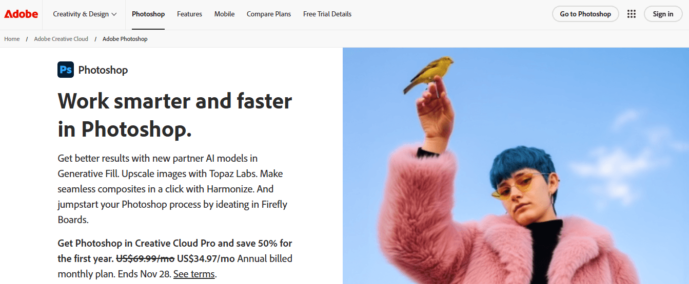
Photoshop remains the high-fidelity tool when you need precise control over retouching, masking, and pixel-level composition. For production, treat Photoshop as the source editor, where you assemble the master artboard. Then, export layered masters or PSD assets into an automated pipeline for resizing and format conversion.
When to pick Photoshop
Choose Photoshop when the creative intent depends on custom retouch, high-dynamic-range blending, or complex masking that simpler editors cannot reproduce. The tradeoff is time: high-fidelity edits often require more QA and a production step to convert layered files into templated outputs.
5. Figma
Figma is ideal for teams that need responsive components and collaborative design systems, because it makes it simple to create flexible components, set constraints, and export multiple asset scales for email. Build responsive components that contain logo marks, headline blocks, and CTA buttons, then export at multiple resolutions or use plugins to automate slices for email.
Designing Templates the Right Way
Start with a working canvas size that allows you to iterate quickly and produce clean crops across channels. For example, a flexible working width of 600-700px, as recommended by Mailmodo in 2024, can serve as your master file size to maintain predictable alignment when batch-exporting variants. Then use component constraints to ensure logos and CTAs never collapse during automatic resizing.
Status Quo Disruption: The Three-Step Pattern
Most teams handle sizing and approvals through a mix of email threads, manual resizes, and repeated exports because those methods are familiar and require no new tooling. That approach works at first, but as campaigns multiply, feedback scatters, versions pile up, and designers spend disproportionate time reconciling conflicting notes instead of creating. Teams find that platforms like FLORA AI centralize templates, preserve brand tokens, and automate batch exports, compressing review cycles from days to hours while maintaining a clear audit trail of who made changes.
A Production Habit That Actually Saves Time
Pattern recognition across teams reveals that the real bottleneck is not the canvas, but rather the export handoff. If you standardize a master template and automate exports and format conversion, you remove the repeated manual step that consumes creative bandwidth. Think of it like converting a craft bakery into a small-scale factory; you keep the same recipes, but you stop baking each loaf by hand.
Choosing Tools by Constraint, Not Preference
If your constraint is speed and low learning overhead, consider using Canva or Visme for mockups and rapid turnaround. If your constraint is fidelity and retouching, use Photoshop for masters. If your constraints are collaborative iteration and responsive components, Figma is the ideal platform to define these requirements. When your constraint is volume, consistency, and automated exports, move masters into a canvas that supports template rules and batch generation.
A Short Analogy to Help Decide
Treat your banner system like a modular kitchen: one set of standardized cabinets and fixtures, many different meals prepared quickly, not a new set of bespoke tools for every dinner.
Curiosity Loop
That improvement sounds useful, but the surprising part is how a single change to the canvas can flip weeks of rework into minutes.
Related Reading
Try FLORA's AI-native Creative Canvas for Free Today
When campaigns multiply, quick fixes that once felt efficient can turn into hours of rework. Reclaim that time with FLORA's AI playground, featuring a single, infinite canvas that allows teams to design once and generate consistent, production-ready banners across channels while maintaining full creative control. Over 50,000 users have tried FLORA's AI-native Creative Canvas, and users report saving an average of 3 hours per week by switching to this streamlined workflow.


"/><stop offset="1" stop-color="rgba(15, 15, 15, 0)"/></linearGradient></defs><path d="M 899.729 124.429 L 931.177 124.429 L 931.177 108.467 L 946.905 108.467 L 946.905 44.616 L 884.001 44.616 L 884.001 92.504 L 868.274 92.504 L 868.274 124.429 L 852.554 124.429 L 852.554 140.392 L 836.826 140.392 L 836.826 156.355 L 852.554 156.355 L 852.554 172.317 L 836.826 172.317 L 836.826 204.242 L 821.098 204.242 L 821.098 236.168 L 852.554 236.168 L 852.554 252.129 L 758.2 252.129 L 758.2 236.167 L 789.65 236.167 L 789.65 204.241 L 805.378 204.241 L 805.378 172.316 L 821.098 172.316 L 821.098 124.428 L 836.826 124.428 L 836.826 92.504 L 852.554 92.504 L 852.554 44.616 L 836.826 44.616 L 836.826 28.654 L 962.625 28.654 L 962.625 44.616 L 978.353 44.616 L 978.353 60.579 L 994.081 60.579 L 994.081 76.541 L 978.353 76.541 L 978.353 124.429 L 946.905 124.429 L 946.905 140.392 L 931.177 140.392 L 931.177 156.355 L 946.905 156.355 L 946.905 236.168 L 978.417 236.168 L 978.417 220.205 L 994.145 220.205 L 994.145 204.242 L 1009.865 204.242 L 1009.865 188.28 L 1025.593 188.28 L 1025.593 204.242 L 1009.865 204.242 L 1009.865 220.205 L 994.145 220.205 L 994.145 236.168 L 1025.593 236.168 L 1025.593 252.13 L 915.449 252.13 L 915.449 156.355 L 899.729 156.355 Z M 1135.672 172.317 L 1119.944 172.317 L 1119.944 76.541 L 1104.216 76.541 L 1104.216 92.504 L 1088.496 92.504 L 1088.496 108.467 L 1072.768 108.467 L 1072.768 92.504 L 1088.496 92.504 L 1088.496 76.541 L 1104.216 76.541 L 1104.216 60.579 L 1119.944 60.579 L 1119.944 28.654 L 1135.672 28.654 L 1135.672 60.579 L 1151.392 60.579 L 1151.392 236.168 L 1167.12 236.168 L 1167.12 252.13 L 1104.216 252.13 L 1104.216 236.168 L 1119.944 236.168 L 1119.944 188.28 L 1135.672 188.28 Z M 1072.768 124.429 L 1072.768 140.392 L 1057.041 140.392 L 1057.041 156.355 L 1041.321 156.355 L 1041.321 172.317 L 1025.593 172.317 L 1025.593 156.355 L 1041.321 156.355 L 1041.321 140.392 L 1057.041 140.392 L 1057.041 124.429 Z M 176.61 25.988 C 124.406 25.988 78.864 38.954 68.867 80.108 C 64.424 102.095 70.533 130.282 105.522 145.504 C 107.678 146.379 109.332 146.83 110.516 147.152 C 112.382 147.661 113.082 147.852 112.742 148.886 C 112.186 150.577 106.633 150.014 102.19 148.323 C 69.424 136.484 51.65 107.168 54.983 77.289 C 60.536 35.572 109.966 -1.636 179.387 0.056 C 202.713 0.056 238.812 5.692 273.246 15.276 C 293.795 20.914 321.009 28.243 346.555 34.444 C 369.881 24.86 392.096 18.659 411.534 18.659 C 425.628 18.659 438.846 21.919 444.414 28.654 L 537.86 28.654 L 537.86 44.616 L 506.41 44.616 L 506.41 60.579 L 490.685 60.579 L 490.685 92.504 L 474.959 92.504 L 474.959 124.429 L 459.233 124.429 L 459.233 172.317 L 443.508 172.317 L 443.508 220.205 L 427.783 220.205 L 427.783 236.168 L 522.135 236.168 L 522.135 220.205 L 537.86 220.205 L 537.86 204.242 L 553.586 204.242 L 553.586 172.317 L 569.311 172.317 L 569.311 204.242 L 553.586 204.242 L 553.586 236.168 L 537.86 236.168 L 537.86 252.13 L 364.881 252.13 L 364.881 236.168 L 396.332 236.168 L 396.332 220.205 L 412.058 220.205 L 412.058 172.317 L 427.783 172.317 L 427.783 140.392 L 443.508 140.392 L 443.508 92.504 L 459.234 92.504 L 459.234 44.616 L 444.157 44.616 C 437.338 52.415 419.206 55.303 394.318 55.303 C 379.323 55.303 357.108 53.048 349.333 51.92 C 337.67 63.196 325.452 77.853 314.9 90.82 C 305.307 102.032 297.996 111.856 290.818 121.501 C 284.281 130.284 277.855 138.919 269.914 148.323 C 283.798 148.886 298.794 147.759 309.901 143.812 C 320.454 129.155 333.783 122.39 342.669 124.645 C 351.554 126.9 350.444 135.92 337.67 145.504 C 335.4 147.26 333.256 148.887 331.193 150.453 C 322.659 156.932 315.515 162.356 306.569 171.436 C 304.66 173.374 302.994 175.312 301.571 176.968 C 299.269 179.646 297.602 181.584 296.572 181.584 C 293.24 182.148 294.351 172 296.572 166.363 C 299.349 159.597 302.126 154.524 304.903 150.577 C 295.462 153.396 284.91 154.524 266.026 154.524 C 264.938 155.812 263.791 157.222 262.545 158.751 C 259.978 161.904 256.993 165.569 253.253 169.745 C 204.381 225.557 123.85 256 71.645 256 C 29.993 256 0 239.087 0 212.591 C 0 193.987 12.774 175.947 34.99 175.947 C 53.317 175.947 61.092 188.349 60.537 200.188 C 59.981 208.644 57.204 213.718 51.651 219.92 C 47.763 224.429 44.431 228.376 44.431 234.013 C 44.431 243.597 52.762 249.798 68.867 250.362 C 111.631 253.181 142.177 234.013 176.61 195.678 C 190.494 180.456 200.491 168.054 210.488 153.96 C 198.27 153.96 186.607 153.96 179.943 154.524 C 172.902 154.799 168.37 155.744 165.639 156.313 C 162.768 156.912 161.886 157.096 162.17 155.652 C 162.726 153.396 167.724 149.45 184.385 148.323 C 188.537 147.94 196.791 148.077 204.443 148.204 C 208.052 148.264 211.528 148.323 214.375 148.323 C 222.151 137.611 231.037 125.772 242.7 113.37 C 264.915 89.128 294.35 65.451 323.23 47.411 C 307.124 45.719 281.021 40.645 263.804 37.263 C 239.923 32.753 203.268 25.988 177.166 25.988 L 176.61 25.988 Z M 365.438 39.518 C 386.542 45.156 403.204 46.847 413.2 46.847 C 427.64 46.847 440.969 42.336 441.524 36.136 C 442.08 29.37 428.751 24.296 410.979 24.296 L 410.423 24.296 C 394.317 24.296 375.435 32.753 365.438 39.518 Z M 711.023 252.129 L 616.672 252.129 L 616.672 236.167 L 600.946 236.167 L 600.946 220.204 L 585.221 220.204 L 585.221 108.466 L 600.946 108.466 L 600.946 76.54 L 616.672 76.54 L 616.672 60.578 L 632.396 60.578 L 632.396 44.616 L 663.847 44.616 L 663.847 28.654 L 758.2 28.654 L 758.2 44.616 L 773.924 44.616 L 773.924 60.579 L 789.65 60.579 L 789.65 172.317 L 773.924 172.317 L 773.924 188.28 L 758.2 188.28 L 758.2 220.205 L 742.474 220.205 L 742.474 236.168 L 711.023 236.168 Z M 663.847 44.616 L 663.847 60.579 L 648.122 60.579 L 648.122 76.541 L 632.396 76.541 L 632.396 108.467 L 616.672 108.467 L 616.672 220.205 L 632.396 220.205 L 632.396 236.168 L 695.298 236.168 L 695.298 220.205 L 711.023 220.205 L 711.023 204.242 L 726.749 204.242 L 726.749 188.28 L 742.474 188.28 L 742.474 156.355 L 758.2 156.355 L 758.2 60.579 L 742.474 60.579 L 742.474 44.616 Z" fill="url(%23k7ftP17bN-2050371890-linear-gradient)" height="255.9995555606772px" id="k7ftP17bN" width="1167.1199228535695px"/></svg>)