Nov 16, 2025

FLORA

Ever upload a shop header and see your logo chopped off or your product photos blurred on a phone? Banner size matters: knowing Etsy banner dimensions, pixel resolution, aspect ratio, and the safe area ensures your shop cover photo remains sharp on both desktop and mobile. This piece guides you through Etsy shop banner size, file formats such as PNG and JPEG, and provides practical design tips and best practices to ensure your storefront looks polished and true to your brand.
To make that easier, FLORA AI's AI playground lets you test sizes, preview desktop and mobile views, and get quick design feedback tailored to your Etsy Shop Banner Size and branding.
Table of Contents
Standard Etsy Banner Sizes
How Your Banner Displays on Mobile vs. Desktop
File Formats and Upload Requirements
3 Design Directives for a High-Quality Etsy Banner
6 Tools for Designing Etsy Banners
Try FLORA's intelligent Creative Canvas for Free Today
Summary
Choosing the right pixel dimensions determines whether a banner reads like a clear sign or static noise. Design full-width headers at 3360 x 840 pixels with a minimum baseline of 1200 x 300 pixels. Use 1200 x 160 pixels for mini banners, which do not render on mobile devices.
Mobile now dominates attention patterns, with handheld devices accounting for approximately 70% of digital media time, and optimized mobile banners showing roughly 50% higher engagement. Therefore, prioritize large type, high contrast, and obvious tap targets for phone views.
Export decisions matter as much as layout: use high-quality JPEGs for photos, PNGs for crisp logos and text, maintain the sRGB profile, generate 2x (retina) versions, and respect practical upload limits, such as an approximate 50 MB maximum, to avoid server re-encoding issues.
Manual, multi-tool workflows fragment assets as SKUs and promotions scale, stretching review cycles. In contrast, teams that centralize the generation and export of report compression iterations can reduce the time from days to minutes.
Treat banner design as testable product work: run one controlled A/B swap at a time over a one to two week window, because a well-designed Etsy banner has been linked to a 25% increase in sales, and 80% of sellers say quality banners boost credibility.
This is where FLORA'S intelligent AI playground comes in, allowing teams to test sizes, preview desktop and mobile views, and spin one approved concept into hundreds of device-optimized variants. The system offers speed and control.
Standard Etsy Banner Sizes
Etsy supports two primary banner formats: a full-width big banner for maximum visual impact, and a slimmer mini banner for a cleaner, product-forward header. Design your full-width header at 3360 x 840 pixels for the sharpest results. Keep a minimum baseline of 1200 x 300 pixels to avoid pixelation. Mini banners typically measure 1200 x 160 pixels and are not visible on mobile devices.
Why Does Banner Size Matter?
The truth is, the pixel dimensions you choose determine whether your banner reads like a clear sign or like static noise. Larger, properly scaled files preserve detail and type, while undersized assets force automatic compression and cropping that steal clarity.
How Should You Approach Layout and Safe Zones?
When preparing multi-size headers, the first step is to mark a safe zone where logos and primary text reside, roughly in the central area of the composition, so that nothing essential gets chopped off during automatic cropping. Treat the edges as bleed, keep type inside the safe band, and use layered source files so you can nudge elements for each export without redesigning the whole image, a precise habit that removes guesswork.
The Friction of Fragmentation: From Manual Process to Bottleneck
Most teams follow a familiar process, switching between a design app, a cropping tool, and a separate export step because that workflow is simple and feels reliable. That approach works until product lines grow and seasonal promos multiply, at which point files and versions proliferate, review cycles stretch, and simple resizing becomes a bottleneck.
Platforms like FLORA centralize:
Intelligent-system-based generation
Licensing
Export profiles
It allows teams to produce one concept and spin out hundreds of correctly sized, on-brand variants without toggling tools, compressing iteration from days to predictable minutes.
What File Formats And Export Settings Actually Keep Banners Crisp?
If your design is photo-heavy, export at high-quality JPEG to balance detail and file size; if it has crisp logos or text, export PNG to preserve edges. Always export at the pixel dimensions the platform will display, keep the sRGB color profile, and generate 2x (retina) versions when possible, so text and fine textures stay sharp on high-density screens. It’s exhausting when a header looks perfect on desktop and then disappears or becomes unreadable on other views, so test at actual sizes before you publish.
The Legibility Mandate: Decoupling Design Intent from Display Reality
Think of a banner like a storefront awning: the central sign must be legible from the sidewalk, even if the sides are trimmed or the street view changes.That mismatch between design intent and how banners actually display is where the next set of real surprises shows up.
Related Reading
How Your Banner Displays on Mobile vs. Desktop
Desktop and mobile do not just crop the same image differently; they change what the banner is for. On desktop, the header often functions as a composed backdrop that supports browsing, while on mobile, the banner must earn attention quickly because viewers swipe, scan, and decide in a single thumb movement. Design choices, therefore, need to reflect different attention patterns, not just different pixels.
How Does User Attention Shift Between Desktop And Mobile?
Mobile-focused viewing now dominates overall attention, and that changes priorities, not just layout:
Because most impressions happen on smaller screens
Legibility under motion
In short glances, it becomes the practical constraint
On desktops, you can layer nuance and secondary calls to action because people tend to linger, but on phones, you must place the idea and the action where a thumb can reach it, and strip out visual noise that slows cognitive recognition.
Why Do Some Banners Get More Interaction On Phones?
Data shows that mobile banners often produce higher interaction when they are optimized for quick taps, and this shift affects how success is measured. A banner that prioritizes a single readable message and an obvious tap target can outperform a more ornate desktop-first design.
In practice, that changes what you A/B test:
Headline size
CTA contrast
Immediate affordance often beats decorative detail when it comes to chasing engagement on phones.
What Visual Tactics Actually Change Between Devices?
Start with hierarchy, not ornament. On phones, increase type weight, raise contrast between foreground and background, and simplify imagery to single-subject compositions so recognition happens inside a single swipe. Use larger, rounded tap targets and avoid using small text that requires extended viewing. On desktop, you can experiment with subtler gradients, secondary copy, and compositional breathing room, as the viewer has time to parse layered information. Think of the two as different chapters of the same story, not the same page cropped.
Automating Variant Consistency: Compressing Iteration from Days to Hours
Most teams handle this by exporting a few fixed variants and testing them manually, as that approach is familiar and low-friction. This approach works early on, but as product lines and seasonal promotions expand, the manual variant method fractures:
Assets multiply
Review threads lengthen
Maintaining consistency:
Color
Typographic scale
Voice across dozens of exports
It becomes a coordination tax that slows launches and introduces errors. Platforms like the intelligent AI playground centralize generation and export profiles, allowing teams to spin one approved concept into multiple device-optimized variants while maintaining type, color, and brand rules, thereby compressing iteration from days to hours without requiring tool switching.
How Should You Validate Behaviour Across Real Devices?
Treat validation as part of the intuitive creative loop, not a checkbox at the end. Run quick, focused tests on at least three phone widths and two desktop breakpoints, gather engagement and clarity metrics over a short window, and prioritize variants that improve:
Measurable click
Dwell
Conversion outcomes
Use live screenshots, along with a small sample of real-device testing, for thumb reach and perceived contrast. Emulators can catch scale errors, but they miss real-world motion and hand posture. If measurement shows a variant gains interaction on mobile without hurting desktop performance, promote it as the new default rather than preserving legacy artwork for both.
Contextual Clarity: The Imperative for Control in High-Volume Creative Work
A small tactile analogy to keep this practical: a banner is not a poster hung on a wall; it is a storefront sign glimpsed from a moving path, and your job is to make that glimpse decisive for the shopper. FLORA is the first intelligent-native creative canvas that unifies text, image, and video generation in one infinite intelligent playground. Built for professional teams, it replaces the chaos of jumping between tools with a robust system that gives you complete control over your creative process.
File Formats and Upload Requirements
Deliver web-ready PNG or JPEG exports for uploads, while maintaining layered, editable masters and a clear versioning system, so you never have to rebuild an asset from scratch.
Compression strategy
Color conversion
Filename conventions
These small details determine whether a banner appears crisp in the browser or gets distorted by server-side re-encoding.
Which Master And Export Formats Should I Keep?
When we hand projects off to ops or contractors, we keep three things: a layered master (PSD or AI), a flattened high-resolution copy for print or handoff, and a suite of web-optimized exports. For that flattened archive, use a long-lived, widely accepted exchange format, as this choice preserves layout and fonts across platforms when handing files to non-design teams, while layered masters maintain editability intact.
How Can I Reduce File Weight Without Compromising Type or Texture?
The failure point is usually either too much compression, which blurs the type, or no compression at all, which leaves files unusable on slower connections.
Use targeted techniques where targeted on:
Reduce color depth for flat graphic areas with indexed palettes
Apply subtle lossy settings for photographic regions
Prefer efficient encoders like mozjpeg or modern WebP
Strip metadata and EXIF before export to shave kilobytes and avoid accidental color shifts from embedded profiles. Test perceived quality at actual device sizes rather than relying on zoomed previews; a small headline that appears fine at 100 percent can become unreadable in the browser when the platform recompresses the file.
Achieving Output Integrity: Leveraging Centralized Profiles for Scale
Most teams export variants by hand because that workflow feels simple and requires no new tools. That works at first, but as SKUs multiply, exports scatter across drives, naming becomes inconsistent, and quality drifts between batches, resulting in rework and last-minute fixes during launch weeks. Platforms like FLORA offer preset export profiles, centralized asset control, and batch generation, enabling teams to produce consistent, optimized variants at scale while reducing manual touchpoints and review loops.
How Should Teams Name, Version, And Test Assets Before Upload?
If you need to scale, naming and test protocols are nonnegotiable. Use hyphenated, ASCII-friendly filenames, include a precise size or device token (for example, shopbanner-3360x840-v3@2x.jpg), and keep a manifest that maps each filename to its approved use case.
Automate a quick device-check step:
Upload a staging image
Capture screenshots on at least two phone widths and a desktop breakpoint
Verify:
Contrast
Type legibility
Cropping
That small discipline prevents the last-minute panic when a banner reads fine on the designer’s machine but fails in real-world viewing.
Where Should Archival And Team-Sharing Live?
Keep the working set in a versioned design repo and the web-ready exports in a CDN or media manager. Even if your archive can accept large files, expect limits on many repositories. Treat that as a cue to store masters in compressed, export-ready packages rather than monolithic files, and document which export profile created each upload so teams can reproduce any variant quickly. A banner is both a finished artifact and an operational item; think of the master as a recipe card, and the exported files as the dishes that are prepared from it. You want the dish to travel, reheat, and still taste as you intended it to.
3 Design Directives for a High-Quality Etsy Banner
Design choices that respect a small canvas win more often than bigger ideas:
Focus on clarity
A single emotional hook
Repeatable rules that scale across variants
Below are three concrete tactics you can use immediately to make banners that look and perform like they belong to a professional shop.
1. Infuse Brand Colors and Logos
Start by treating the banner as a concentrated brand moment, not a billboard. Place a signature logo or graphic that reads well at small sizes, then pair it with a background image that signals the product category or mood, and anchor everything with a restrained palette so it stands out.
Be ruthless about hierarchy:
Logo and shop name first
Short brand message second
Product hint third
This matters because your header is a credibility shortcut, not decoration. Treat color and mark as identity anchors you can reuse across listings, so variants feel like the same shop at a glance.
2. Strike a Balance
Decide whether the goal is to create a memory or a moment. Use a minimalist approach for steady-state presentation, keeping an icon, wordmark, and one emotional cue so the shop becomes recognizable over repeat visits. Reserve maximal, celebratory art for limited drops and launches, letting color and motion break the usual rules so the event reads as special. This tension between minimal and maximal is precisely where most sellers get stuck: limited space forces tradeoffs, and the failure mode is trying to show everything at once until nothing reads.
Practical Tactics That Help Keep Balance
Select a single focal point and design everything else to complement and support it.
For regular promos, keep a template with locked safe elements so swaps are fast.
For launches, temporarily relax the palette but keep type, logo placement, and tone consistent so the shop still feels like itself.
The Coordination Tax: When Fragmentation Stalls Concept-to-Publish Velocity
Most teams coordinate banner changes across a handful of tools and email threads because that approach feels low friction. That works early on, but as SKUs and seasonal campaigns grow, feedback fragments, assets multiply, and the time between concept and publish stretches from days to weeks.
Solutions like FLORA’s intelligent AI playground centralize:
Generation
Versioning
Export presets
It enables teams to transform a single approved concept into hundreds of on-brand variants, thereby reducing turnaround time and rework while preserving:
Color
Scale
Voice
3. Use A/B Testing
A/B testing is the only reliable path from opinion to evidence. Run one controlled swap at a time, keeping other variables steady, and choose metrics upfront. Use a fixed window that is large enough to capture buying cycles, typically one to two weeks, depending on traffic, and then compare the performance. Testing is worth the effort: a well-designed Etsy banner can lead to a 25% increase in sales, so narrow, measurable experiments pay in real revenue. If traffic is low, run sequential A/B tests on comparable weeks, or pool similar items to achieve statistical significance.
The Market Stall Analogy: Isolating Variables for Pure Performance Data
Think of each test like tasting two recipes at a market stall, keeping everything else identical so you can tell which seasoning actually moved buyers. FLORA is the first intelligent-native creative canvas that unifies text, image, and video generation in one infinite intelligent playground. Built for professional teams, it replaces the chaos of jumping between tools with a robust system that gives complete control over iteration and scale.
Related Reading
6 Tools for Designing Etsy Banners
These six tools cover distinct needs in the Etsy banner workflow: quick templates for non-designers, photo-first editors for product shots, and an intelligent generative canvas for scalable, repeatable variants.
1. FLORA
FLORA provides a single canvas where text, image, and video systems collaborate, allowing you to generate, refine, and batch-export variants without switching between apps. Use it when you need consistency across dozens of banners or seasonal updates, because its system-based structure makes repeatable workflows explicit and reusable.
The real value is evident in collaborative workflows, where teams or partners can edit:
The exact composition in real-time
Reducing version confusion
Speeding up reviews
Practical Tip
Build one high-fidelity master concept, lock in brand tokens like color and wordmark, then use system presets to spin out device-optimized exports and establish consistent naming conventions. That keeps the voice consistent while allowing you to produce hundreds of correctly framed variants at speed.
2. Canva
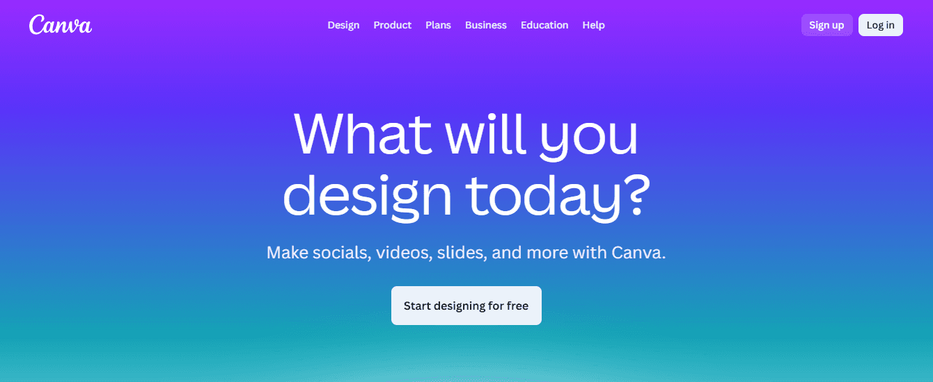
Canva is the fastest path from idea to publication for non-designers, with:
Ready-made banner templates
Drag-and-drop composition
An accessible type and graphics library
It shines when you need clean, professional visuals without a steep learning curve, or when a solo seller needs one-off banners before a launch.
Practical Tip
Think of Canva as pre-cut cookie dough; it speeds up the baking process, but you still need a custom icing for that handmade finish. Add unique photography or a hand-drawn mark to keep the banner feeling authentic.
3. BeFunky
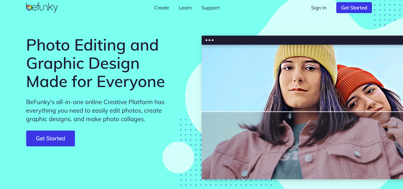
BeFunky is practical when product photography is the banner’s anchor. Its integrated photo editor provides targeted exposure, color correction, and clarity tools, allowing the image to read sharply within a small canvas. Use it as the photo prep step before layout.
Defragmenting the Pipeline: The Value of a Unified Creative Canvas
Most teams stitch these tools together because each one solves a clear problem, and changing that habit feels risky. That familiar approach works well early on, but as product lines and promotions expand, asset versions proliferate, and feedback becomes scattered across tools. Manual exports become the hidden tax on speed. Teams find that platforms like FLORA, offering an intuitive canvas, reduce tool switching and license friction, compressing iteration from days to predictable minutes while keeping brand rules enforced across every export.
4. PicMonkey
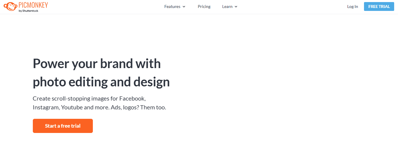
PicMonkey is ideal for sellers who rely on lifestyle imagery and require advanced photo retouching capabilities alongside design features. Its layer-based editing and retouch tools let you refine skin tones, remove distractions, and create believable composites that read as editorial rather than stock.
5. Fotor
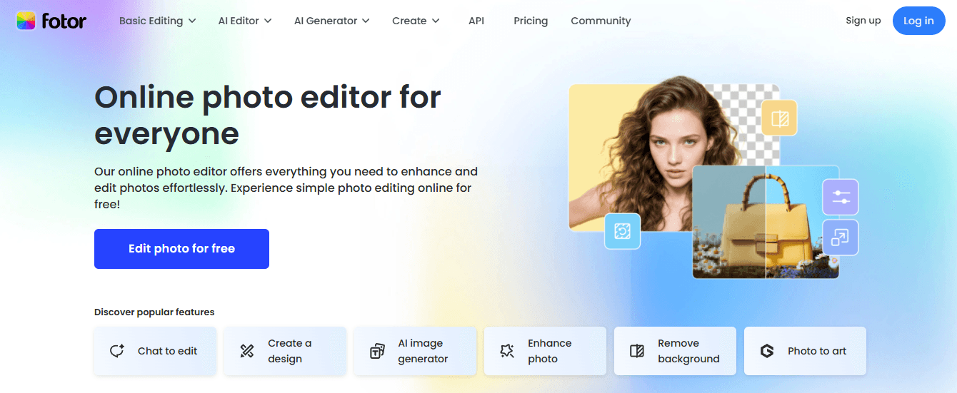
Fotor is the fast and forgiving option for users who want decent results with minimal effort.
The dashboard provides:
Preset layouts
Stock imagery
Essential editing controls
It enables you to create a clean banner quickly and easily.
6. Adobe Express
Adobe Express sits between approachable and professional, offering strong typography, brand kit support, and access to Adobe’s image library, making it a good step up for sellers who may scale into advanced design later. It’s beneficial when typography and type-driven hierarchy are central to your header’s message.
Preserving Nuance at Scale: Integrating Handcrafted Detail with Automation
When you must scale with quality, mix tools intentionally instead of randomly, for example, use BeFunky or PicMonkey to perfect product shots, then import them into Canva or Adobe Express for quick, templated layouts, or feed them into an intelligent-system-based canvas for automated variant generation. This preserves the human touch while allowing repeatable systems to handle laborious tasks.
Try FLORA's intelligent Creative Canvas for Free Today
When we streamlined pipelines for teams, the pattern was clear: switching between editors steals hours and erodes brand consistency. Try FLORA's intelligent AI playground for free today; it can significantly increase production speed and consistency.


"/><stop offset="1" stop-color="rgba(15, 15, 15, 0)"/></linearGradient></defs><path d="M 899.729 124.429 L 931.177 124.429 L 931.177 108.467 L 946.905 108.467 L 946.905 44.616 L 884.001 44.616 L 884.001 92.504 L 868.274 92.504 L 868.274 124.429 L 852.554 124.429 L 852.554 140.392 L 836.826 140.392 L 836.826 156.355 L 852.554 156.355 L 852.554 172.317 L 836.826 172.317 L 836.826 204.242 L 821.098 204.242 L 821.098 236.168 L 852.554 236.168 L 852.554 252.129 L 758.2 252.129 L 758.2 236.167 L 789.65 236.167 L 789.65 204.241 L 805.378 204.241 L 805.378 172.316 L 821.098 172.316 L 821.098 124.428 L 836.826 124.428 L 836.826 92.504 L 852.554 92.504 L 852.554 44.616 L 836.826 44.616 L 836.826 28.654 L 962.625 28.654 L 962.625 44.616 L 978.353 44.616 L 978.353 60.579 L 994.081 60.579 L 994.081 76.541 L 978.353 76.541 L 978.353 124.429 L 946.905 124.429 L 946.905 140.392 L 931.177 140.392 L 931.177 156.355 L 946.905 156.355 L 946.905 236.168 L 978.417 236.168 L 978.417 220.205 L 994.145 220.205 L 994.145 204.242 L 1009.865 204.242 L 1009.865 188.28 L 1025.593 188.28 L 1025.593 204.242 L 1009.865 204.242 L 1009.865 220.205 L 994.145 220.205 L 994.145 236.168 L 1025.593 236.168 L 1025.593 252.13 L 915.449 252.13 L 915.449 156.355 L 899.729 156.355 Z M 1135.672 172.317 L 1119.944 172.317 L 1119.944 76.541 L 1104.216 76.541 L 1104.216 92.504 L 1088.496 92.504 L 1088.496 108.467 L 1072.768 108.467 L 1072.768 92.504 L 1088.496 92.504 L 1088.496 76.541 L 1104.216 76.541 L 1104.216 60.579 L 1119.944 60.579 L 1119.944 28.654 L 1135.672 28.654 L 1135.672 60.579 L 1151.392 60.579 L 1151.392 236.168 L 1167.12 236.168 L 1167.12 252.13 L 1104.216 252.13 L 1104.216 236.168 L 1119.944 236.168 L 1119.944 188.28 L 1135.672 188.28 Z M 1072.768 124.429 L 1072.768 140.392 L 1057.041 140.392 L 1057.041 156.355 L 1041.321 156.355 L 1041.321 172.317 L 1025.593 172.317 L 1025.593 156.355 L 1041.321 156.355 L 1041.321 140.392 L 1057.041 140.392 L 1057.041 124.429 Z M 176.61 25.988 C 124.406 25.988 78.864 38.954 68.867 80.108 C 64.424 102.095 70.533 130.282 105.522 145.504 C 107.678 146.379 109.332 146.83 110.516 147.152 C 112.382 147.661 113.082 147.852 112.742 148.886 C 112.186 150.577 106.633 150.014 102.19 148.323 C 69.424 136.484 51.65 107.168 54.983 77.289 C 60.536 35.572 109.966 -1.636 179.387 0.056 C 202.713 0.056 238.812 5.692 273.246 15.276 C 293.795 20.914 321.009 28.243 346.555 34.444 C 369.881 24.86 392.096 18.659 411.534 18.659 C 425.628 18.659 438.846 21.919 444.414 28.654 L 537.86 28.654 L 537.86 44.616 L 506.41 44.616 L 506.41 60.579 L 490.685 60.579 L 490.685 92.504 L 474.959 92.504 L 474.959 124.429 L 459.233 124.429 L 459.233 172.317 L 443.508 172.317 L 443.508 220.205 L 427.783 220.205 L 427.783 236.168 L 522.135 236.168 L 522.135 220.205 L 537.86 220.205 L 537.86 204.242 L 553.586 204.242 L 553.586 172.317 L 569.311 172.317 L 569.311 204.242 L 553.586 204.242 L 553.586 236.168 L 537.86 236.168 L 537.86 252.13 L 364.881 252.13 L 364.881 236.168 L 396.332 236.168 L 396.332 220.205 L 412.058 220.205 L 412.058 172.317 L 427.783 172.317 L 427.783 140.392 L 443.508 140.392 L 443.508 92.504 L 459.234 92.504 L 459.234 44.616 L 444.157 44.616 C 437.338 52.415 419.206 55.303 394.318 55.303 C 379.323 55.303 357.108 53.048 349.333 51.92 C 337.67 63.196 325.452 77.853 314.9 90.82 C 305.307 102.032 297.996 111.856 290.818 121.501 C 284.281 130.284 277.855 138.919 269.914 148.323 C 283.798 148.886 298.794 147.759 309.901 143.812 C 320.454 129.155 333.783 122.39 342.669 124.645 C 351.554 126.9 350.444 135.92 337.67 145.504 C 335.4 147.26 333.256 148.887 331.193 150.453 C 322.659 156.932 315.515 162.356 306.569 171.436 C 304.66 173.374 302.994 175.312 301.571 176.968 C 299.269 179.646 297.602 181.584 296.572 181.584 C 293.24 182.148 294.351 172 296.572 166.363 C 299.349 159.597 302.126 154.524 304.903 150.577 C 295.462 153.396 284.91 154.524 266.026 154.524 C 264.938 155.812 263.791 157.222 262.545 158.751 C 259.978 161.904 256.993 165.569 253.253 169.745 C 204.381 225.557 123.85 256 71.645 256 C 29.993 256 0 239.087 0 212.591 C 0 193.987 12.774 175.947 34.99 175.947 C 53.317 175.947 61.092 188.349 60.537 200.188 C 59.981 208.644 57.204 213.718 51.651 219.92 C 47.763 224.429 44.431 228.376 44.431 234.013 C 44.431 243.597 52.762 249.798 68.867 250.362 C 111.631 253.181 142.177 234.013 176.61 195.678 C 190.494 180.456 200.491 168.054 210.488 153.96 C 198.27 153.96 186.607 153.96 179.943 154.524 C 172.902 154.799 168.37 155.744 165.639 156.313 C 162.768 156.912 161.886 157.096 162.17 155.652 C 162.726 153.396 167.724 149.45 184.385 148.323 C 188.537 147.94 196.791 148.077 204.443 148.204 C 208.052 148.264 211.528 148.323 214.375 148.323 C 222.151 137.611 231.037 125.772 242.7 113.37 C 264.915 89.128 294.35 65.451 323.23 47.411 C 307.124 45.719 281.021 40.645 263.804 37.263 C 239.923 32.753 203.268 25.988 177.166 25.988 L 176.61 25.988 Z M 365.438 39.518 C 386.542 45.156 403.204 46.847 413.2 46.847 C 427.64 46.847 440.969 42.336 441.524 36.136 C 442.08 29.37 428.751 24.296 410.979 24.296 L 410.423 24.296 C 394.317 24.296 375.435 32.753 365.438 39.518 Z M 711.023 252.129 L 616.672 252.129 L 616.672 236.167 L 600.946 236.167 L 600.946 220.204 L 585.221 220.204 L 585.221 108.466 L 600.946 108.466 L 600.946 76.54 L 616.672 76.54 L 616.672 60.578 L 632.396 60.578 L 632.396 44.616 L 663.847 44.616 L 663.847 28.654 L 758.2 28.654 L 758.2 44.616 L 773.924 44.616 L 773.924 60.579 L 789.65 60.579 L 789.65 172.317 L 773.924 172.317 L 773.924 188.28 L 758.2 188.28 L 758.2 220.205 L 742.474 220.205 L 742.474 236.168 L 711.023 236.168 Z M 663.847 44.616 L 663.847 60.579 L 648.122 60.579 L 648.122 76.541 L 632.396 76.541 L 632.396 108.467 L 616.672 108.467 L 616.672 220.205 L 632.396 220.205 L 632.396 236.168 L 695.298 236.168 L 695.298 220.205 L 711.023 220.205 L 711.023 204.242 L 726.749 204.242 L 726.749 188.28 L 742.474 188.28 L 742.474 156.355 L 758.2 156.355 L 758.2 60.579 L 742.474 60.579 L 742.474 44.616 Z" fill="url(%23k7ftP17bN-2050371890-linear-gradient)" height="255.9995555606772px" id="k7ftP17bN" width="1167.1199228535695px"/></svg>)