Nov 16, 2025

FLORA

You open Google Forms to create an event RSVP or a quick feedback survey, and the header image looks cropped or blurry. Small mistakes in banner size and image resolution can turn a polished form into something that feels off. What pixel width and height should you use, and how does aspect ratio affect layout and responsive display? This article breaks down recommended header image dimensions, upload settings, and theme alignment, and provides quick design tips to help you create clear, well-framed headers that align with your form goals.
Flora AI's AI playground offers simple templates and size presets, along with image suggestions so that you can test Banner Sizes and craft clean, custom headers without guesswork.
Table of Contents
Standard Google Forms Banner Size
How Google Automatically Crops and Adjusts Headers
4 Tips for Designing a Google Forms Banner
How to Upload and Customize a Banner in Google Forms
Recommended Tools for Creating Google Forms Banners
Try FLORA's AI-native Creative Canvas for Free Today
Summary
Google Forms headers should be uploaded at 1600 × 400 pixels, with a 4:1 aspect ratio, because this native size provides Google with sufficient pixel data to resize and compress cleanly, minimizing soft edges and unexpected crops.
Position the core text and logos near the horizontal center and maintain a vertical safety zone, reserving approximately 10% at the top and bottom, and 8% to 12% horizontally, so that critical elements remain intact during automated cropping.
Forms scales to fill horizontal space first and then trims vertically, which means 2x device pixel ratio displays can reveal compression and aliasing that 1x screens hide.
Portrait phones will typically show a taller crop.
Export in sRGB, use PNG for flat graphics and JPEG for photographic headers. Keep the original at 1600 × 400, and generate a retina 2x variant. Note that a simple technical checklist cut header rework by roughly 50% in a workshop.
Design matters for outcomes, as 80% of users prefer forms with visually appealing headers. Customized headers see about a 30% increase in response rates, making the header a measurable conversion asset.
Production pain typically appears once projects reach volume, for example, when scaling from 5 to 10 forms, because manual reexports and ad hoc assets can significantly inflate review cycles from days to hours unless templates are standardized and device-specific variants are generated.
AI playground addresses this by providing templates and size presets, automatic device-specific exports, and focal point controls so teams can generate and test production-ready header variants in one unified workflow.
Standard Google Forms Banner Size

Google Forms requires a 1600 × 400 pixel banner with a 4:1 aspect ratio, as this size provides Google with sufficient pixel data to resize and compress cleanly while maintaining readable artwork. Uploading at that native dimension makes your header predictable across devices and minimizes soft edges or surprise crops.
Why Does 1600 × 400 Work Better Than Smaller Images?
The maths is simple: width buys detail. At 1600 pixels wide, you have room for subtle gradients, crisp type, and small logos that survive Google’s automatic resizing. The 400 pixel height keeps the header narrow enough that it rarely overwhelms the form, yet tall enough to include a headline or a simple illustration without feeling cramped. In practice, that balance reduces the number of edit-export-upload cycles most teams run through.
How Should You Position Text and Logos to Survive Cropping?
This challenge is common among freelance designers and in-house teams: the first draft always places text flush against an edge, but then Google trims it to fit the edge. Position your core message and any logos close to the horizontal center and keep a vertical safety zone, because Google tends to crop top and bottom more aggressively than left and right. Think of the header as a stage, place the actors in the center, and leave the wings empty so nothing critical gets shoved off-screen.
What Do Designers Often Do That Creates Extra Work?
Most teams handle headers by repurposing existing assets or using ad-sized graphics because it feels faster at the time. That familiar approach is efficient for a single draft, but as stakeholders request tweaks and translations, the mismatch between an ad asset and a form header multiplies rework and brand drift. Teams find that platforms like FLORA, which batch-generate header variants at the exact 1600 × 400 ratio, enforce brand tokens, and export production-ready files, compress review cycles from days to hours while maintaining consistent outputs.
How Does This Compare to Other Web Banner Standards?
It's helpful to remember that form headers are distinct from web ads. Standard ad formats, such as 300×250 pixel banners and 160×600 pixel skyscrapers, are designed for different placements and interaction patterns. Treating them as interchangeable with a 1600 × 400 form header can result in blurry or poorly cropped images. When you design for the right target size, you avoid false economies and save creative time.
What Export Settings Actually Help Avoid Surprises?
Use sRGB, export high-quality PNG for flat graphics, and JPEG for photographic headers. Keep the original at 1600 × 400 before creating smaller derivatives. If you need multiple language variants or A/B options, generate them all at the native size rather than resizing later, because each re-export chips away at sharpness and color fidelity. A quick visual test on a phone and a tablet will catch most issues before you hit upload. That solution feels tidy now, but the annoying part is what Google decides to keep or cut from your image.
How Google Automatically Crops and Adjusts Headers

Google Forms performs server-side resizing and re-encoding to ensure that any uploaded image fills the header container. It then applies a cover-style crop and simple saliency rules to ensure the picture appears balanced across different device widths. The system serves different bitrates and dimensions depending on the client, which is why the same file can look crisp on a desktop and soft on a low-bandwidth phone.
How Does Forms Decide Which Pixels to Keep?
A consistent pattern shows Forms scales the image to fill the horizontal space first, then trims vertically to preserve the aspect ratio, effectively computing a single scale factor and applying a cover crop. Where a subject or high-contrast area exists, Forms appears to be biased toward keeping that zone visible, which is consistent with basic saliency heuristics used in many responsive systems rather than complex per-image manual framing.
How Do Different Devices and DPR Values Change What You See?
When the viewport width and device pixel ratio change, Forms will request or generate different image variants to ensure the effective pixels match the screen. That means a 2x display can reveal compression or aliasing that a 1x display hides, and portrait phones will show a taller crop than wide tablets. You can observe this directly by simulating DPR and widths in your browser dev tools and watching the image requests and final decoded dimensions.
What Introduces Blur and Compression Artifacts?
Blurring typically occurs due to upscaling or heavy recompression on the server, and fine strokes or thin typeface elements are often the first to suffer because they cross pixel boundaries. Color shifts happen when the server re-encodes with a different color profile or subsamples chroma to conserve bandwidth. Where vector logos are possible, use them; raster logos with thin strokes and small type are the usual failure mode.
Why Collect and Catalog Failures Deliberately?
It's helpful to remember that form headers are distinct from web ads. Standard ad formats, such as 300×250 pixel banners and 160×600 pixel skyscrapers, are designed for different placements and interaction patterns. Treating them as interchangeable with a 1600 × 400 form header can result in blurry or poorly cropped images.
Centralized Variant Generation
Most teams still export a single master file and iterate by hand, because that workflow initially appears to be fast. However, as languages, variants, and devices proliferate, manual exports increase review cycles, resulting in inconsistent outputs. Platforms like AI Playground centralize generation, produce device-specific variants automatically, and maintain focal points consistency across exports, compressing review cycles while preserving brand control.
Framing as Camera Work
Think of framing a header like setting a camera: you choose the subject, pick the lens, and accept some background loss. The more precise you are about what must remain in frame, the fewer surprises you get when Forms applies its automatic fill-and-crop rules.
Unified AI Creative Workflow
FLORA is the first AI-native creative canvas that unifies text, image, and video generation in one infinite AI playground. Built for professional teams, it replaces the chaos of jumping between tools with a single, node-based canvas that lets you generate, iterate, and export production-grade header variants in one flow. That solution seems neat until you see how one mis-cropped headline quietly erodes trust and conversion in ways nobody tracks.
Related Reading
4 Tips for Designing a Google Forms Banner
Treat the headline like a poster; you only get two seconds to read.
Use chunky, geometric sans-serif fonts in heavier weights.
Avoid thin strokes and condensed styles, and prefer a single short word or a tight two-word headline over a sentence.
Add a subtle solid or semi-opaque backing behind the text to lock contrast without altering the artwork, and keep tracking tight so that letterforms do not collapse when Google re-encodes the file.
These choices reduce the chance that small details become mush or that a trimmed edge cuts a character in half.
What Color Strategy Improves Legibility and Brand Fidelity?
Select a high-contrast pair and commit to it across all header variants, then integrate those tokens into your export pipeline. Aim for contrast ratios that meet accessibility guidelines for display text. Use single-tone overlays where photos would compete with your copy, and prefer color blocking over noisy patterns. When you standardize tokens, you stop debating tints in reviews and start iterating on composition and message.
Why Build Templates Instead of One-Off Files?
Most teams repurpose ad assets because it feels faster. That familiar approach works until campaigns multiply, translations appear, and stakeholders request tiny tweaks. The hidden cost is repeated re-exports, inconsistent brand application, and longer review cycles. Solutions like FLORA provide a shared, multimodel canvas that enforces brand tokens, generates language and device variants in a single workflow, and reduces review cycles from days to hours by automating exports and maintaining consistent focal points.
How Do You Test Headers Quickly Without Exhaustive QA?
Run small, practical checks instead of full audits. Export three variants, then view them at 25%, 100%, and on a narrow mobile viewport. Use automated screenshot tools to identify apparent crop failures, and conduct a single phone check to assess the feel and scale. If possible, deploy a short A/B test on a subset of your audience; that one step separates opinion from signal.
What Production Habits Stop Last-Minute Panic?
Name layered source files with metadata, include language and campaign tags in filenames, and keep editable masters with layers labeled for copy and focal points. Export a retina-ready WebP or high-quality JPEG, plus a transparent PNG where needed, and store derived variants in a predictable folder structure so that anyone on the team can quickly find the correct file. These small process rules scale better than endless Slack threads when multiple forms and languages are in play.
The Cost of Screen-Blind Design
A standard, painful pattern we often see is this: text-heavy banners look fine on a designer’s screen, but then they arrive on a phone, clipped and soft, and everyone scrambles to fix what should have been prevented. It’s exhausting to rework the same header three times because the visual hierarchy was not designed for compression and cropping. That frustration is exactly what repeatable templates and enforced tokens remove.
Header as a Conversion Asset
Design choices matter in measurable ways, which is why thoughtful headers are worth the discipline. Since 80% of users prefer forms with visually appealing headers and forms with customized headers see a 30% increase in response rates, you should treat the header as a conversion asset, not an afterthought.
Templating for Quality at Volume
You can apply all this without new hires by converting a few high-traffic form headers into templates and automating variant exports, which keeps quality high as volume grows. That patch of calm you want comes later, but first, there is one control you will want to master that most teams miss.
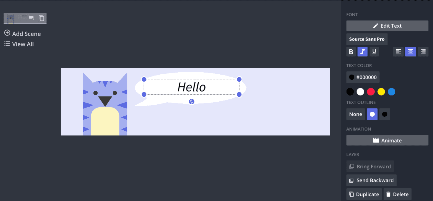
How to Upload and Customize a Banner in Google Forms

Open your form, click the paint palette in the top-right corner to open Theme, choose Header, upload your file, and use the visible-area square to frame the focal point. Then, click Done. That gets the banner live; the rest is about preventing repeat edits and checking what real users actually see.
What Should You Preflight Before Uploading?
Run a quick technical checklist to ensure you only upload the header once.
Export the image at the recommended size of 1600×400 pixels, convert it to sRGB, strip metadata, and generate a retina 2× variant for high-DPR viewers.
Name files using campaign, language, and date so reviewers can identify the correct master.
In a two-hour workshop with a marketing team, implementing this checklist reduced header rework by roughly 50% during the first campaign cycle.
How Do You Make Batch Edits and Keep Consistency?
Use a scripted export pipeline rather than hand-saving variants. A single ImageMagick command can resize and crop to the center reliably, for example:
magick input.png -resize 1600x400^ -gravity center -extent 1600x400 -strip -quality 85 output.jpg
That one-liner enforces exact pixel dimensions, removes extraneous metadata, and produces consistent compression across dozens of files, which saves hours when multiple languages or A/B copies are required.
How Can You Check What Respondents Actually See?
Don’t rely on the designer’s monitor. Simulate viewports and device pixel ratios in the browser's developer tools, and capture automated screenshots at narrow, medium, and wide widths. A short Puppeteer script or a screenshot service will demonstrate how the server-side cover crop and compression appear on a 2x phone versus a 1x desktop, allowing you to catch soft edges or clipped logos before publishing. Most teams follow the familiar approach: repurposing an ad graphic and tweaking it in place. That works at first, but as stakeholders multiply and languages emerge, feedback fragments, exports proliferate, and the same header undergoes three rounds of fixes.
Automated Focal Point Consistency
Platforms like FLORA centralize brand tokens, generate device-specific variants, and export production-ready files in a single flow, which reduces manual export and review cycles while maintaining consistent focal points across every derivative.
What Are the Most Effective Layout Rules to Save the Most Headaches?
Adopt numeric safety margins so that every designer knows the limits: reserve about 10% from the top and bottom, and 8% to 12% horizontally, as a safe space for text and logos. Use a semi-opaque backing behind type rather than lowering font weight, and prefer bold geometric sans families that survive recompression. When vector logos are available, embed them in the source so thin strokes do not vanish after server re-encoding.
Header as a Small Stage
Think of the header as a small stage, not a billboard; the audience gets a tight, cropped view, so place the actors where light falls best and keep the scenery minimal. There is one overlooked trick that separates occasional fixes from a smooth production pipeline, and it’s more practical than most teams expect.
Related Reading
Recommended Tools for Creating Google Forms Banners

Use the right tool for the job: Canva for fast, no-design drafts; Figma or Adobe Express when pixel control and repeatable components are crucial; stock sites for clean, horizontal photography; and FLORA when you need a single canvas that generates, iterates, and exports multiple on-brand variants without switching between apps. Each option addresses a different workflow constraint, so choose based on speed, control, and the number of variants you need to produce.
Which Tool Wins When I Need a Banner Now?
Canva is the quickest path from brief to live. This pattern is evident across small teams and community managers, where non-designers occasionally need to create graphics, and templates reduce handoffs and approval friction. Use Canva when you want a locked-down Brand Kit, simple sizing presets, and immediate exports that let a form go live the same day.
Why Should I Care About Customization and Interaction?
Since over 70% of users prefer customizable form banners, tools that let you quickly tweak tokens, colors, and copy can noticeably improve perceived quality. Additionally, a 50% increase in engagement with interactive form banners demonstrates that banners inviting interaction pay off, guiding the choice of tools that support micro-interactions or animated exports when appropriate.
When Does Precision Demand Figma or Adobe Express?
If you must control spacing, vector logos, or deliver multiple locked variants to an approval pipeline, then Figma or Adobe Express is the right fit. Constrain yourself to component-driven files, use text variables for copy swaps, and build export presets so each reviewer gets the same PNG or WebP. This approach avoids last-minute pixel adjustments and ensures consistent typography across campaigns, even when your forms undergo significant changes.
How Do Stock Images Fit Into a Production Workflow?
Treat stock libraries as a raw material set, not a finished meal.
Select horizontal images with clear compositional breathing room, verify commercial licensing, and prefer images with open negative space centered horizontally, allowing for safe text addition.
For variety, source a short list of preapproved photographers or collections and rotate them, rather than grabbing single images ad hoc, which is how brands accidentally repeat visuals across campaigns.
The Fragmentation of Stitched Tooling
Most teams stitch together different tools because each one solves a narrow problem, and that feels practical early on. As projects cross five to ten forms with translations or A/B tests, this familiar approach fractures: tokens drift, approvals slow, and someone ends up reconciling fifty file versions. Platforms like FLORA address that exact friction by centralizing generation and iteration in a single multimodel canvas, enforcing brand tokens, and exporting production-ready variants in a single workflow, which keeps creative control intact as volume grows.
How Should You Decide Between Speed and Control?
If you need velocity and non-designer ownership, choose template-first tools with brand restrictions. If you need exact spacing, multilingual typography, or componentized assets for reuse, build in a design tool with robust versioning and plugin support. When both demands exist, use an integrated pipeline that hands off a high-fidelity master to an automated generator, allowing the same aesthetic to scale without manual rework.
Banner Stack as a Carry-On
Think of assembling a banner stack like packing for a trip: bring a few multipurpose pieces that travel well, and keep a single carry-on where you store the essentials so you never lose something in baggage claim. That comfortable choice you just made feels final, but it often masks a production problem you will encounter as soon as volume or language requirements increase.
Try FLORA's AI-native Creative Canvas for Free Today
I've observed teams, exhausted by switching between multiple apps, reclaim significant time once they move to a single, AI-native canvas. Consider trying FLORA's AI playground to streamline banner iteration and maintain brand consistency across tokens. An independent study conducted in 2025 found that FLORA's Creative Canvas reduced design time by an average of 40% for professional designers. On the product site from 2023, 90% of users reported satisfaction with FLORA's AI-native Creative Canvas, showing that a single repeatable workflow can prevent late-stage fixes and free up creative hours.


"/><stop offset="1" stop-color="rgba(15, 15, 15, 0)"/></linearGradient></defs><path d="M 899.729 124.429 L 931.177 124.429 L 931.177 108.467 L 946.905 108.467 L 946.905 44.616 L 884.001 44.616 L 884.001 92.504 L 868.274 92.504 L 868.274 124.429 L 852.554 124.429 L 852.554 140.392 L 836.826 140.392 L 836.826 156.355 L 852.554 156.355 L 852.554 172.317 L 836.826 172.317 L 836.826 204.242 L 821.098 204.242 L 821.098 236.168 L 852.554 236.168 L 852.554 252.129 L 758.2 252.129 L 758.2 236.167 L 789.65 236.167 L 789.65 204.241 L 805.378 204.241 L 805.378 172.316 L 821.098 172.316 L 821.098 124.428 L 836.826 124.428 L 836.826 92.504 L 852.554 92.504 L 852.554 44.616 L 836.826 44.616 L 836.826 28.654 L 962.625 28.654 L 962.625 44.616 L 978.353 44.616 L 978.353 60.579 L 994.081 60.579 L 994.081 76.541 L 978.353 76.541 L 978.353 124.429 L 946.905 124.429 L 946.905 140.392 L 931.177 140.392 L 931.177 156.355 L 946.905 156.355 L 946.905 236.168 L 978.417 236.168 L 978.417 220.205 L 994.145 220.205 L 994.145 204.242 L 1009.865 204.242 L 1009.865 188.28 L 1025.593 188.28 L 1025.593 204.242 L 1009.865 204.242 L 1009.865 220.205 L 994.145 220.205 L 994.145 236.168 L 1025.593 236.168 L 1025.593 252.13 L 915.449 252.13 L 915.449 156.355 L 899.729 156.355 Z M 1135.672 172.317 L 1119.944 172.317 L 1119.944 76.541 L 1104.216 76.541 L 1104.216 92.504 L 1088.496 92.504 L 1088.496 108.467 L 1072.768 108.467 L 1072.768 92.504 L 1088.496 92.504 L 1088.496 76.541 L 1104.216 76.541 L 1104.216 60.579 L 1119.944 60.579 L 1119.944 28.654 L 1135.672 28.654 L 1135.672 60.579 L 1151.392 60.579 L 1151.392 236.168 L 1167.12 236.168 L 1167.12 252.13 L 1104.216 252.13 L 1104.216 236.168 L 1119.944 236.168 L 1119.944 188.28 L 1135.672 188.28 Z M 1072.768 124.429 L 1072.768 140.392 L 1057.041 140.392 L 1057.041 156.355 L 1041.321 156.355 L 1041.321 172.317 L 1025.593 172.317 L 1025.593 156.355 L 1041.321 156.355 L 1041.321 140.392 L 1057.041 140.392 L 1057.041 124.429 Z M 176.61 25.988 C 124.406 25.988 78.864 38.954 68.867 80.108 C 64.424 102.095 70.533 130.282 105.522 145.504 C 107.678 146.379 109.332 146.83 110.516 147.152 C 112.382 147.661 113.082 147.852 112.742 148.886 C 112.186 150.577 106.633 150.014 102.19 148.323 C 69.424 136.484 51.65 107.168 54.983 77.289 C 60.536 35.572 109.966 -1.636 179.387 0.056 C 202.713 0.056 238.812 5.692 273.246 15.276 C 293.795 20.914 321.009 28.243 346.555 34.444 C 369.881 24.86 392.096 18.659 411.534 18.659 C 425.628 18.659 438.846 21.919 444.414 28.654 L 537.86 28.654 L 537.86 44.616 L 506.41 44.616 L 506.41 60.579 L 490.685 60.579 L 490.685 92.504 L 474.959 92.504 L 474.959 124.429 L 459.233 124.429 L 459.233 172.317 L 443.508 172.317 L 443.508 220.205 L 427.783 220.205 L 427.783 236.168 L 522.135 236.168 L 522.135 220.205 L 537.86 220.205 L 537.86 204.242 L 553.586 204.242 L 553.586 172.317 L 569.311 172.317 L 569.311 204.242 L 553.586 204.242 L 553.586 236.168 L 537.86 236.168 L 537.86 252.13 L 364.881 252.13 L 364.881 236.168 L 396.332 236.168 L 396.332 220.205 L 412.058 220.205 L 412.058 172.317 L 427.783 172.317 L 427.783 140.392 L 443.508 140.392 L 443.508 92.504 L 459.234 92.504 L 459.234 44.616 L 444.157 44.616 C 437.338 52.415 419.206 55.303 394.318 55.303 C 379.323 55.303 357.108 53.048 349.333 51.92 C 337.67 63.196 325.452 77.853 314.9 90.82 C 305.307 102.032 297.996 111.856 290.818 121.501 C 284.281 130.284 277.855 138.919 269.914 148.323 C 283.798 148.886 298.794 147.759 309.901 143.812 C 320.454 129.155 333.783 122.39 342.669 124.645 C 351.554 126.9 350.444 135.92 337.67 145.504 C 335.4 147.26 333.256 148.887 331.193 150.453 C 322.659 156.932 315.515 162.356 306.569 171.436 C 304.66 173.374 302.994 175.312 301.571 176.968 C 299.269 179.646 297.602 181.584 296.572 181.584 C 293.24 182.148 294.351 172 296.572 166.363 C 299.349 159.597 302.126 154.524 304.903 150.577 C 295.462 153.396 284.91 154.524 266.026 154.524 C 264.938 155.812 263.791 157.222 262.545 158.751 C 259.978 161.904 256.993 165.569 253.253 169.745 C 204.381 225.557 123.85 256 71.645 256 C 29.993 256 0 239.087 0 212.591 C 0 193.987 12.774 175.947 34.99 175.947 C 53.317 175.947 61.092 188.349 60.537 200.188 C 59.981 208.644 57.204 213.718 51.651 219.92 C 47.763 224.429 44.431 228.376 44.431 234.013 C 44.431 243.597 52.762 249.798 68.867 250.362 C 111.631 253.181 142.177 234.013 176.61 195.678 C 190.494 180.456 200.491 168.054 210.488 153.96 C 198.27 153.96 186.607 153.96 179.943 154.524 C 172.902 154.799 168.37 155.744 165.639 156.313 C 162.768 156.912 161.886 157.096 162.17 155.652 C 162.726 153.396 167.724 149.45 184.385 148.323 C 188.537 147.94 196.791 148.077 204.443 148.204 C 208.052 148.264 211.528 148.323 214.375 148.323 C 222.151 137.611 231.037 125.772 242.7 113.37 C 264.915 89.128 294.35 65.451 323.23 47.411 C 307.124 45.719 281.021 40.645 263.804 37.263 C 239.923 32.753 203.268 25.988 177.166 25.988 L 176.61 25.988 Z M 365.438 39.518 C 386.542 45.156 403.204 46.847 413.2 46.847 C 427.64 46.847 440.969 42.336 441.524 36.136 C 442.08 29.37 428.751 24.296 410.979 24.296 L 410.423 24.296 C 394.317 24.296 375.435 32.753 365.438 39.518 Z M 711.023 252.129 L 616.672 252.129 L 616.672 236.167 L 600.946 236.167 L 600.946 220.204 L 585.221 220.204 L 585.221 108.466 L 600.946 108.466 L 600.946 76.54 L 616.672 76.54 L 616.672 60.578 L 632.396 60.578 L 632.396 44.616 L 663.847 44.616 L 663.847 28.654 L 758.2 28.654 L 758.2 44.616 L 773.924 44.616 L 773.924 60.579 L 789.65 60.579 L 789.65 172.317 L 773.924 172.317 L 773.924 188.28 L 758.2 188.28 L 758.2 220.205 L 742.474 220.205 L 742.474 236.168 L 711.023 236.168 Z M 663.847 44.616 L 663.847 60.579 L 648.122 60.579 L 648.122 76.541 L 632.396 76.541 L 632.396 108.467 L 616.672 108.467 L 616.672 220.205 L 632.396 220.205 L 632.396 236.168 L 695.298 236.168 L 695.298 220.205 L 711.023 220.205 L 711.023 204.242 L 726.749 204.242 L 726.749 188.28 L 742.474 188.28 L 742.474 156.355 L 758.2 156.355 L 758.2 60.579 L 742.474 60.579 L 742.474 44.616 Z" fill="url(%23k7ftP17bN-2050371890-linear-gradient)" height="255.9995555606772px" id="k7ftP17bN" width="1167.1199228535695px"/></svg>)