Nov 3, 2025

FLORA

You upload a new cover photo, and on mobile, your message gets chopped off — small mistake, big first impression. Banner size matters: the header image or profile banner is the first thing visitors see, and the wrong pixels or aspect ratio can hide your logo or key text. Want to get the dimensions, safe area, and mobile crop right? This article gives clear Twitter Banner Size and design tips, covering resolution, file formats, composition, focal point placement, and branding, so your header looks sharp on every device.
Flora AI's AI playground helps you preview headers across desktop and mobile, test different aspect ratios and safe areas, and export optimized PNG or JPG files so you spend less time guessing and more time creating.
Summary
Build your master banner at the platform target, exporting it at 1500 x 500 pixels with a 3:1 aspect ratio. Keep final uploads under the 5 MB cap to avoid automatic downscaling and preserve edge detail and color consistency.
Anchor primary text and logos inside a central safe band, because programmatic cropped-area estimates matched human-checked ground truth about 80% of the time in the cited AGU assessment.
Frame like a cinematographer so the subject survives minor crops, then prototype dozens of variations from a single master to reduce repetitive manual reframing and compress review cycles from days to hours.
Automate previews across real device viewports and run quick raster checks, such as a 1x and 2x mobile-size proof, as well as a headless-browser screenshot. Include at least a 13-inch laptop and a high-DPI phone in your device set.
Avoid visual clutter and gratuitous depth cues, since 70% of users find 3D charts misleading, and 60% of dashboards suffer from unnecessary information that erodes clarity and decision speed.
Adopt simple production rules, such as conducting three quick visual checks before review, and adhere to strict filename patterns, like Project_Banner_v02_EN_20251101.jpg, to ensure metadata and a single canonical master prevent last-minute rework.
This is where Flora AI's AI playground comes in, as it allows teams to preview headers across desktop and mobile, test safe areas and aspect ratios, and batch-export optimized PNG or JPG files.
Table of Contents
The Correct Twitter Banner Size
Safe Zones and Cropping Areas
5 Best Design Tips for an Effective Twitter (X) Banner
Common Mistakes to Avoid
How to Change Your Twitter (X) Banner
Try FLORA's AI-Native Creative Canvas for Free Today
The Correct Twitter Banner Size

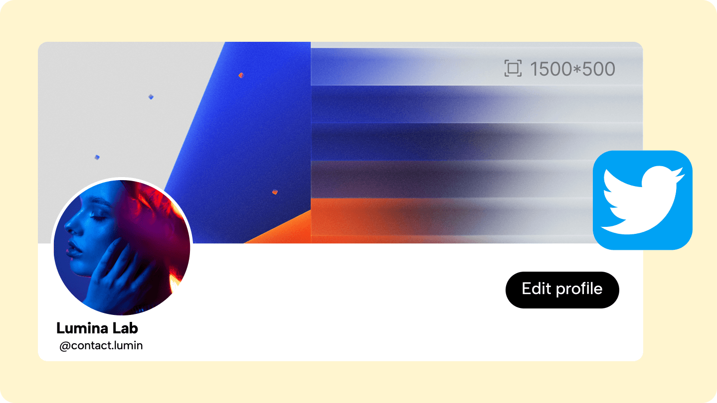
Build your master banner to match the platform’s display grid, using the recommended Twitter header size of 1500 x 500 pixels and keeping the composition framed to the 3:1 aspect ratio for a Twitter header so exports land predictably across devices.
Why Does Pixel-Accurate Export Matter?
If you treat the banner as a final, production asset, you stop chasing pixel fixes. Exporting at the exact target resolution prevents the platform’s automatic downscaling, preserves edge detail, and maintains consistent color profiles between creative review and live view. Use PNG for graphics with text or hard edges, and JPG for photo-heavy scenes. Aim for smaller file sizes to speed up load times without sacrificing appearance.
What Usually Trips Teams Up When They Scale Banner Production?
This challenge is prevalent across both freelance and agency work: repeated manual crops and ad-hoc exports consume time and disrupt creative focus. Designers trade attention for:
Low-value grunt work
Approvals pile up
Version names multiply
Inconsistent Artboard Crops
The result is slower iteration and more last-minute fixes during launch week. Most teams handle this by exporting a single master artboard and then creating platform crops in separate passes. That method is familiar and gets the job done for single campaigns, but as you scale, it makes errors, inconsistent framing, and review friction.
From Manual Passes to Batch-Export Mastery
Platforms like Flora AI offer a distinct approach, connecting generative models and export workflows, allowing teams to prototype numerous compositions, preserve reference-driven style, and batch-export production-ready banners at the correct resolution. This compresses review cycles from days to hours while keeping assets audit-ready.
How Should You Think About Composition When You Want Efficient Variations?
Think like a cinematographer, not a poster artist. Frame for the subject you want to preserve after minor crops, then generate variations that maintain that focal geometry. When teams choose a single master and allow for intelligent, model-driven reframing, they reduce repetitive manual work and maintain a consistent brand voice across dozens of iterations.
The Cost of Repetitive Crops
It’s exhausting when a designer spends an afternoon repeatedly tweaking crops instead of exploring new concepts—what starts as efficiency ends up costing creative momentum. That quiet problem points to something more profound, and the next section exposes the single framing detail that makes or breaks every export.
Related Reading
Safe Zones and Cropping Areas

Safe zones are the parts of your header that survive every device crop, and cropping areas are the margins that the platform is free to shave off when it fits an image into different aspect boxes. Keep your composition anchored to the safe zone, and you stop reacting to screenshots; you start controlling what people actually see.
How Does the Platform Decide What to Crop?
The clipping behavior is mechanical, not aesthetic: Twitter fits the image into multiple predefined viewports, then crops the top and bottom to preserve the aspect ratio, while the UI chrome covers the lower-left corner.
Programmatic Previews as Ground Truth
A 2022 AGU assessment using the SMA approach found 80% accuracy compared to test points, showing that automated cropped-area estimates can closely match human-checked ground truth, making programmatic previews a reliable baseline rather than a guess. The same 2022 inspection also relied on 3m visible data used for imagery inspection, highlighting how sample size and scene variety materially affect what a “safe” composition looks like across audiences and devices.
Where Do You Place Your Focal Points so They Survive Crops?
Think in lanes, not pixels. Anchor primary text and logos in the central horizontal band and keep secondary information inside flexible lanes above and below that band. Treat the lower-left as a contested zone, because the profile picture and buttons occupy it; never let identity or calls to action rest there.
When we map compositions this way, the work shifts from tedious pixel nudging to deliberate geometry, the kind that can be preserved when you reframe for different aspect ratios or translate a concept into multiple variations.
What Testing Method Actually Finds the Failure Modes?
Run automated overlay previews across real device viewports and then inspect a representative sample of images rather than a single master artboard. Pattern-based testing reveals the failure mode quickly: the tight top padding appears fine on desktops but consistently clips on smaller mobile devices, and left-aligned logos disappear under the UI chrome.
Automate the preview step to catch failures before sign-off, and use a varied image set so the edge cases are revealed during review, not on launch day.
Design Review Proliferation
Most teams follow the familiar approach: They export one master image, then manually crop it for different devices. That works at first because it is simple and requires no new tooling. As variants multiply and stakeholders weigh in, the:
Familiar workflow breaks down
Designers spend hours reconciling conflicting data
AI Reframing for Rework-Free Production
Platforms like Flora AI provide an alternative by connecting generative reframing models and batch export workflows, allowing teams to prototype numerous compositions, preserve subject consistency from references, and push production-ready crops without manual rework, thereby compressing review cycles from days to hours while maintaining auditable records.
What Visual Checklist Catches the Subtle Mistakes?
Add three quick checks to every review: confirm the primary focal point sits well within the central band; simulate the lower-left overlay and check legibility against it; and run a small multi-device export to verify that contrast and spacing hold up at reduced sizes. A single analogy helps here: treat the safe zone like a stage spotlight, compose for what the audience will always see, then let the extras breathe outside that light.
There is one design habit that still surprises teams when it fails, and that’s what the next section exposes.
5 Best Design Tips for an Effective Twitter (X) Banner
A clear hierarchy, restrained typography, and export-ready assets are what make a Twitter banner work, not cleverness or more copy. Prioritize legible focal points, tested file formats, and a workflow that enables you to produce consistent variants quickly, so every launch appears intentional.
How Should You Treat File Weight and Formats?
This is where launches often go wrong, because people usually think that smaller is always better. According to the Snappa Blog, the maximum file size for a Twitter header is 5MB, allowing you to maintain high quality while trimming unnecessary metadata and inefficient compression.
Use sRGB for the web, export photographic scenes as high-quality JPEGs, and use PNGs for graphics with hard edges. Then, run a single visual check at full screen to catch banding or blockiness before uploading.
What Do Designers Actually Get Wrong with Imagery and Sharpness?
This problem appears across agency and internal teams: images that read crisp on a 13-inch laptop become visibly soft on larger screens because aggressive compression and upscaling reveal flaws. Treat sharpness as a production requirement, not an aesthetic afterthought.
Work with the largest reasonable source image you have
Sharpen for the export size
Flatten complex layer effects into a single bitmap only after you confirm that type and contrast hold up at both small and significant views.
How Do You Keep Text Readable Without Cluttering the Design?
If you must include text, limit it, size it boldly, and provide contrast cushions, such as subtle strokes or soft backplates, so legibility survives UI overlays. Use system-safe line lengths and a responsive type scale so that short headlines do not become unreadable whips when viewed on mobile.
When exporting, rasterize a proof image at the mobile preview size to ensure that kerning and line breaks function correctly. Because typography that looks fine at 150% zoom often fails at the actual device pixel density, this step is crucial.
The Style Versioning Trap
Most teams handle variations by making manual crops and saving dozens of incremental files.
That familiar approach is simple, which is why it survives. The hidden cost becomes apparent when stakeholders request five style directions, and the designer is the only one who knows which file corresponds to which brief, resulting in review friction and last-minute rework.
Generative Reframing for Zero Version Confusion
Solutions like platforms that tie generative reframing to batch export offer a different path, letting teams prototype multiple compositions, preserve reference-driven style, and push production-ready banners without switching tools, which shortens iteration loops and reduces version confusion.
What Small Composition Choices Yield the Biggest Returns?
Use optical centering rather than strict mathematical centering for portraits and logos, as human perception favors where the eye naturally lands, rather than the geometric center. Favor a single accent color for calls to action, and lock secondary elements to a simple grid so automated reframing preserves relationships.
Previews Catch Failure
Automate at least one multi-device preview in your pipeline so you catch contrast or cropping failures before anyone signs off. Think of a banner like a stage set, not a poster; you control what the audience always sees, and everything else exists to support that sightline. Nevertheless, the real cost of these choices becomes apparent only when you see how designs fail under pressure, and that is where the next section proves unexpectedly revealing.
Common Mistakes to Avoid

Most banner mistakes stem from adding too many visual signals, overlooking how people actually perceive images in context, and treating production as an afterthought rather than an integral part of the creative brief. Fixes are not just technical tweaks; they are process shifts that preserve clarity, accessibility, and brand consistency as you scale.
What Visual Traps Quietly Erode Clarity?
Designers often pile on effects to make a header feel premium, but extra textures, glossy overlays, and faux depth usually compete with the message rather than support it. When teams add three-dimensional echoes and drop shadows, thinking they add sophistication, viewers often lose the focal point, as noted by the OWOX Blog. According to the blog, 70% of users find 3D charts misleading, which means that those depth cues can make a banner harder to read, not easier.
How Does Accessibility Become a Creative Constraint, Not a Checkbox?
Small type, low contrast, and color choices that look trendy in the studio can erase meaning for people with low vision or color-blindness. Treat contrast and readable sizes as part of the composition problem, not an afterthought. Simulate common color deficiencies, test headlines at actual device pixel densities, and opt for fewer, bolder words rather than fine print that will be lost on smaller screens.
Accessibility is also a legal risk management consideration for international campaigns that require alt text and localized legal content to be built into the asset workflow.
Which Operational Mistakes Consume Time and Break Brand Control?
The slip-ups are procedural: Unclear version names, storing proofs in multiple drives, and skipping a single-source master file that ties assets to their usage rights. These habits inflate review cycles and cause last-minute reworks when a stakeholder requests a different language, logo lockup, or a seasonal update.
Treat asset metadata as first-class: embed license and usage tags, maintain a canonical file with generation parameters, and lock typography and color tokens to prevent copies from drifting from brand standards.
Most teams handle iteration by exporting and emailing files because it is familiar and requires no new toolchain. That works early on, but as campaigns scale, feedback splinters across comments, and old files get reused by mistake, pushing fixes into crunch time.
Single Source of Truth for Creative Assets
Platforms like AI playground centralize versions, attach comments to specific exports, and automate batch reframes and production exports, reducing time lost to manual reconciliation while preserving the creative intent captured in a single source of truth.
What Legal and Localization Pitfalls Are Easy to Miss?
Banners are often half an image, half a legal claim when used in different markets, and that mismatch breaks trust quickly. You must build region-aware layers, avoid embedding hard-coded promotional dates, and maintain an auditable trail that shows where each localized header originated and which rights apply to it.
Additionally, using third-party fonts or imagery without proper licenses can lead to takedowns and delays that can hinder launches.
How Should Teams Test Banners Without Burning Cycles?
Run small, repeatable checks: automated visual regression against the canonical artboard, a color-blindness sweep, a device-pixel-ratio sample including high-DPR phones, and a quick legal or localization audit of any embedded text. Resist the impulse to add too many visual elements at once, as clutter can reduce comprehension.
Clarity’s Biggest Threat
In fact, according to a 2025 OWOX report, 60% of dashboards are overloaded with unnecessary information, showing that adding more elements often lowers overall clarity and slows decision-making. Think of a banner like a shop window on a busy street, where a single focal object draws the passerby in, and everything else either supports that display or steals attention.
That perspective makes design choices and production gates easier to justify and automate.
The Infinite AI Creative Canvas
FLORA is the first AI-native creative canvas that unifies text, image, and video generation in one infinite AI playground, built for professional teams to prototype, iterate, and export production-ready banners without needing to switch tools. Try FLORA's AI playground for free today.
The surprising part about making a banner actually work is not the design rules; it is what happens when you change the way the work flows.
Related Reading
How to Change Your Twitter (X) Banner
Open your profile, click "Edit Profile," tap the header area, select the file you want, position it in the preview, and save — the change takes effect immediately. After that quick action, treat the upload as the start of a short production pass: verify formats, metadata, and previews so that the live result matches the intended outcome.
Why Prepare Files Before You Upload?
Treat the banner file like a delivery, not a sketch. Export in sRGB, flatten complex layer styles to avoid platform reinterpreting effects, and keep a high-quality master copy. Embed explicit metadata, such as:
Project name
Version
Language
Usage rights
This allows every export to carry the context that reviewers will ask for later. Also, use predictable export presets for the team so the designer who hands off a job is the same one who set the file parameters.
How Should You Name and Store Versions to Prevent Loss?
Use a strict filename pattern, for example, Project_Banner_v02_EN_20251101.jpg, and attach a short JSON sidecar or IPTC block with author, color profile, and source references. Store the canonical master, the flattened proof, and the actual upload file in a single folder, along with thumbnails and a changelog.
That single-source approach prevents the usual scramble where someone drags an old JPG into a campaign at the last minute.
What Checks Catch Problems Before Stakeholders See Them?
Automate three visual checks before the first review: a full-screen proof on a calibrated monitor, a 1x and 2x mobile-size raster to check legibility at device pixel densities, and a headless-browser screenshot across a small device matrix. If you add a short checklist to each export—such as confirming the color profile, attaching metadata, and including preview screenshots—you stop wasting time on avoidable nitpicks during approvals.
The Fragmented Feedback Trap
Most teams handle review by emailing files back and forth because it is familiar and requires no new platforms, and that works well until variants multiply and feedback splinters across threads. As the number of versions grows, the hidden cost becomes delays and context loss: designers spend hours reconciling:
Comments
Approvals stall
Brand consistency drifts
Platforms like FLORA offer a different path; teams find that centralized asset history, threaded comments tied to specific exports, and batch reframing capabilities significantly reduce review cycles while preserving the original creative intent.
How Can You Scale Variations Without Losing Control?
Build parameterized masters. Lock core tokens such as logo placement, color swatches, and focal geometry, then generate variations by swapping backgrounds, color accents, or copy lanes in an automated pipeline. Export all derived banners with linked metadata and a minor visual diff that highlights what changed from the master.
This approach turns repetitive manual cropping into a predictable production step, freeing creative time for new concepts.
What Quick Tools Give High Confidence Across Devices?
Maintain a concise, repeatable device setup: a 13-inch laptop, a large desktop, a standard Android phone, and a high-DPI iPhone. Use browser emulation and a headless screenshot tool to capture those views in one click, and compare them against your thumbnail proof to catch cropping and contrast failures.
If you must run a live check, create a private test account and view the header in the wild, because simulated previews still miss subtle UI overlays and platform chrome.
The 1500 x 500 Canonical
A brief technical reminder: the recommended Twitter header dimensions are 1500 x 500 pixels. Export at this target resolution to prevent platform downscaling and maintain a single, canonical version for audits. The 3:1 aspect ratio also matters—keeping this focal geometry in your master file helps avoid unexpected crops after upload.
Think of a banner like an awning outside a store; it needs one clear object that draws attention, and everything else exists to support that sightline. Design and production choices should protect that single object through every crop and device.
From One-Off Banner to Reliable System
The twist many teams miss is how quickly a tight production discipline turns a one-off banner into a reliable system for dozens of variations, and that’s where the next step becomes unexpectedly powerful. That solution sounds simple until you see what it unlocks next.
Related Reading
Try FLORA's AI-Native Creative Canvas for Free Today
When teams spend hours stitching exports and reconciling feedback, iteration slows and creative momentum fades. This guide is designed to help eliminate that predictable friction. Over 10,000 users have already joined FLORA’s AI-native creative canvas, reporting up to a 50% reduction in design time when integrating it into their workflows.


"/><stop offset="1" stop-color="rgba(15, 15, 15, 0)"/></linearGradient></defs><path d="M 899.729 124.429 L 931.177 124.429 L 931.177 108.467 L 946.905 108.467 L 946.905 44.616 L 884.001 44.616 L 884.001 92.504 L 868.274 92.504 L 868.274 124.429 L 852.554 124.429 L 852.554 140.392 L 836.826 140.392 L 836.826 156.355 L 852.554 156.355 L 852.554 172.317 L 836.826 172.317 L 836.826 204.242 L 821.098 204.242 L 821.098 236.168 L 852.554 236.168 L 852.554 252.129 L 758.2 252.129 L 758.2 236.167 L 789.65 236.167 L 789.65 204.241 L 805.378 204.241 L 805.378 172.316 L 821.098 172.316 L 821.098 124.428 L 836.826 124.428 L 836.826 92.504 L 852.554 92.504 L 852.554 44.616 L 836.826 44.616 L 836.826 28.654 L 962.625 28.654 L 962.625 44.616 L 978.353 44.616 L 978.353 60.579 L 994.081 60.579 L 994.081 76.541 L 978.353 76.541 L 978.353 124.429 L 946.905 124.429 L 946.905 140.392 L 931.177 140.392 L 931.177 156.355 L 946.905 156.355 L 946.905 236.168 L 978.417 236.168 L 978.417 220.205 L 994.145 220.205 L 994.145 204.242 L 1009.865 204.242 L 1009.865 188.28 L 1025.593 188.28 L 1025.593 204.242 L 1009.865 204.242 L 1009.865 220.205 L 994.145 220.205 L 994.145 236.168 L 1025.593 236.168 L 1025.593 252.13 L 915.449 252.13 L 915.449 156.355 L 899.729 156.355 Z M 1135.672 172.317 L 1119.944 172.317 L 1119.944 76.541 L 1104.216 76.541 L 1104.216 92.504 L 1088.496 92.504 L 1088.496 108.467 L 1072.768 108.467 L 1072.768 92.504 L 1088.496 92.504 L 1088.496 76.541 L 1104.216 76.541 L 1104.216 60.579 L 1119.944 60.579 L 1119.944 28.654 L 1135.672 28.654 L 1135.672 60.579 L 1151.392 60.579 L 1151.392 236.168 L 1167.12 236.168 L 1167.12 252.13 L 1104.216 252.13 L 1104.216 236.168 L 1119.944 236.168 L 1119.944 188.28 L 1135.672 188.28 Z M 1072.768 124.429 L 1072.768 140.392 L 1057.041 140.392 L 1057.041 156.355 L 1041.321 156.355 L 1041.321 172.317 L 1025.593 172.317 L 1025.593 156.355 L 1041.321 156.355 L 1041.321 140.392 L 1057.041 140.392 L 1057.041 124.429 Z M 176.61 25.988 C 124.406 25.988 78.864 38.954 68.867 80.108 C 64.424 102.095 70.533 130.282 105.522 145.504 C 107.678 146.379 109.332 146.83 110.516 147.152 C 112.382 147.661 113.082 147.852 112.742 148.886 C 112.186 150.577 106.633 150.014 102.19 148.323 C 69.424 136.484 51.65 107.168 54.983 77.289 C 60.536 35.572 109.966 -1.636 179.387 0.056 C 202.713 0.056 238.812 5.692 273.246 15.276 C 293.795 20.914 321.009 28.243 346.555 34.444 C 369.881 24.86 392.096 18.659 411.534 18.659 C 425.628 18.659 438.846 21.919 444.414 28.654 L 537.86 28.654 L 537.86 44.616 L 506.41 44.616 L 506.41 60.579 L 490.685 60.579 L 490.685 92.504 L 474.959 92.504 L 474.959 124.429 L 459.233 124.429 L 459.233 172.317 L 443.508 172.317 L 443.508 220.205 L 427.783 220.205 L 427.783 236.168 L 522.135 236.168 L 522.135 220.205 L 537.86 220.205 L 537.86 204.242 L 553.586 204.242 L 553.586 172.317 L 569.311 172.317 L 569.311 204.242 L 553.586 204.242 L 553.586 236.168 L 537.86 236.168 L 537.86 252.13 L 364.881 252.13 L 364.881 236.168 L 396.332 236.168 L 396.332 220.205 L 412.058 220.205 L 412.058 172.317 L 427.783 172.317 L 427.783 140.392 L 443.508 140.392 L 443.508 92.504 L 459.234 92.504 L 459.234 44.616 L 444.157 44.616 C 437.338 52.415 419.206 55.303 394.318 55.303 C 379.323 55.303 357.108 53.048 349.333 51.92 C 337.67 63.196 325.452 77.853 314.9 90.82 C 305.307 102.032 297.996 111.856 290.818 121.501 C 284.281 130.284 277.855 138.919 269.914 148.323 C 283.798 148.886 298.794 147.759 309.901 143.812 C 320.454 129.155 333.783 122.39 342.669 124.645 C 351.554 126.9 350.444 135.92 337.67 145.504 C 335.4 147.26 333.256 148.887 331.193 150.453 C 322.659 156.932 315.515 162.356 306.569 171.436 C 304.66 173.374 302.994 175.312 301.571 176.968 C 299.269 179.646 297.602 181.584 296.572 181.584 C 293.24 182.148 294.351 172 296.572 166.363 C 299.349 159.597 302.126 154.524 304.903 150.577 C 295.462 153.396 284.91 154.524 266.026 154.524 C 264.938 155.812 263.791 157.222 262.545 158.751 C 259.978 161.904 256.993 165.569 253.253 169.745 C 204.381 225.557 123.85 256 71.645 256 C 29.993 256 0 239.087 0 212.591 C 0 193.987 12.774 175.947 34.99 175.947 C 53.317 175.947 61.092 188.349 60.537 200.188 C 59.981 208.644 57.204 213.718 51.651 219.92 C 47.763 224.429 44.431 228.376 44.431 234.013 C 44.431 243.597 52.762 249.798 68.867 250.362 C 111.631 253.181 142.177 234.013 176.61 195.678 C 190.494 180.456 200.491 168.054 210.488 153.96 C 198.27 153.96 186.607 153.96 179.943 154.524 C 172.902 154.799 168.37 155.744 165.639 156.313 C 162.768 156.912 161.886 157.096 162.17 155.652 C 162.726 153.396 167.724 149.45 184.385 148.323 C 188.537 147.94 196.791 148.077 204.443 148.204 C 208.052 148.264 211.528 148.323 214.375 148.323 C 222.151 137.611 231.037 125.772 242.7 113.37 C 264.915 89.128 294.35 65.451 323.23 47.411 C 307.124 45.719 281.021 40.645 263.804 37.263 C 239.923 32.753 203.268 25.988 177.166 25.988 L 176.61 25.988 Z M 365.438 39.518 C 386.542 45.156 403.204 46.847 413.2 46.847 C 427.64 46.847 440.969 42.336 441.524 36.136 C 442.08 29.37 428.751 24.296 410.979 24.296 L 410.423 24.296 C 394.317 24.296 375.435 32.753 365.438 39.518 Z M 711.023 252.129 L 616.672 252.129 L 616.672 236.167 L 600.946 236.167 L 600.946 220.204 L 585.221 220.204 L 585.221 108.466 L 600.946 108.466 L 600.946 76.54 L 616.672 76.54 L 616.672 60.578 L 632.396 60.578 L 632.396 44.616 L 663.847 44.616 L 663.847 28.654 L 758.2 28.654 L 758.2 44.616 L 773.924 44.616 L 773.924 60.579 L 789.65 60.579 L 789.65 172.317 L 773.924 172.317 L 773.924 188.28 L 758.2 188.28 L 758.2 220.205 L 742.474 220.205 L 742.474 236.168 L 711.023 236.168 Z M 663.847 44.616 L 663.847 60.579 L 648.122 60.579 L 648.122 76.541 L 632.396 76.541 L 632.396 108.467 L 616.672 108.467 L 616.672 220.205 L 632.396 220.205 L 632.396 236.168 L 695.298 236.168 L 695.298 220.205 L 711.023 220.205 L 711.023 204.242 L 726.749 204.242 L 726.749 188.28 L 742.474 188.28 L 742.474 156.355 L 758.2 156.355 L 758.2 60.579 L 742.474 60.579 L 742.474 44.616 Z" fill="url(%23k7ftP17bN-2050371890-linear-gradient)" height="255.9995555606772px" id="k7ftP17bN" width="1167.1199228535695px"/></svg>)