Nov 20, 2025

FLORA

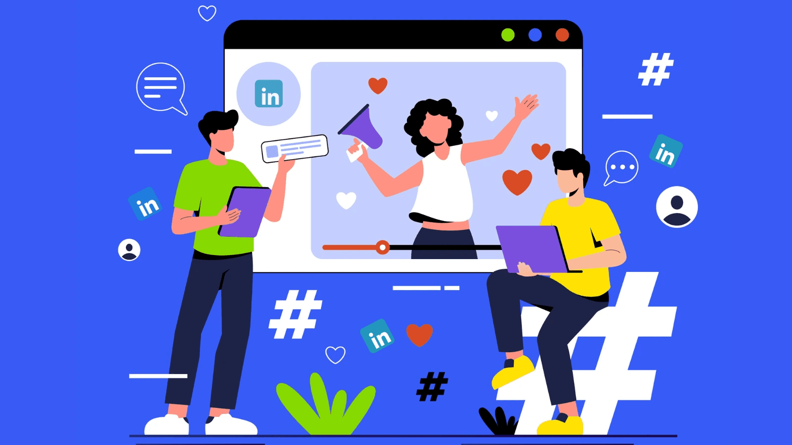
You plan a LinkedIn event and choose a cover photo only to find the header cropped, the logo cut off, or the text unreadable on mobile. Banner size matters: the correct image dimensions, aspect ratio, resolution, and file type keep your event cover photo crisp across desktop and mobile while avoiding awkward cropping. Want a quick guide to the recommended LinkedIn Event Banner Size and how to set it up with pixel specs, safe zone tips, upload guidelines, and simple templates?
Flora AI's AI playground gives hands-on help, letting you test image dimensions, pick templates, and export the correct file so your banner displays correctly on all devices.
Table of Contents
The Recommended LinkedIn Event Banner Size
How LinkedIn Event Banners Display on Desktop vs. Mobile
How to Design Your LinkedIn Event Banner
5 Top Tools to Create a Perfect LinkedIn Event Banner
Try FLORA's AI-native Creative Canvas for Free Today
Summary
Design at a 16:9 canvas and start large, for example, 1600 x 900 pixels, since downscaling preserves detail, and LinkedIn also lists a platform-friendly wide-hero option at 1584 x 396 pixels.
LinkedIn renders event banners differently by device, showing desktop at roughly 1200 x 627 pixels and mobile at 640 x 360 pixels, which forces center-first cropping and trims top and bottom content.
Keep focal information inside a central safe zone, use high-contrast type, and export as JPEG or PNG under 8 MB to avoid upload failures and compression artifacts.
Treat testing as a checklist and verify on real devices, not just emulators, by checking at least three real-device screenshots to catch subtle cropping and compression differences.
Manual resizing and ad hoc export workflows scale poorly, and teams consistently hit friction once a calendar grows to 10 or more events because version control and review loops break down.
Creative wins compound on LinkedIn, where events show about 30% higher engagement than other platforms, custom banners can lift RSVPs by around 150%, and over 75% of users engage with events on the platform.
Flora AI's AI playground addresses this by producing device-optimized crops and safe-zone previews from a single master canvas, streamlining multi-size exports and localization.
The Recommended LinkedIn Event Banner Size

LinkedIn event banners should use a 16:9 canvas so the image scales predictably across devices, and designers get the best balance of clarity by working at a higher resolution than downscaling. For a dependable, production-ready starting point, many teams pick larger canvases like 1600 x 900 pixels, while LinkedIn also recommends a wide-hero option (1584 x 396 pixels) as platform-friendly.
Which Canvas Should You Design First?
Start with a larger 16:9 size so you can create every variant from a single master. Designing on a roomy canvas preserves detail, reduces compression artifacts, and keeps type legible when you export for feeds, event pages, or promotional posts. Many studios prefer 1600 x 900 pixels because it provides headroom for cropping and sharpening without bloating file size, and working this way turns a single concept into dozens of crisp outputs rather than redoing the layout for each target.
How Do Teams Manage the Work Without Chaos?
Most teams handle exports manually because it feels safe and familiar, but that approach fractures as events multiply. When projects move from one or two events to a calendar of ten or more, manual resizing, inconsistent exports, and last-minute uploads create late nights and version confusion.
Intelligent Canvas for Visual Consistency
Platforms like FLORA provide an alternative: teams use a single intelligent canvas to generate multiple banner sizes and stylistic variants, routing every change through model-driven templates so visual consistency stays intact and review cycles compress from days to hours while maintaining production quality.
What Practical Rules Stop Small Mistakes from Becoming Big Problems?
Keep your focal information inside the central safe area, use high-contrast type, and export JPEG or PNG under 8 MB to avoid upload failures. Upload images directly from your device, because cloud-upload workflows are not supported for event pages, and check how sharp your exports remain at smaller sizes before you mark the design final. Think of it like taking a photograph, not a screenshot: capture more detail up front so you have room to crop and reposition without visible loss. That neat technical clarity feels satisfying until the next step reveals a surprising tension with how those banners actually appear on different screens.
Related Reading
How LinkedIn Event Banners Display on Desktop vs. Mobile
LinkedIn renders the same uploaded banner differently depending on device, changing what viewers actually see: on desktop, event banners display at 1200x627 pixels, preserving horizontal space while allowing a vertical crop; on mobile, banners are resized to 640x360 pixels, forcing tighter vertical framing and emphasizing the image's center.
How Exactly Does Desktop Treat the Image?
Desktop tends to show the banner’s full width and then trims top or bottom to fit the viewer’s browser height or the page chrome. The practical result, as we’ve repeatedly observed across multi-event campaigns, is that left and right spacing survives but vertical margins vanish first when windows are constrained. Think of the banner as a stage, the center under the spotlight, while the curtains at the top and bottom are quick to disappear.
Why Does Mobile Feel So Different?
Mobile platforms reduce the effective pixel area and crop toward the center, so any visual story that relies on top or bottom elements can lose meaning on a phone. After working on several event rollouts last quarter, the pattern became clear: text near the edges gets trimmed, and compositions that look balanced on desktop suddenly feel claustrophobic on handheld screens. That emotional sting is real; it causes last-minute redesigns and blown deadlines.
What Technical Behaviors Produce Those Crops?
Responsive rendering chooses a display box based on the container aspect ratio, then aligns the image to prioritize horizontal coverage, which is why the center remains visible while the edges and vertical space are sacrificed. High pixel-density displays and aggressive server-side compression can compound the issue, pushing designers to use bolder type and fewer small details, as fine elements disappear faster than expected when the platform recompresses images.
Scattered Feedback and Broken Version Control
Most teams handle this by manual resizing and eyeballing previews, because it is familiar and low-cost at first. That approach works for one or two events, but as stakeholder counts and localization needs grow, feedback scatters and version control breaks down. Platforms like AI playground centralize generation, safe-zone overlays, and export presets, so teams can produce multiple device-optimized crops from a single master asset, compressing review cycles from days to hours while keeping every variant on-brand.
How Should You Test a Banner Before You Publish?
Treat testing like a checklist: preview at the platform’s desktop and mobile sizes, audit legibility at the smallest target pixel size, and inspect exported files for compression artifacts. Use an automated workflow that outputs both desktop and mobile crops and adds safe-zone guides to each export so reviewers can see precisely what will be visible in context. When you adopt that discipline, you stop firefighting last-minute copy shifts and start shipping predictable assets.
Focal Point Design and Real-Device Verification
A simple rule I rely on is to design with a clear center focal point, then verify three real-device screenshots, because emulators can miss subtle differences in cropping and compression. That small discipline saves hours of back-and-forth and keeps the creative intent intact.
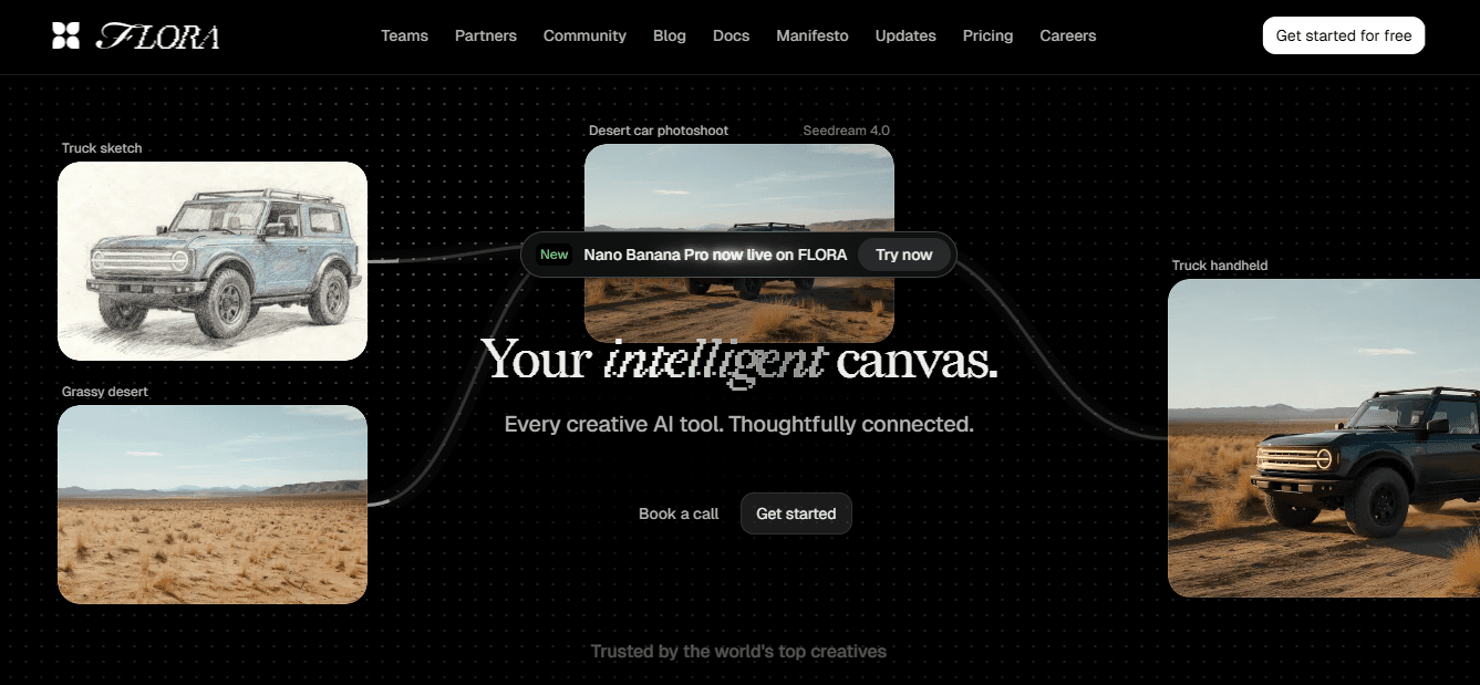
Unified AI Creative Canvas
FLORA is the first AI-native creative canvas that unifies text, image, and video generation in one infinite AI playground. Try FLORA's AI playground for free today!
Related Reading
How to Design Your LinkedIn Event Banner
Design banners so a single glance answers three questions: who this is for, what they will gain, and what to do next. Keep copy minimal, prioritize a clear visual hierarchy, and build a version strategy so one concept yields all language and size variants without manual rework.
What Should the Typographic Hierarchy Do?
Good type tells the story before a viewer clicks. Use a bold, highly legible headline with short line lengths, then a smaller supporting line that explains the benefit in plain language. Limit distinct typefaces to one display and one functional font, set a tight vertical rhythm. Hence, the headline and subline read as a single visual unit, and choose weights that survive platform compression so emphasis does not rely solely on color.
How Should Image Elements and Identity Behave?
Treat logos and speaker portraits as repeatable parts, not decorative flourishes. Create a fixed lockup zone for your logo and use consistent portrait crops, borders, and color overlays so that multiple banners look like a cohesive family. For speaker names, prefer short, left-aligned lines and a consistent size scale so adding or removing a panel does not force layout changes.
What Accessibility and Metadata Practices Actually Matter?
Write concise alt text that describes the key message, not every visual detail, and include the event title and CTA verb within the first 100 characters so assistive tools and social previews capture intent. Use color contrast checks to achieve a ratio of at least 4.5:1 for body text, and prepare monochrome or high-contrast variants for viewers on low-brightness devices or with vision differences.
How Do Teams Avoid Chaos as Events Multiply?
Most teams manage exports and approvals with ad hoc folders and threaded messages because it is familiar and low-cost. That approach scales poorly, fragmenting brand rules and creating last-minute rework when a copy tweak must be applied across ten localized versions. Platforms like FLORA provide an alternative path, generating variants from a single intelligent canvas while preserving style rules, and teams find that centralized templates and model-driven exports cut iteration time and reduce inconsistent assets.
How Should You Measure What Works?
Use small, controlled experiments, changing one variable per test: headline phrasing, portrait treatment, or CTA verb. Track clickthrough and registration lift on the event landing page with consistent UTM tags so your tests compare apples to apples.
Higher Engagement and Active Audience
That discipline matters here because LinkedIn events drive 30% higher engagement compared to other platforms, which means creative wins on this channel compound faster. Also, 75% of LinkedIn users engage with events, so the audience is active and responsive when the banner communicates clearly.
What Naming, Versioning, and Export Rules Save Time?
Adopt a short, consistent file-name schema that encodes language, date, and treatment, for example: EVENTNAME_en_US_v03_HEADLINE-A. Store canonical assets in a governed library and automatically surface derived exports, so a single copy change propagates to all localized banners. Think of the workflow like a recipe book, where the master formula lives in one place and every regional cook follows the same steps.
Why Iterate with Restraint, Not Frenzy?
Rapid iteration helps, but uncontrolled A/B testing breaks brand recognition. Run sequential micro-tests and freeze your core identity elements—logo lockup, headline voice, color palette — while you experiment with variable elements such as:
Imagery
CTA wording
The discipline keeps visual consistency across dozens of outputs while letting you learn which micro-changes actually move registration rates. After you tighten these mechanics, there is one testing habit that separates predictable launches from emotional firefights.
5 Top Tools to Create a Perfect LinkedIn Event Banner
1. FLORA AI
FLORA is the only option here designed around a single generative canvas that runs text, image, and video models together, so you can turn one idea into banners in multiple sizes and stylistic variants without juggling licenses or recreating layouts.
Use cases: Team ideation sessions, template-driven production, and campaigns that need rapid localization across markets.
Strengths: Node-based workflows that capture the creative recipe, real-time collaboration like a design whiteboard, and multi-model outputs that let you generate portrait, hero, and square crops from one prompt.
Tradeoffs: It requires an initial investment in templates and rules, but that pays back quickly as events scale because the creative recipe becomes repeatable.
2. Canva
Canva earns its place when speed and low friction matter. It gives editable templates, AI copy and layout suggestions, and simple export flows that get a polished banner live fast.
Use cases: Small teams, one-off events, and marketing owners who need results without a design handoff.
Strengths: near-instant templated options and approachable controls that reduce back-and-forth.
Weaknesses: templated layouts can become visually similar across events, and complex brand rules or bespoke portrait lockups are more complicated to enforce at scale. After running rapid campaigns where time to publish mattered most, the pattern emerged: Canva helps you launch fast, but it takes more effort to keep dozens of banners visually consistent.
3. Fotor
Fotor shines for photographic refinement—background removal, object erasing, and creative art effects produce slick hero images when a strong photo is the centerpiece.
Use cases: Speaker headshots, location photos, or lifestyle imagery that must look photo‑retouched.
Strengths: Advanced image tools and quick presets.
Limitations: Its layout and brand controls are relatively shallow, so when teams need strict logo lockups, consistent typography, or multi-language variants, Fotor forces manual rework. That friction shows up as extra rounds of layout adjustment when events multiply.
4. Visme
Visme is the tool to choose when maintaining brand rules across many banners is a priority, because its brand kit stores colors, logos, and fonts, and supports collaboration at scale.
Use cases: Organizations with strict identity guidelines or recurring series that must look cohesive.
Strengths: Robust brand management and data‑friendly visuals.
Downsides: The feature surface is larger, and it takes time to learn, which makes it less suitable when you need a fast, one-person turnaround. If your constraint is consistency across dozens of events rather than speed, Visme is the pragmatic pick.
5. Venngage
Venngage offers a minimalist path from idea to banner, with helpful AI layout suggestions and simple customization for charts or overlays when you want an informative visual without fuss.
Use cases: Quick campaign variants, small teams that need charted visuals, or anyone who wants usable AI edits without steep learning.
Strengths: Approachable editor and strong starter templates.
Tradeoffs: It lacks the production controls and multi-model generation that large creative teams require for high-volume, brand-governed output.
Why Most Teams Switch Approach as Events Scale
Most teams handle banner creation through a mix of single-tool edits and manual resizing because it feels immediate and familiar. That approach works for a handful of events. Still, as stakeholder counts rise and localization needs multiply, the hidden cost appears: dozens of manual exports, repeated alignment conversations, and brittle brand rules that leak. Platforms like FLORA offer a different path, combining an intelligent canvas with model-driven templates and centralized assets, so teams can compress review cycles from days to hours while keeping exports consistent.
How to Match a Tool to a Specific Bottleneck
If your leading blocker is speed and low friction, pick Canva or Venngage for rapid drafts and approvals. If you need photographic polish for hero images, choose Fotor and then layer on brand controls elsewhere. If consistency across a program of events is the priority and training time is acceptable, Visme enforces brand fidelity. When the problem is producing many production‑grade variants from a single concept, teams find that an AI-native canvas that supports real-time collaboration and multi-model exports solves the root cause rather than the symptoms.
Minor, Practical Criteria I Use When Choosing a Tool for Event Banners
Ownership model: Who will be the canonical editor and keeper of brand rules?
Scale: Are you producing one banner or one hundred localized variants this quarter?
Photo vs. layout needs: Do you need retouching first, or layout control first?
Collaboration: Does the team require simultaneous editing and threaded review?
150% RSVP Increase
Answer those, and you immediately narrow the choices, because the right platform aligns with the bottleneck, not the aesthetic. Also, investing in a quality banner matters—LinkedIn events with custom banners see a 150% increase in RSVPs compared to those without, and over 80% of LinkedIn users believe a well-designed event banner boosts engagement, so tool choice directly impacts outcomes. That familiar workflow feels solved, until you face a calendar of events and a pile of inconsistent exports—what happens next is where choices really pay off.
Related Reading
Try FLORA's AI-native Creative Canvas for Free Today
We know it’s exhausting when AI tools can’t apply your brand kit and every banner turns into late-night manual fixes. To stop chasing exports and inconsistent outputs, try a different path you can test quickly. FLORA’s AI playground, trusted at scale with over 10,000 users and reported to boost productivity by 30%, can help remove rework from your subsequent event rollout.


"/><stop offset="1" stop-color="rgba(15, 15, 15, 0)"/></linearGradient></defs><path d="M 899.729 124.429 L 931.177 124.429 L 931.177 108.467 L 946.905 108.467 L 946.905 44.616 L 884.001 44.616 L 884.001 92.504 L 868.274 92.504 L 868.274 124.429 L 852.554 124.429 L 852.554 140.392 L 836.826 140.392 L 836.826 156.355 L 852.554 156.355 L 852.554 172.317 L 836.826 172.317 L 836.826 204.242 L 821.098 204.242 L 821.098 236.168 L 852.554 236.168 L 852.554 252.129 L 758.2 252.129 L 758.2 236.167 L 789.65 236.167 L 789.65 204.241 L 805.378 204.241 L 805.378 172.316 L 821.098 172.316 L 821.098 124.428 L 836.826 124.428 L 836.826 92.504 L 852.554 92.504 L 852.554 44.616 L 836.826 44.616 L 836.826 28.654 L 962.625 28.654 L 962.625 44.616 L 978.353 44.616 L 978.353 60.579 L 994.081 60.579 L 994.081 76.541 L 978.353 76.541 L 978.353 124.429 L 946.905 124.429 L 946.905 140.392 L 931.177 140.392 L 931.177 156.355 L 946.905 156.355 L 946.905 236.168 L 978.417 236.168 L 978.417 220.205 L 994.145 220.205 L 994.145 204.242 L 1009.865 204.242 L 1009.865 188.28 L 1025.593 188.28 L 1025.593 204.242 L 1009.865 204.242 L 1009.865 220.205 L 994.145 220.205 L 994.145 236.168 L 1025.593 236.168 L 1025.593 252.13 L 915.449 252.13 L 915.449 156.355 L 899.729 156.355 Z M 1135.672 172.317 L 1119.944 172.317 L 1119.944 76.541 L 1104.216 76.541 L 1104.216 92.504 L 1088.496 92.504 L 1088.496 108.467 L 1072.768 108.467 L 1072.768 92.504 L 1088.496 92.504 L 1088.496 76.541 L 1104.216 76.541 L 1104.216 60.579 L 1119.944 60.579 L 1119.944 28.654 L 1135.672 28.654 L 1135.672 60.579 L 1151.392 60.579 L 1151.392 236.168 L 1167.12 236.168 L 1167.12 252.13 L 1104.216 252.13 L 1104.216 236.168 L 1119.944 236.168 L 1119.944 188.28 L 1135.672 188.28 Z M 1072.768 124.429 L 1072.768 140.392 L 1057.041 140.392 L 1057.041 156.355 L 1041.321 156.355 L 1041.321 172.317 L 1025.593 172.317 L 1025.593 156.355 L 1041.321 156.355 L 1041.321 140.392 L 1057.041 140.392 L 1057.041 124.429 Z M 176.61 25.988 C 124.406 25.988 78.864 38.954 68.867 80.108 C 64.424 102.095 70.533 130.282 105.522 145.504 C 107.678 146.379 109.332 146.83 110.516 147.152 C 112.382 147.661 113.082 147.852 112.742 148.886 C 112.186 150.577 106.633 150.014 102.19 148.323 C 69.424 136.484 51.65 107.168 54.983 77.289 C 60.536 35.572 109.966 -1.636 179.387 0.056 C 202.713 0.056 238.812 5.692 273.246 15.276 C 293.795 20.914 321.009 28.243 346.555 34.444 C 369.881 24.86 392.096 18.659 411.534 18.659 C 425.628 18.659 438.846 21.919 444.414 28.654 L 537.86 28.654 L 537.86 44.616 L 506.41 44.616 L 506.41 60.579 L 490.685 60.579 L 490.685 92.504 L 474.959 92.504 L 474.959 124.429 L 459.233 124.429 L 459.233 172.317 L 443.508 172.317 L 443.508 220.205 L 427.783 220.205 L 427.783 236.168 L 522.135 236.168 L 522.135 220.205 L 537.86 220.205 L 537.86 204.242 L 553.586 204.242 L 553.586 172.317 L 569.311 172.317 L 569.311 204.242 L 553.586 204.242 L 553.586 236.168 L 537.86 236.168 L 537.86 252.13 L 364.881 252.13 L 364.881 236.168 L 396.332 236.168 L 396.332 220.205 L 412.058 220.205 L 412.058 172.317 L 427.783 172.317 L 427.783 140.392 L 443.508 140.392 L 443.508 92.504 L 459.234 92.504 L 459.234 44.616 L 444.157 44.616 C 437.338 52.415 419.206 55.303 394.318 55.303 C 379.323 55.303 357.108 53.048 349.333 51.92 C 337.67 63.196 325.452 77.853 314.9 90.82 C 305.307 102.032 297.996 111.856 290.818 121.501 C 284.281 130.284 277.855 138.919 269.914 148.323 C 283.798 148.886 298.794 147.759 309.901 143.812 C 320.454 129.155 333.783 122.39 342.669 124.645 C 351.554 126.9 350.444 135.92 337.67 145.504 C 335.4 147.26 333.256 148.887 331.193 150.453 C 322.659 156.932 315.515 162.356 306.569 171.436 C 304.66 173.374 302.994 175.312 301.571 176.968 C 299.269 179.646 297.602 181.584 296.572 181.584 C 293.24 182.148 294.351 172 296.572 166.363 C 299.349 159.597 302.126 154.524 304.903 150.577 C 295.462 153.396 284.91 154.524 266.026 154.524 C 264.938 155.812 263.791 157.222 262.545 158.751 C 259.978 161.904 256.993 165.569 253.253 169.745 C 204.381 225.557 123.85 256 71.645 256 C 29.993 256 0 239.087 0 212.591 C 0 193.987 12.774 175.947 34.99 175.947 C 53.317 175.947 61.092 188.349 60.537 200.188 C 59.981 208.644 57.204 213.718 51.651 219.92 C 47.763 224.429 44.431 228.376 44.431 234.013 C 44.431 243.597 52.762 249.798 68.867 250.362 C 111.631 253.181 142.177 234.013 176.61 195.678 C 190.494 180.456 200.491 168.054 210.488 153.96 C 198.27 153.96 186.607 153.96 179.943 154.524 C 172.902 154.799 168.37 155.744 165.639 156.313 C 162.768 156.912 161.886 157.096 162.17 155.652 C 162.726 153.396 167.724 149.45 184.385 148.323 C 188.537 147.94 196.791 148.077 204.443 148.204 C 208.052 148.264 211.528 148.323 214.375 148.323 C 222.151 137.611 231.037 125.772 242.7 113.37 C 264.915 89.128 294.35 65.451 323.23 47.411 C 307.124 45.719 281.021 40.645 263.804 37.263 C 239.923 32.753 203.268 25.988 177.166 25.988 L 176.61 25.988 Z M 365.438 39.518 C 386.542 45.156 403.204 46.847 413.2 46.847 C 427.64 46.847 440.969 42.336 441.524 36.136 C 442.08 29.37 428.751 24.296 410.979 24.296 L 410.423 24.296 C 394.317 24.296 375.435 32.753 365.438 39.518 Z M 711.023 252.129 L 616.672 252.129 L 616.672 236.167 L 600.946 236.167 L 600.946 220.204 L 585.221 220.204 L 585.221 108.466 L 600.946 108.466 L 600.946 76.54 L 616.672 76.54 L 616.672 60.578 L 632.396 60.578 L 632.396 44.616 L 663.847 44.616 L 663.847 28.654 L 758.2 28.654 L 758.2 44.616 L 773.924 44.616 L 773.924 60.579 L 789.65 60.579 L 789.65 172.317 L 773.924 172.317 L 773.924 188.28 L 758.2 188.28 L 758.2 220.205 L 742.474 220.205 L 742.474 236.168 L 711.023 236.168 Z M 663.847 44.616 L 663.847 60.579 L 648.122 60.579 L 648.122 76.541 L 632.396 76.541 L 632.396 108.467 L 616.672 108.467 L 616.672 220.205 L 632.396 220.205 L 632.396 236.168 L 695.298 236.168 L 695.298 220.205 L 711.023 220.205 L 711.023 204.242 L 726.749 204.242 L 726.749 188.28 L 742.474 188.28 L 742.474 156.355 L 758.2 156.355 L 758.2 60.579 L 742.474 60.579 L 742.474 44.616 Z" fill="url(%23k7ftP17bN-2050371890-linear-gradient)" height="255.9995555606772px" id="k7ftP17bN" width="1167.1199228535695px"/></svg>)